
Welcome to the Polished Habitat Decorating Method series! Today we’re going over the third step of decorating – finding the color scheme for our room.
It’s finally time to do a bit of shopping and get to the pretty stuff after 2 sessions of brainstorming worksheets in Step 1: Feel & Function and Step 2: Style Direction. If you haven’t done those yet, make sure you go back before completing this step. If you have an open layout, you’ll also want to visit my tips for decorating an open floor plan.
You can also get an email with all the steps, plus free worksheets for the first two steps by filling out the box below.
My favorite room designs happen when I take the time to find one guiding inspiration piece of artwork to determine the color palette.
Let’s start by looking at an example so you can see the big picture of how it comes together. After that, we’ll get into the details of finding your own inspiration piece.
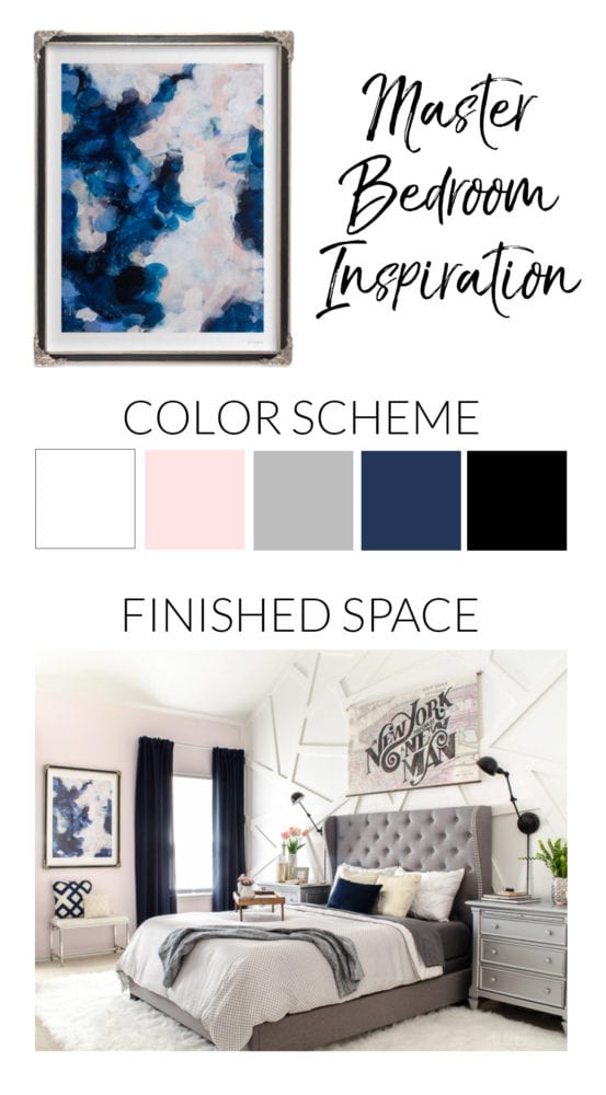
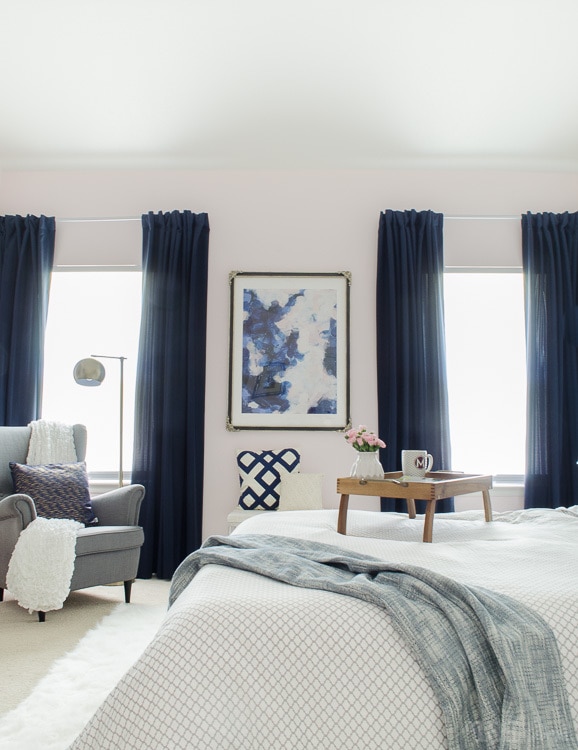
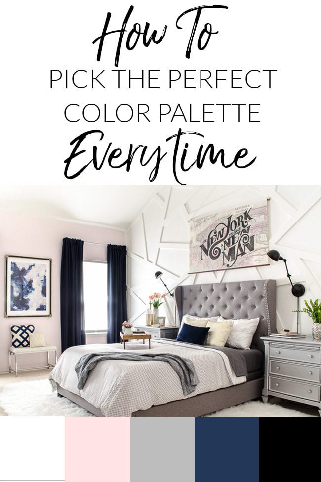
For our master bedroom, I was stuck trying to decide if I wanted a light, airy space or something more dark and cozy. The answer became clear when I fell in love with a piece of artwork that combined both light and dark into one abstract print, using shades of blue and blush.
I pulled the entire color scheme for our bedroom straight out of the art! It’s a bit hard to tell in that photo, but the curtains and front bed pillow are navy in real life.
Because I started with the art, I didn’t have to worry about picking colors for the room that clashed. I could already see how beautiful they were together in my inspiration piece.
Sticking to that palette for all the major decisions in the room gave me a huge head start in creating a cohesive, polished feel. For each decision, I asked myself how the item would look with the art.
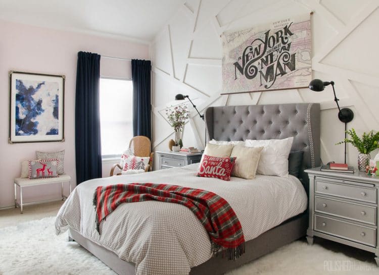
This particular print also reminded me how much I love balancing out extremes. We went with a very modern and angular accent wall behind the bed, but then softened it with the soft fur rug and more traditional furniture and drapes.
You don’t have to stick to your color scheme for 100% of the items in the room, because that would make daily living in the space too complicated and restrained. But 80-90% is a good goal.
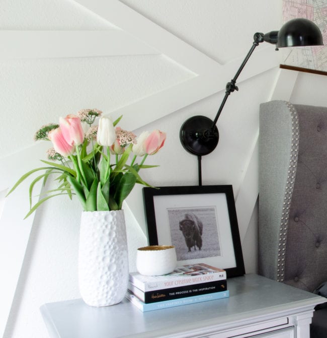
For example, we added some greenery to both nightstands and it’s a beautiful pop against the rest of the cohesive colors.
To make these off-palette accents work, try to incorporate at least 3 items around the room. I have green plants or stems on each side of the bed, and then again across from the bed.
I used the same repeating technique at Christmas by incorporating red into the room. If you showed me a picture of our bedroom and asked if you could add red, I would have said NOOOOO.
But, by adding it multiple times in smaller pieces, it works brilliantly.
Enough about me, let’s talk about finding your own inspiration!
Grab both your Feel & Function and Style Direction worksheets, because we’re going to need some of the words you wrote down.
First, read back over both sheets and highlight any words you feel the strongest connection toward. Which words make you really smile when thinking about the space you’re working on?
We’re going to take those words and use them to search for the perfect inspiration.
Some of my favorite places to do this are Minted, Saatchi Art, Fabric.com, even Home Depot because they all have good search tools to help me at least narrow down my initial direction.
As you search online, create a special Pinterest board just for the room you are working on. Pin any options you’re considering to that board so you can review them all in one place before making your final decision.
Ready for some examples? Let’s pretend these the words you circled were:
Nature, Calm, Welcoming, & Relaxing
To begin, I went to Minted and selected the categories of Beach, Floral & Fauna, and Landscapes since I thought any of those could encompass “nature” and would be a great starting point for my search.
If you had one primary color in mind, you could also select it to narrow things down, but I left that open to see what I could find.
Since there are SO many options and my search was just getting started, I opted to scroll through fairly quickly and just hit the little favorite heart to save any images I was drawn to. I didn’t even expand any to look closer at this step.
As you scroll, keep repeating your words in your mind….nature, calm, welcoming, relaxing. It’ll help you stay focused. I quickly realized a few pieces I really liked were too busy to be relaxing and calm.
Within about 10 minutes, I had already favorited 22 prints! When I clicked over to the favorites screen to review them, there were some pretty clear trends. Many of my picks had blush pink and light to medium greens.
Look for trends in your own favorites and that will lead you in the right direction.
The wide range of art and ability to quickly “favorite” items is why I usually start my hunt at Minted, but feel free to start anywhere you love finding prints or wallpaper.
It’s also important to note that the same exact words mean different things to different people. Some will find the ocean calming, while for someone else it would be the open plains or the mountains.
Make sure you’re looking for art that embodies the feeling YOU want for your space.
Here’s 8 of the examples I found when looking for inspiration that felt like Nature, Calm, Welcoming, & Relaxing to me.
Once you narrow it down to a few favorites, pin them to your board for this room and then take a look at a couple different stores, pinning favorites from those as well. Being able to see all the options together always helps.
Now, let’s take it a step further and look at some of the different color schemes you could get from these art prints.
Sample Color Schemes & Inspiration Pieces
 Artist: Me Amelia
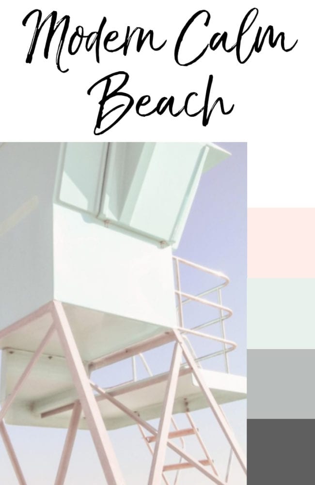
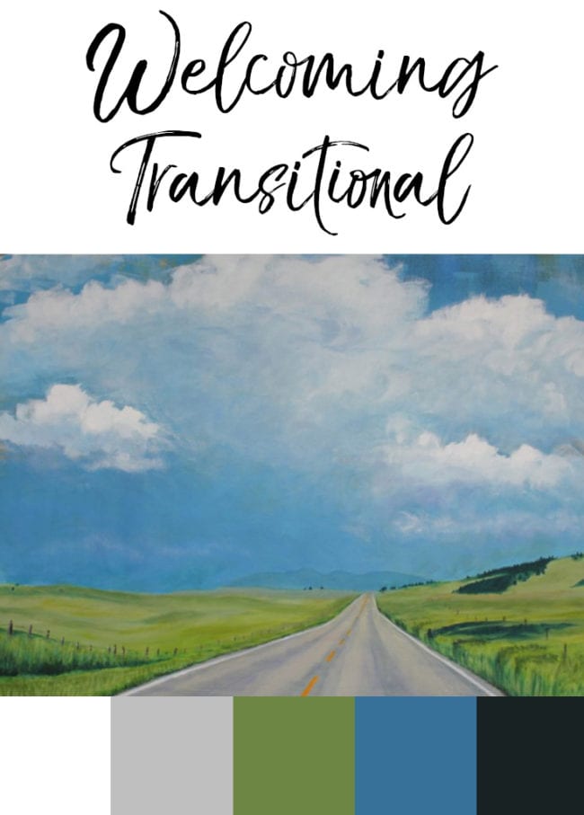
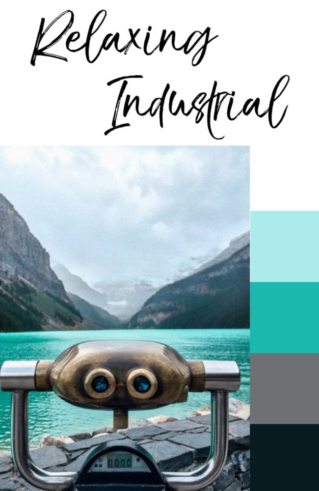
Isn’t it crazy how different your inspiration (and in turn, final room design) could be even if you had highlighted the same exact worksheet words as a friend? There’s no right or wrong, just what’s right for you.
The process of finding your inspiration piece could take 10 minutes like examples I quickly found above…or it could take weeks. Both have happened to me. Try not to get frustrated if you aren’t finding anything you connect with right away.
As you saw in all the examples, I love using art as my inspiration piece.
Yours could be a piece of fabric, wallpaper, or even a photograph you took on vacation! If online searches aren’t working, head to fabric stores and museums for some real-life inspiration.
In fact, your color palette inspiration could be:
A print or original piece of art you use in large scale within your actual room (like my bedroom)
A small notecard you frame for a bookshelf
A wallpaper you cover the room in
A fabric you use for a throw pillow
A priceless, antique painting you saw in a museum
You’re just on the hunt for one item/image that embodies how you want the room to look and feel. This piece will also be the start of your full mood board for the room, which will be when we start to get into more details of furniture, rugs, etc.
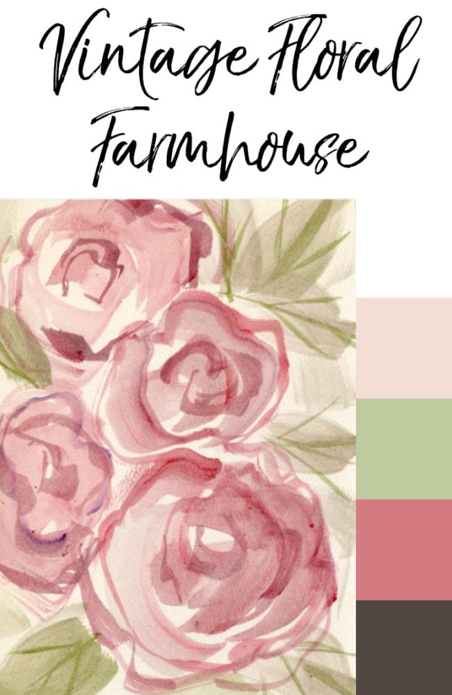
Once you have your inspiration, if you’re struggling to pull colors out of it, I found a free online color palette tool. You can upload your image here, and it will instantly show you 5 colors from the item.
I tested several photos, and it did a good job with most of them. I’d recommend starting with that, and then tweaking them manually in Canva if needed.
Make sense? If you’ve already finished step 1 & 2, it’s your turn to get searching! If not, make sure you go back and start here first.
For step 4, we’ll make mood boards! I’ll show you a couple different ways to do that, and create examples of room designs around each of the four inspiration pieces/color palettes I used in this post.
Does this process make sense? Are you relieved that you have an easy way to pick perfect colors for your room now, or overwhelmed with options? Would a video on how to put together your image with the 5 color squares like mine be helpful?
Let me know in the comments below!




Maggie S says
How do you get the main colors out of the picture (the 5 squares next to the photo)?
Melissa George says
Hi Maggie! Do you mean selecting which colors to pull out for the room, or actually creating the graphic with the little squares? I’m happy to answer either one but want to make sure I understand the question. Thanks!
Maggie S says
I guess I mean how do you pull the colors out –I think there is an app (maybe SW) where it picks the colors. do you use something like that…. or just use your eye to pick the colors.
Melissa George says
I just did it mostly with my eyes. I made the images in Photoshop and there is a color picker tool, but I didn’t find it to be that accurate so it was more trial and error trying to match. I had forgotten about the Sherwin-Williams tool, so that might be a good one to try! I found it here: https://www.sherwin-williams.com/homeowners/color/try-on-colors/snap-it I also did some more searching around and found another option one that doesn’t require downloading anything. https://www.canva.com/color-palette/ I tested it out and it did a pretty good job for an instant result. I’d say maybe start with that, and then use Canva to tweak it further to your liking. It didn’t do as well with the Modern Beach light photo, but the ones with more saturation like the Welcoming Traditional was pretty similar to mine. Hope that helps! I’ll add this info to the post for others as well, so thanks again for asking!
Maggie S says
THANKS!!!
Lisa Hagans says
I love this series! I can’t wait for the next installment. This method really makes me stop and think and break down what and why I like something. I’m bad about putting everything I love into a theme which is nuts. Thanks for sharing this!
Melissa George says
I’m so glad you’re loving it, Lisa! The next one is going to be really fun since we’ll be making mood boards. I’m working on it this week and trying to get it done before we go out of town, but it’ll be another long one with lots of examples, so I don’t want to rush it!
Bekki says
Do you know where I can find the picture that is on the bedroom wall? Do you think doing this same color scheme-navy blue, pink, white, and gray would look nice in a living room? I am designing a board with those colors.
Melissa George says
I think it would look great in a living room! The print was originally from Minted, but I think it rotated out. The Artist is Patricia Vargas though. Maybe she has a shop somewhere online with the prints?