I think rugs are my favorite way to quickly transform the look and feel of a room in a major way. They’re also one of my favorite ways to give a room a more polished or finished feel, which I showed back in this post about our living room.
The dark side is that it’s hard to make a room feel “right” when the rug is “wrong” in your eyes.
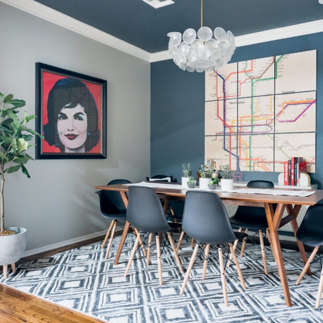
I haven’t been loving the rug in the dining room since the day I put it there.
Lesson learned, trust your gut when you roll out a rug and roll it right back up again if it doesn’t make your heart pitter-patter right away.
Last weekend, it was time to take action on the rug situation! In about 10 minutes, I had THREE spaces with new looks even though I only purchased 1 new rug. Now that’s a Fast Fix!
Staying true to making the Fast Fix posts fast for me too, I took the photos as the rooms existed today without perfectly staging everything. The one sad bottle of wine on the bar cart sure needs some friends. 🙂 So these aren’t perfect after photos, but you’ll definitely see the difference the rugs make.
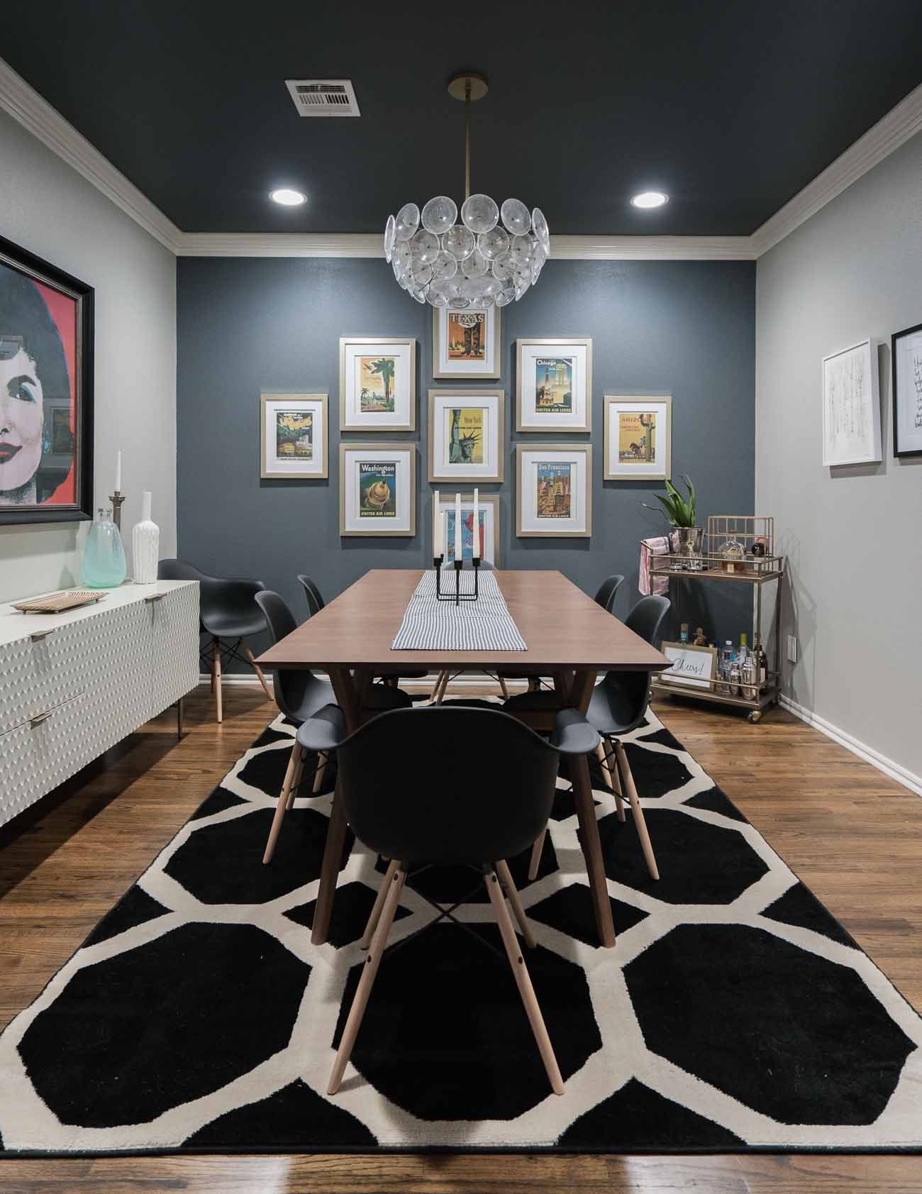
Anyways, here’s the original rug I wasn’t loving.
Long before the recent dining room update, I spotted a houndstooth rug at At Home that I LOVED. I 100% should have gotten it when I had the chance!
I looked for it on their website this weekend and it was shown as a clearance item. We crossed our fingers and headed to the store, but they didn’t have it. 🙁 Womp womp.
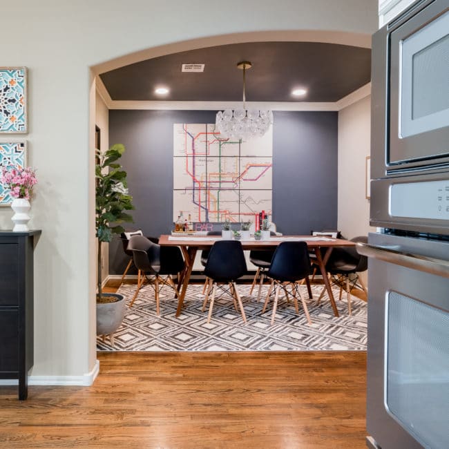
We kept looking around and I found another black and cream rug on clearance. Hold onto your seat because it was…..drumroll…..$50! For a rug big enough to fit under a 6-8 person table!
Here’s the side by side before and after:
Original Rug |
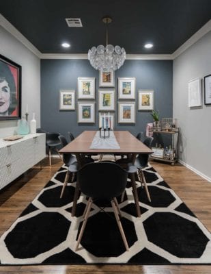
$50 Replacement |
The room still feels off to me, but I love the new rug with Jackie so we’re making progress! I think when I dress it up for spring in a few weeks it will come together.
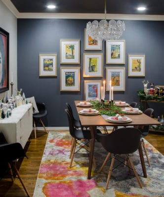
2019 Update: We swapped things around AGAIN, including a rug to replace the $50 replacement and large scale art.
It all feels more cohesive now.
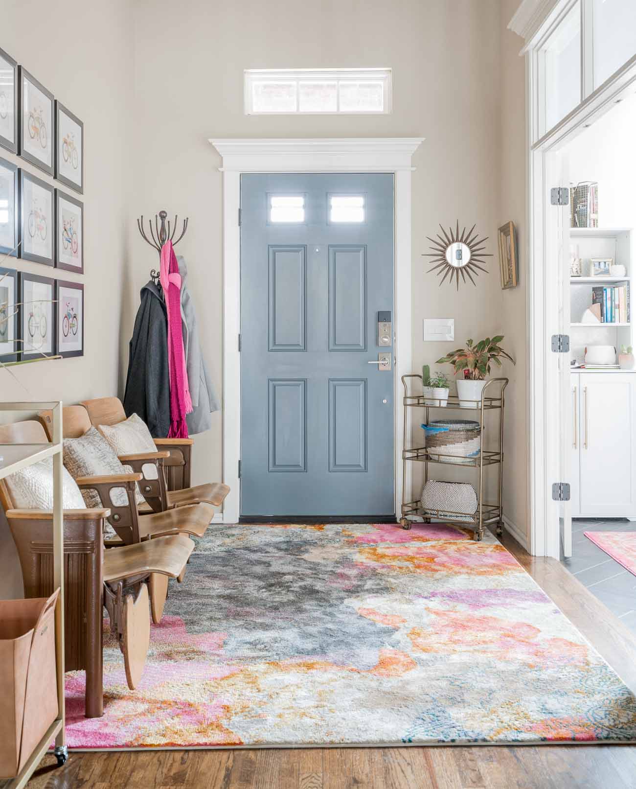
With the dining room rug dilemma solved, I had an epiphany that the original dining room rug could be moved to the entry!
The entry rug has been ‘okay’, but it was lacking a bit of color & modern pop to tie it into the rest of the house.
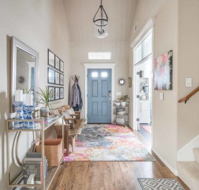
Here’s what it looked like before:
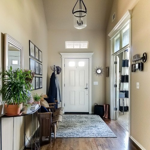
It’s a fun welcome that feels more like us AND the rug is a better size for the space. It’s always bothered me that right side of the auditorium seats didn’t sit on the rug. Now the full set fits!
Here’s a side by side of this one:
2017 |
2018 |
In case you’re now in the love with the “new” entry rug too, here’s an affiliate link to it: NuLOOM Rug. And here is the large bar cart we’re using as the console table now.
So THEN we had the entryway rug available for a new home.
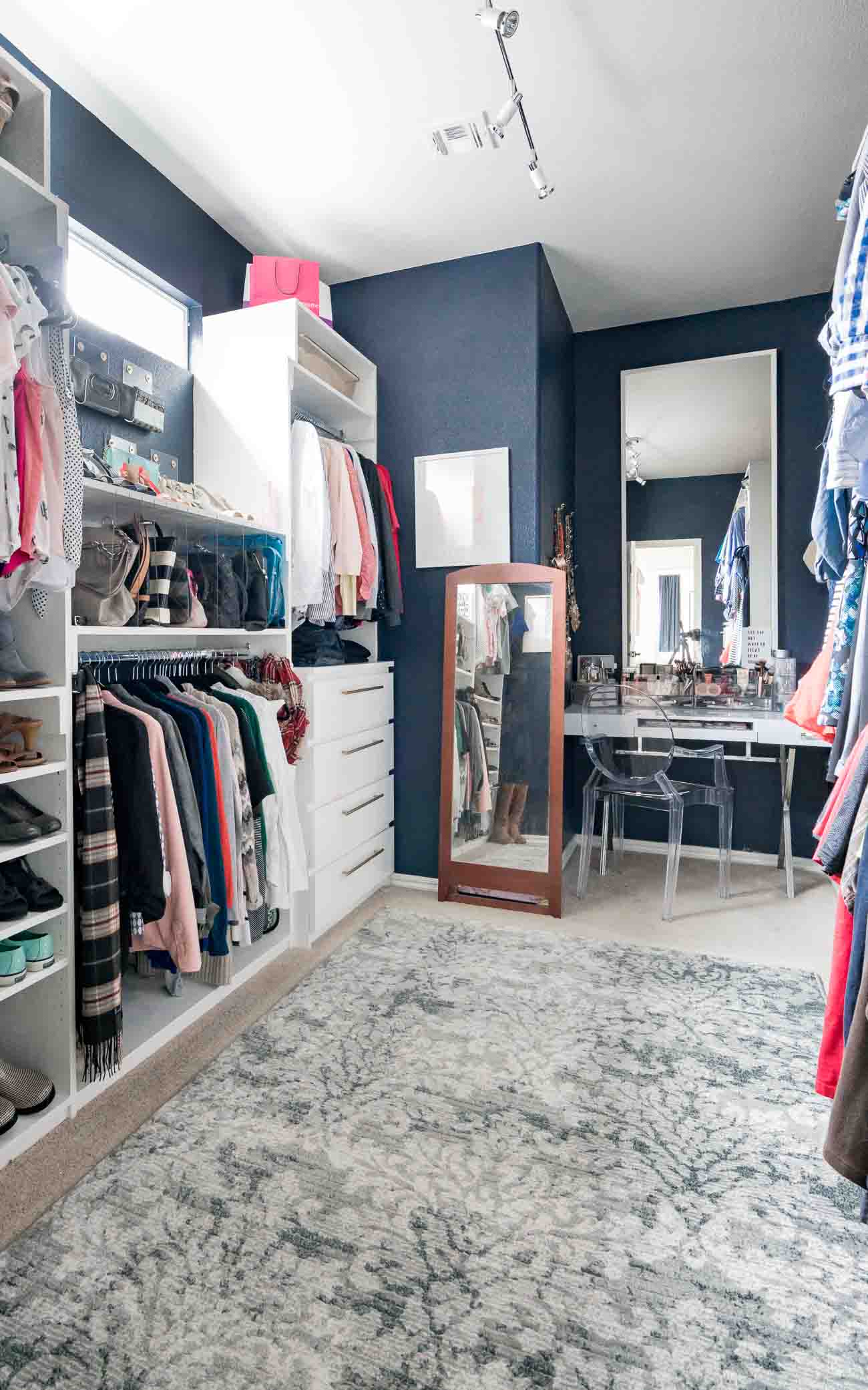
The rug in our master closet was in really bad shape because hard to vacuum cream shag + Maddie = a bad idea.
I was starting to hate being in the closet, but at the same time, there are other improvements I wanted to make before spending money on a closet rug.
I didn’t take a photo of the embarrassing state of the rug, but to give you an idea, it was both discolored and losing fibers. Thankfully, the former entry rug was a perfect fit!
While it wouldn’t be my first choice for the room if I was shopping from scratch, it’s WAY better than the daily frustration of seeing a worn-out rug in an otherwise lovely closet.
And since Maddie loves laying in the closet, it’s going to be so nice to have a vacuumable rug. 🙂
Of course with the rug situation improved, the standing mirror is public enemy #1. I need to pick up one I can hang on the wall for a less cluttered/awkward situation.
Which brings us back around to the lesson that you don’t have to make things perfect all at once.
Gradual progress will still get you to your destination and make life more enjoyable along the way!
I hope you’re inspired to look around your house today and see if anything would work better in a different room.
With the entryway feeling so happy now, I’m inspired to continue moving accessories around and add more spring color everywhere!




Sherri says
Did you repaint your walls in the foyer? The blue door really adds color! Goes great with the rug. Love the new look!!
Melissa George says
Not yet! That was actually the big paint project I mentioned that I want to do. The ceiling in the foyer connects to the ceiling in an open room upstairs and the whole two story stairwell, so we think we’re going to have to hire someone to paint. We keep putting it off because of the money and I usually have no fear of picking paint, but the big pricy project is scarier. 🙂
Lisa says
I love the rug swaps! They look so good! And a great reminder to shop the house when you feel the need for change ? PS. congratulations on your photo shoot! How exciting and so well deserved!
Melissa George says
Thanks Lisa! It’s funny how many times I have to remind myself to shop to house! And wish me luck, they should be here any minute to preview the space and my clothes before tomorrow. 🙂
Lynn says
Love the rug swaps!
Melissa George says
Thank you Lynn!
Kelly says
Why can’t you hang the mirror you have on the wall?
Melissa George says
Oh good question! It’s an easel mirror, so it’s made to be free-standing for a bedroom, I just have it leaning so it’s out of the way. We’d have to permanently remove the easel part to hang it. It’s such a nice mirror that I’d rather sell it to a good home and use the money for one with a more simple skinny frame.
EILEEN-RIPP-EMERSON says
Is the dining room ceiling painted black? If so, does it make room feel small? I like idea but not sure I’d have courage! I really do like the foyer switch as well as closet. Good job on $0!
Melissa George says
It’s the same color as that back wall, which surprisingly is the same exact paint on the front door. It looks WAY lighter in the entry! I REALLY love it on the ceiling, but I think it does help that there is a wide white molding AND that the ceilings are taller than normal in the room. I’m not sure I would love it as much if I did it upstairs were the ceilings are the standard 8 ft. And thank you!!!
Tania says
Well done! Changes like this can give us such a little thrill.
Sarah says
Great idea switching around rugs to make a space feel new…..I have to agree with the dining room still feeling a bit “off”…if I might offer a suggestion or observation….there is perhaps too much going on on all the walls in a smaller space there… I know you love “the Jackie” ….. could she be the focus, on the blue wall, and leave the other two walls blank … place the white console under Jackie, turn the table the other direction….it would make more of a statement and feel less cluttered/busy, more relaxing for dining? The bar cart could go on the right or left wall as you enter the room. What do you think???
Melissa George says
Thanks! I haven’t done a great job capturing it in photographs, but coming into the house in the main hall, it makes more sense to have the Jackie & buffet on the current wall of the dining room. And to seat 8 people at the table, it has to be oriented as it is. BUT, I do agree that there is too much going on on the walls. I’m scheming up some alternate idea. 🙂
Andrea says
I really enjoyed this post. I also really appreciated the side by sides. Inspired me to get a rug out of storage and actually use it!
Melissa George says
That’s great! I love it when I can pull something out of the attic and give it new life!