You know when you’re watching a home renovation show, the contractors do amazing things to a house on a somewhat strict budget, and you think “Hey, I could absolutely do that!”
That’s the beginning of our story.
My husband and I had been looking for a house with a certain style, some land, and in a particular town for a while. It felt so good to finally understand my style and have a vision of what I wanted our home to look like, but then we would walk into homes in our price range and be continually disappointed.
We inquired into several pieces of land for building and actually made an offer on one. In the end, we felt it just wasn’t worth our time, energy, or money to build.
During this process, we passed on our current home the first time our realtor took us through it. Something about it, though, kept it in the back of my mind. It needed to come back to life and we were feeling brave!
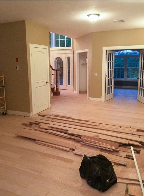
Closing day was so exciting! However, I almost cried after demo day. I just remember thinking “what did we get ourselves into???”
The entire first floor of the house, including the kitchen and a wall separating it from the living room, was ripped out.
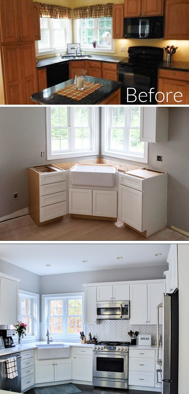
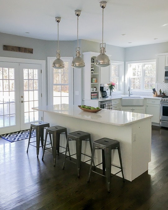
After hiring a general contractor (GC) and going over two main options for kitchen layouts with rk Miles Building Materials Supplier, we decided to go with a large center island. We lost some counter space and a few cabinets taking down the wall, but gained an open concept floor plan.
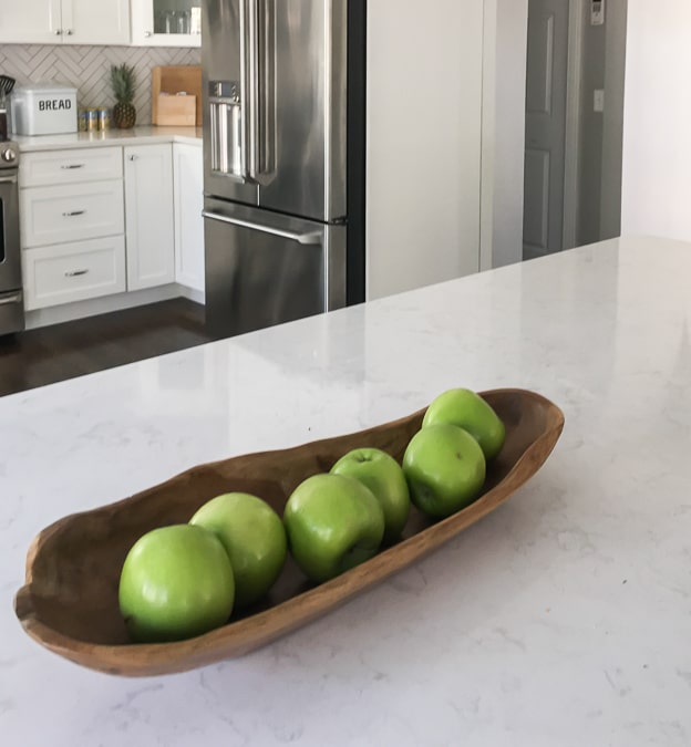
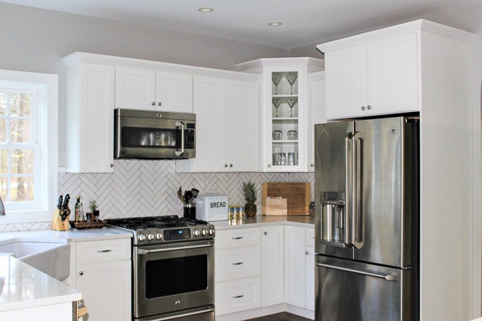
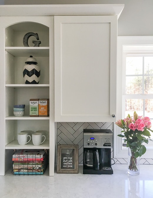
We went with white shaker cabinets (with one glass front corner cabinet and some open shelving on the end), Cambria Torquay Quartz countertops for the marble look (but easier maintenance), and sleek chrome knobs and pulls.
I knew I wanted an apron sink and one of the ideas I took from the designer was to go with white porcelain instead of stainless steel. I’m glad I did. I think it looks great with the modern faucet.
The kitchen pendants are from Joss and Main and the bar stools are from Target.
The final kitchen touch was the backsplash that was installed last fall, white 3×6 subway tile in a herringbone pattern with dark grout. I felt since it was a small space I could go for this bold design.
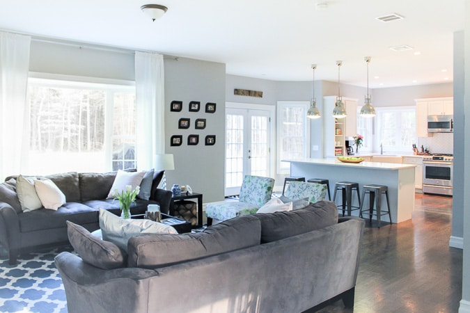
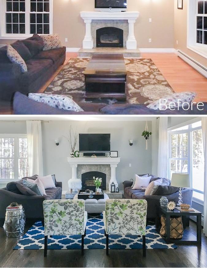
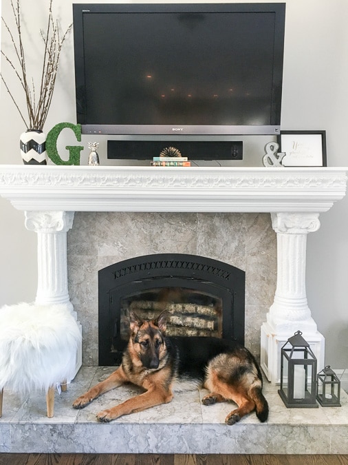
The living room came together after we added our furniture and décor.
Changing the lighting right now isn’t a priority and just isn’t in our budget. I can’t rationalize spending money to change the sconces, even though they aren’t quite my style because eventually, I would just love built-ins next to the fireplace. I think it would really complete the space.
Can you believe there used to be a wall between these spaces?
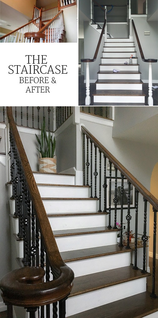
I wanted to replace every third baluster with iron to save money, but our GC thought it would look so much better every other. Our painting company (who did every room in the house including trim and baseboards) sanded and stained the handrails to match the stairs and floors. They also painted the end wooden posts and kick treads white.
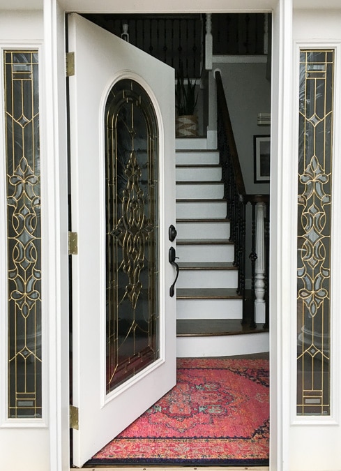
I love the way the new staircase looks when we open the front door!
One thing I learned after this process is to always trust your instincts when working with a designer. People tried to talk me out of most of my decisions.
The dark hardwood floors, the bright white cabinets, the dark grout in our backsplash, etc. Not to say that some of their concerns weren’t true (like how hard it is to keep dark hardwood clean), but regardless I love it. There is no such thing as a perfect home and nothing is more important than who you share it with.
We are nowhere near done, but feel pretty content here and wouldn’t change our decision to purchase this house for the world. I’ll be back showcasing more spaces and sharing renovation tips soon!



Jennifer says
Your home looks gorgeous!! Love every detail! What paint color did you use for the walls?
Nicole says
I love your home! It looks like you put your heart and soul into it!
Tamara Geffin says
Thanks so much! It’s Light French Gray by Sherwin Williams.
Jude McGowan says
Who was your painting company?
Jude McGowan says
Oh, and everything looks spectacular!
Lisa says
This looks great! I too love the dark floors and the backsplash. They all go together so well. And I really like the way you arranged the living room. ? I look forward to seeing the rest of the house ?
Bailey Eastman says
I absolutely love the white herringbone backsplash! It looks so good with the dark grout (that’s how I did my kitchen floor with the white/grey tile & dark grout). We finished our kitchen in September & the only thing that has not been done is the backsplash! I’ll make sure to read more of your posts to hopefully get inspiration to finally pick a backsplash and then onto the bathroom! 🙂
Tamara says
Coffey & Heady did all of our painting for this house and our last house!
North East Factory Direct says
Truly beautiful! Love everything – from your house, You did an amazing job.
Furniture Store Denver says
Gorgeous house! It is so modern and clean looking. I’m really impressed.
Nicole Patterson says
What a stunning transformation ! Everything is absolutely gorgeous !!