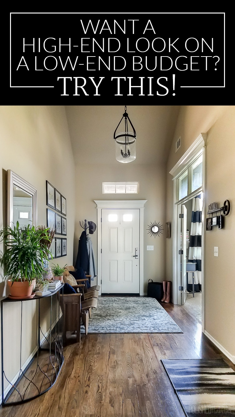
After years of neglet, our entryway is finally organized and stylish! Best of all, we got the look on a low budget!
If you have a room in your house that really embarrasses you, you can probably relate to this post.
For me, that room has been the entryway. I hated greeting guests with a space that was part hodge-podge decor and part storage facility. When we didn’t know what to do with something, it would get thrown in the entry. Serious adulting fail!
There were a couple barriers stopping me from attacking this room. The first was the beige paint that I don’t love. At all. But, the ceilings are taller than we could easily paint. Plus, there is no logical stopping place, so we’d end up having to paint not just the entry, but an open room upstairs.
I couldn’t even commit to a paint color in my mind, which meant the entry just floundered. I kept thinking I couldn’t decorate the room until I changed the paint. That was so wrong. Don’t be like me!
I was also scared that it would cost a fortune to create a chic adult entry. I wanted it to be unique to us, but my method of gathering stuff over time wasn’t getting us anywhere fast. We did have some vintage stadium seats, but as much as I love them, I struggled knowing how to decorate around them.
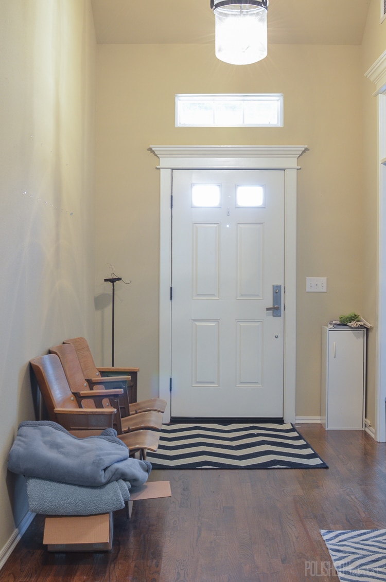
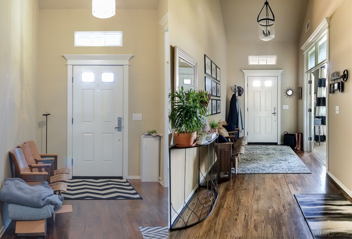
Here’s what the entry looked like before.
On one side of the door, we had an old light fixture. That makes sense, right?
I also had a pile of donations for the animal shelter and a random storage cabinet my neighbor gave me. Don’t give me the benefit of the doubt that all those items were temporary. They had been there way too long. Often, it was actually way worse than that photograph shows.
Well, hallelujah, it doesn’t look like that anymore AND I didn’t have to paint.
Best yet, I got everything I needed at ONE STORE. I ended up with the perfect look for way less money than I expected thanks to the magic of At Home, The Home Décor Superstore.
Seriously, do you shop there?
I’m obsessed and keep going back because they get tons of new items in every week. They’ve managed to curate the best decor in every style. Whether you’re into glam like me, or prefer a more rustic look, they’ve got you covered. The products look high-end, but come without the outrageous price tags.
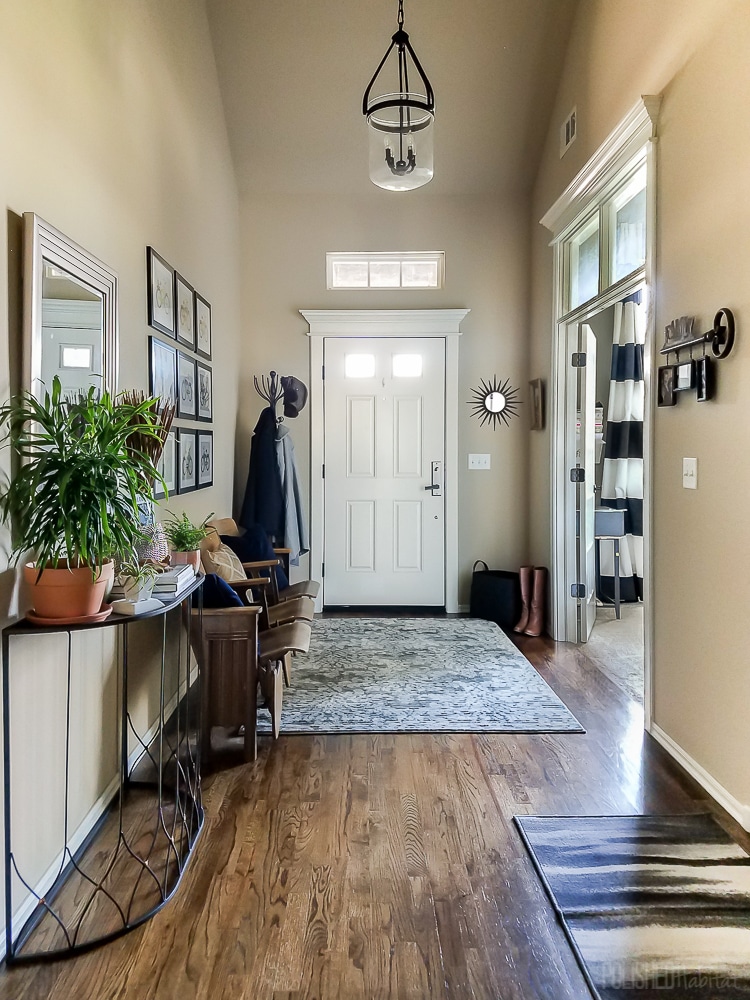
Are you ready to see how grown-up the entry looks after one afternoon of shopping?
It’s like real adults live here now!
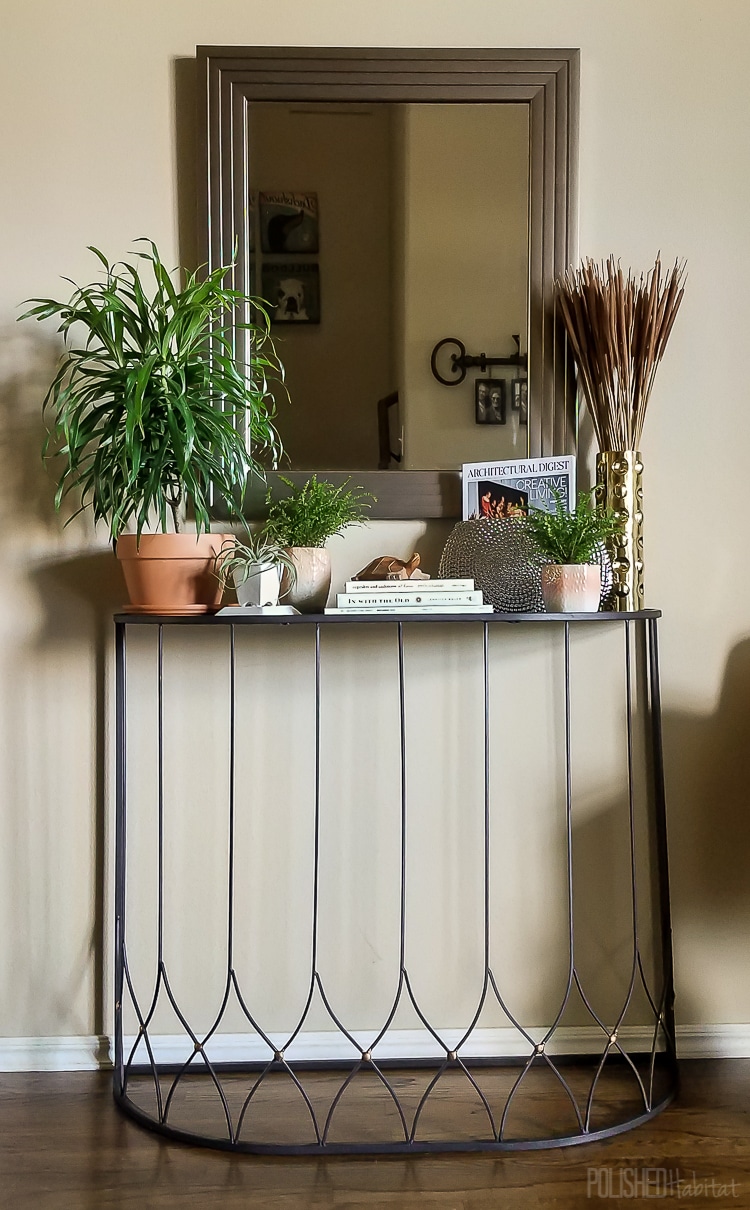
I struggled with a furniture plan because we needed some sort of entry table. But, I didn’t want to cover up the art deco end of the stadium seats. Thankfully, I spotted a wire table that was a perfect solution.
I was drawn to it immediately at the store because it doesn’t look like a mass-produced item. I feel like I picked it up in a vintage shop or at a hip flea market.
The mirror also came from At Home. The repeating lines on the frame give me some subtle art deco flare. I love it and I loved the price!
Quick Tip: I strategically decorated the table with lots of plants so we didn’t have room to clutter up the table with miscellaneous junk!
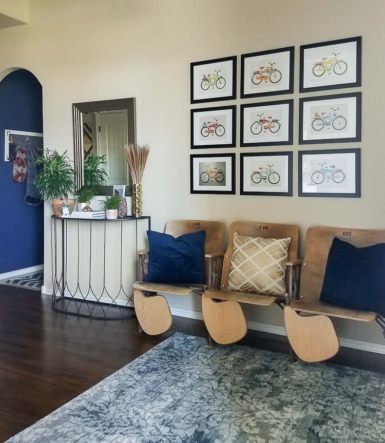
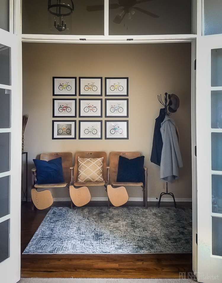
Above the stadium seats, we could FINALLY afford to frame some art prints by Anthony Grant. We’ve had them sitting in the office for two years because we couldn’t figure out how to frame them on a budget.
You guys, those frames were only $9.99 and exactly what I wanted! It’s hard to tell the scale in the photos, but together the art is about 42″ x 51″. Big impact without the big price!
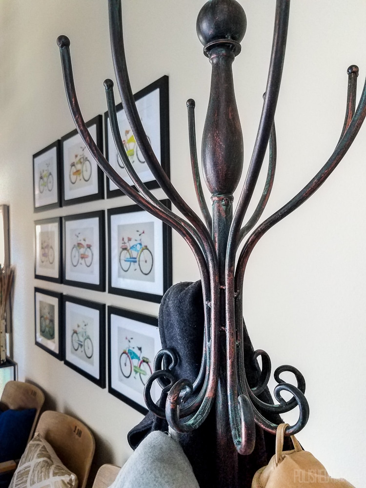
To the right of the seats, I found a vintage-inspired metal coat rack. It will be so much easier for guests to leave coats on the rack than struggling to fit them in the small coat closet. It tucks away behind the door without taking up much floor space.
Like the metal table, the coat rack looks like it came from a Parisian flea market. It’s even more beautiful up close. Doesn’t it look like a piece with stories to tell?
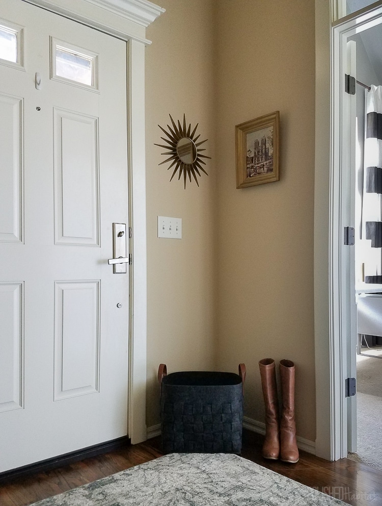
Since I was on a roll, I even spruced up the little space between the front door and the office. The sunburst mirror was another At Home find. I shopped our house for everything else.
I saved one of the best for last, but I’m sure you’ve noticed it.
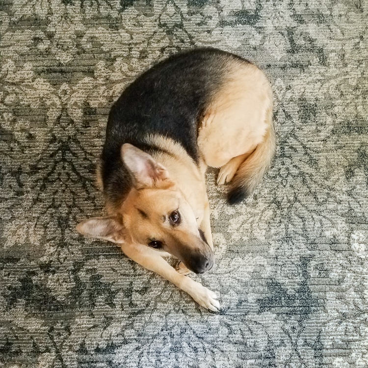
The old rug was way too narrow for the space and just wasn’t right for our entryway. I wanted something with a richer feel than the outdoor rug we had been making due with. I found one that lands somewhere between modern and traditional, which means it’s perfect for me! Maddie is a huge fan of the softness.
She volunteered as a model so you could see the pattern up close. It looks like an expensive silk rug, but as you could guess based on the theme of this post, it cost less! Hooray!
I’m still a bit in shock of the transformation – why didn’t I do this years ago? Here’s the before and after side-by-side. Whoa.
We’ll still paint at some point, but it doesn’t feel as urgent and overwhelming now. I was also getting desperate for a new light fixture before, but now I actually like ours again. I didn’t see that coming!
Sometimes when decorating, excuses hold us back from making decisions.
Being patient is okay, but total inaction is not okay if a space is making you crazy. Move things around, wander around At Home online or in person, and continue the process of making every corner of your house a space that you love.
If you’re struggling to decorate because of an open floor plan, be sure to read these open concept decorating tips next!

