from Society6, all content and opinions expressed here are my own.
Art is one of the best ways to let your personality shine through in your decor.
Right before Christmas last year, we updated the dining room, and it’s never felt right to me. Part of the problem was that I loved the collection of travel posters on the back wall, but they were wrong for the room.
First, there was almost always a glare on them, so you couldn’t even tell what they were. Plus, the travel prints are a more detailed art that should be seen up close versus across a room. I’m still going to use them somewhere in the house, but they needed to exit stage left from the dining room.
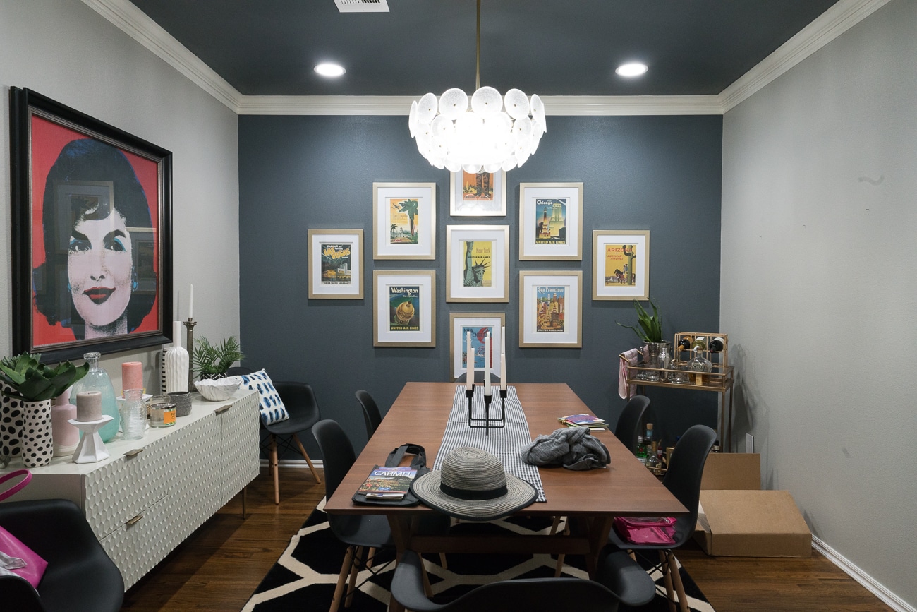
And because the room has always felt off to me, it’s way easier to let it become cluttered as you can see above. The pretty cabinet became a temporary storage shelf of vases I need to take upstairs.
I wondered how much different we could make the room feel if we changed the art, but kept all the same furniture, lighting and rug.
We had some tricky requirements for the art. It needed to be both large-scale AND affordable.
I found the perfect solution with large-scale wood wall art from Society6.
It comes in 3 sizes, 3′ x 3′, 4′ x 4′ and 5′ x 5′ and each piece of art is made up of 9 square panels. After some quick measuring, we realized the largest 5′ x 5′ size would be perfect for us.
The next dilemma was that we found dozens of designs we loved! Narrowing it down to just one was the hardest part.
I decided to mock up a few of my favorites so you could see how just swapping out the art can change the feel of the room.
8 Options of Society6 Wood Wall Art
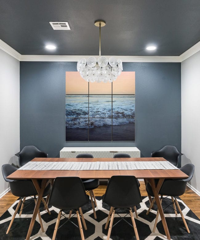
Option 1: Ocean Waves I love that this design makes me feel calm, but the waves also bring a bit of energy.
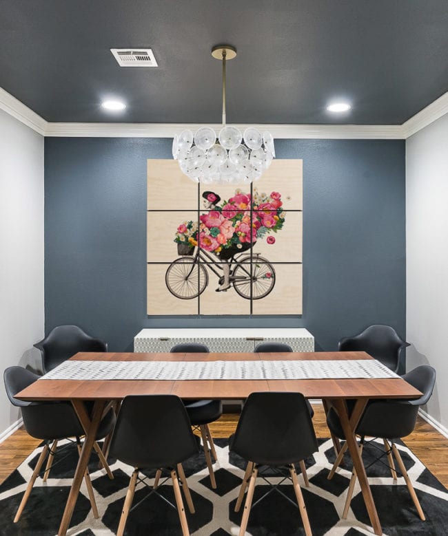
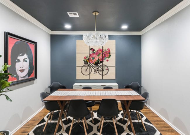
Option 2: Flower Delivery This one has the same characteristic of calm plus energy with the beautiful flowers and motion of the bicycle, but it also gives the whole room a feminine touch without making it overly girly.
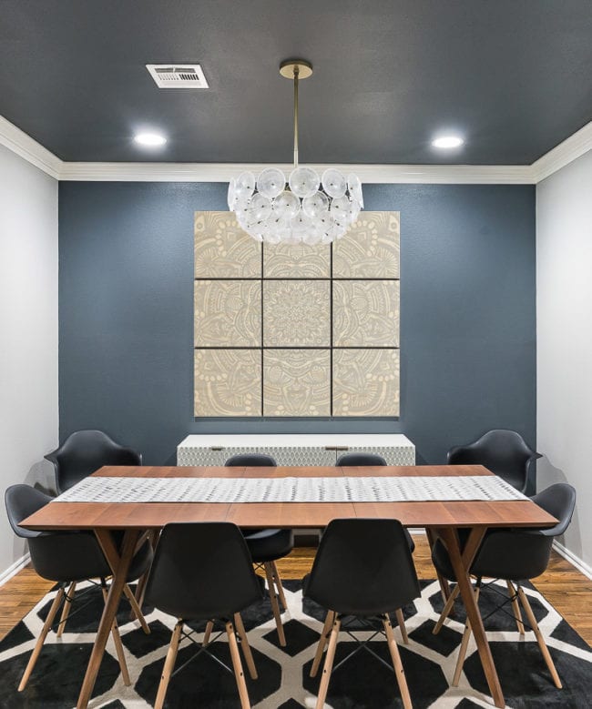
Option 3: Gray Mandala There are several different beautiful mandala options in the wood wall art line, but I thought this simple gray version would create a pretty backdrop and let me swap out decor without worrying about clashing colors. I think this one would be really pretty over a bed as well!
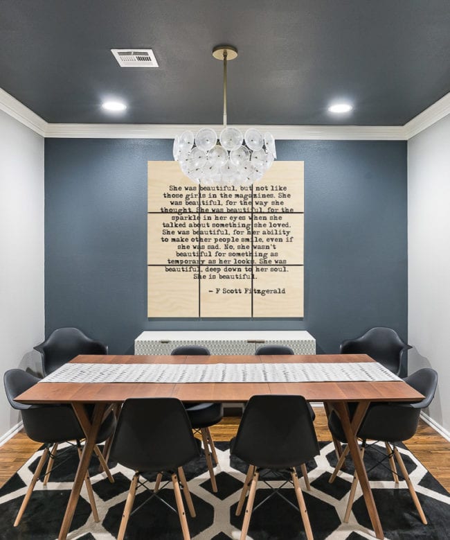
Option 4: Large Quote Going on the same theme of very neutral colors, this quote could be a good choice. I also love the idea of hanging it in a girl’s bedroom. It could work for anything from nursery to a dorm room or beyond!
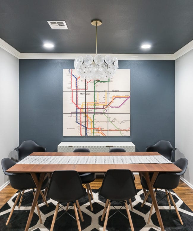
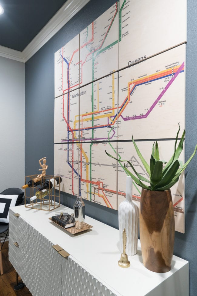
Option 5: Subway Map I love maps and New York, so when I spotted this subway line art, it jumped out to me. The design is a great mix of being neutral overall, but with pops of color.
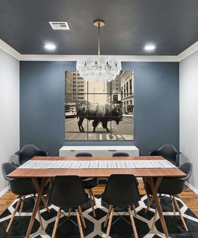
Option 6: Buffalo in New York Speaking of New York, this option really blends my love of city and country in a fun way!
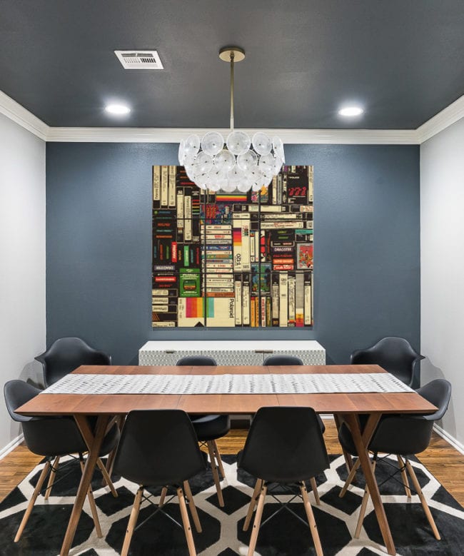
Option 7: Vintage Media Ah, my youth in art. Atari, VHS, and cassette tapes!
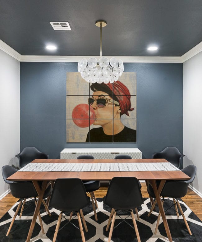
Option 8: Blowing Bubbles I LOVE the edge of whimsy in this one. It’s unique and makes a great statement piece without being over the top.
After I narrowed things down to these overall favorites, we had to figure out what would complement the other art in the room.
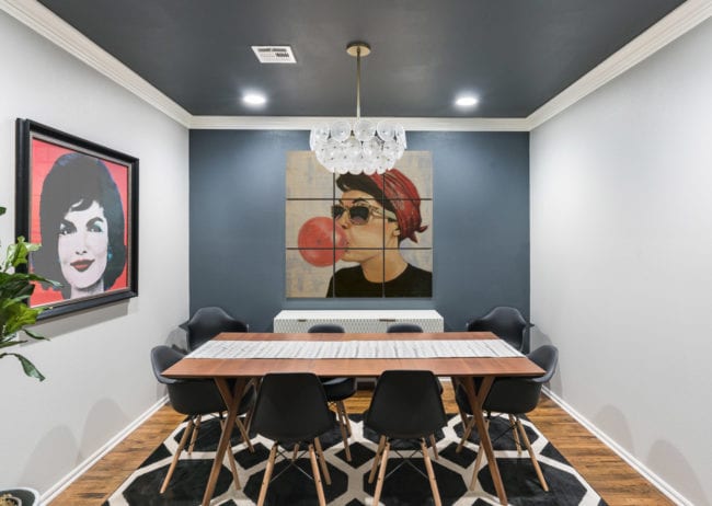
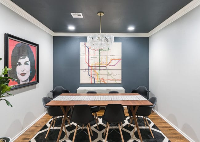
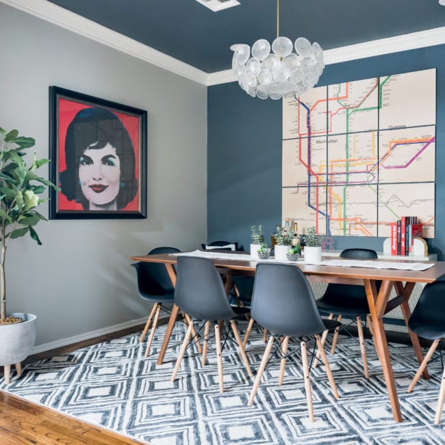
Because the Jackie print is bold, we wanted to make sure whatever we choose complemented it without stealing too much of the attention. While all the examples above work really well with the dining room, when we zoom back to how they would look WITH Jackie, some are better than others.
Here’s an example of how the blowing bubbles art goes from perfect for the room to a bit strange when paired with Jackie.
One of my other favorites, the bicyclist hauling flowers is also a misfit with Jackie.
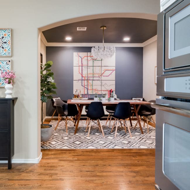
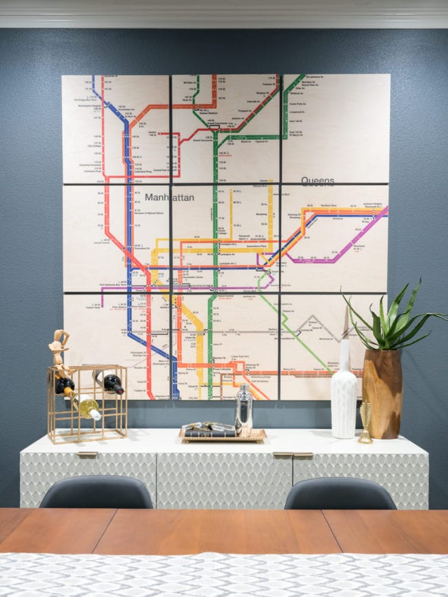
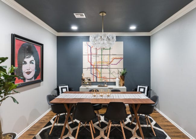
After lots of consideration, we decided the subway map was the perfect match for our personalities and dining room!
We liked that it had a bit of color, including a red line that complements Jackie. And unlike the prior travel poster art, the subway map looks great from a distance. When you get closer, there are still smaller details to enjoy.
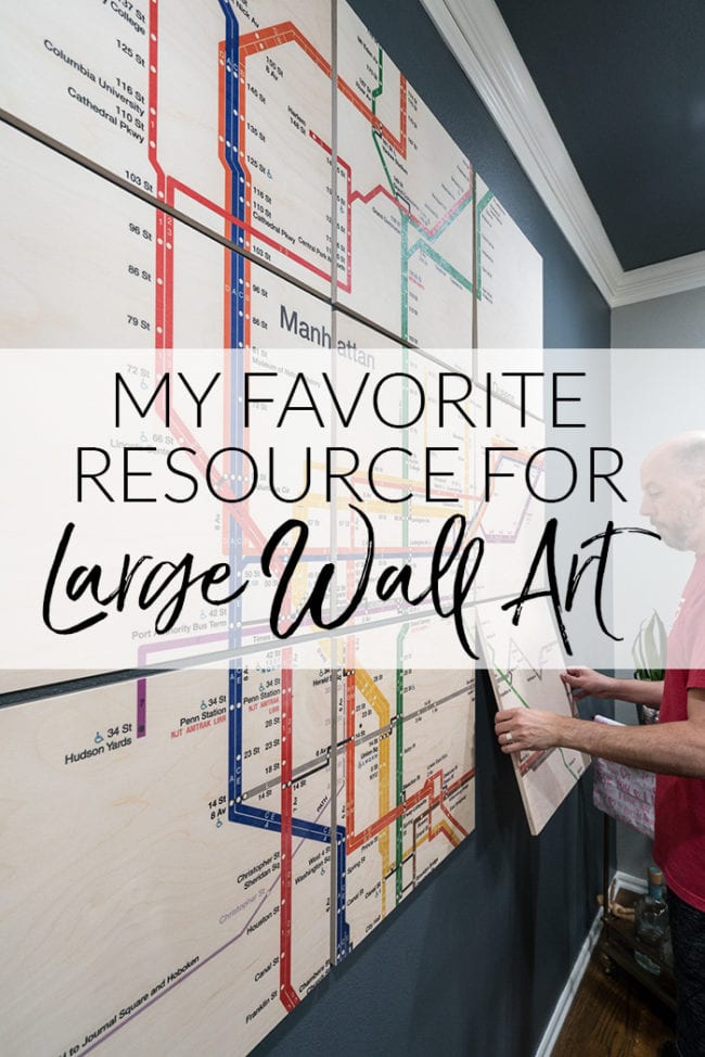
How to Hang Wood Wall Art from Society 6
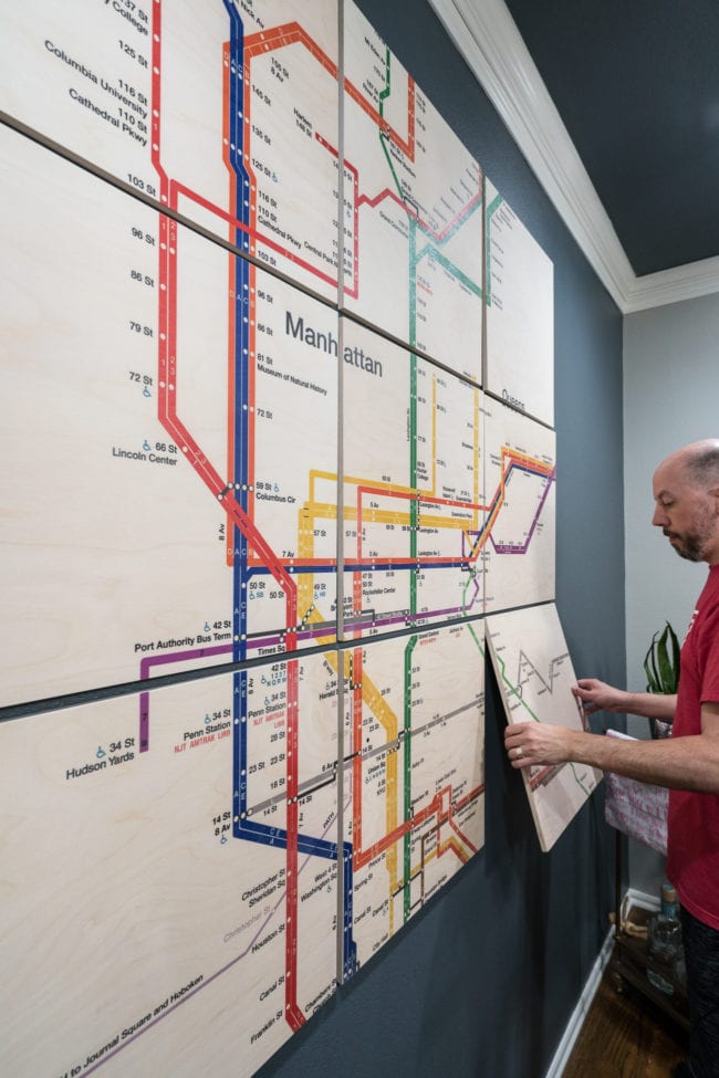
Because the wood wall art comes in 9 pieces, you may be wondering how hard it is to hang up straight. We were worried about that too.
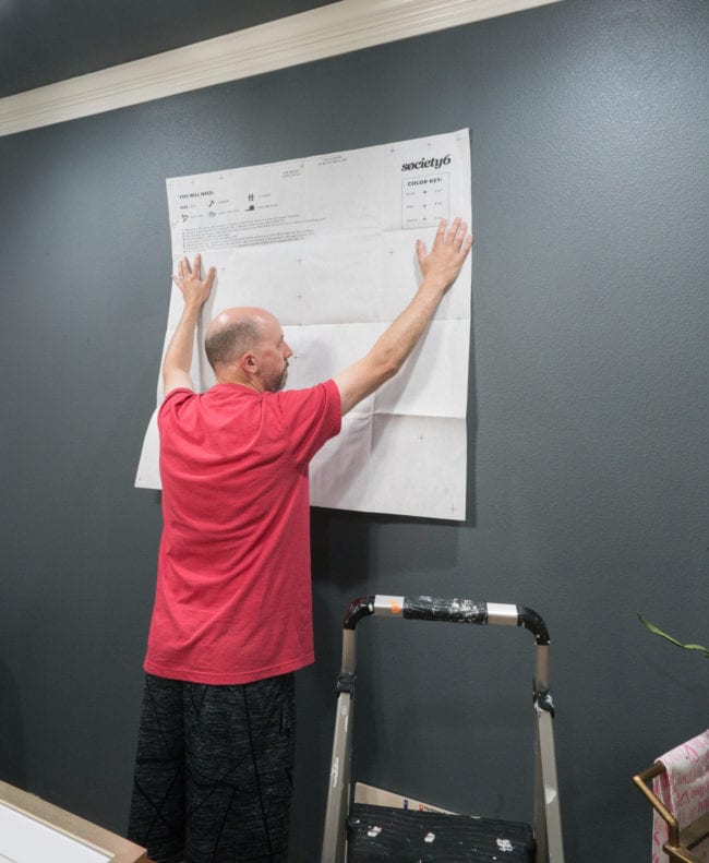
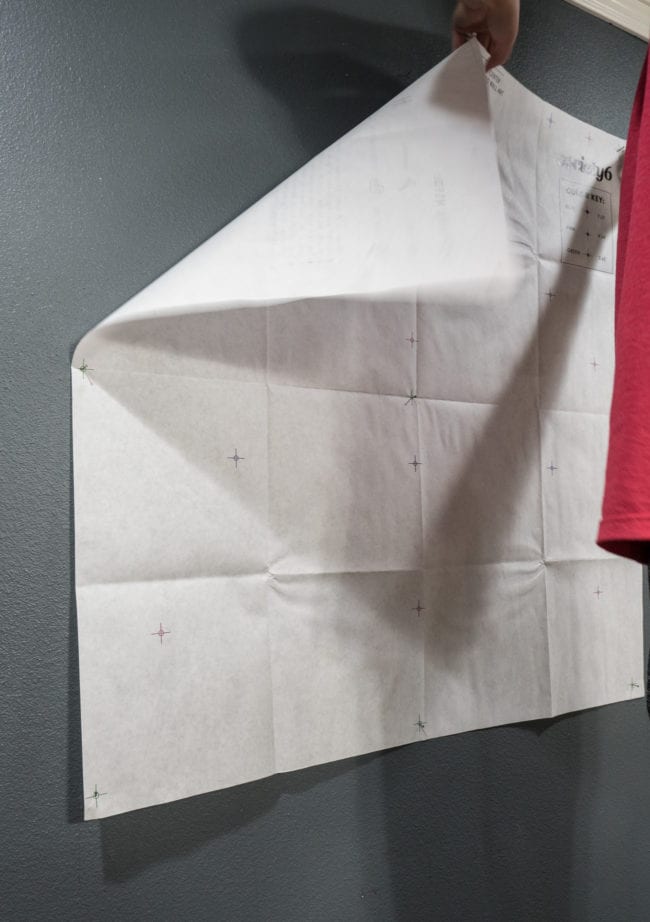
Luckily, it comes with a template!
One thing to note when you’re placing your template on the wall is that it’s designed to show you where to put the nails for all three sizes, but the paper itself is not the full size of the art if you buy the 5′ x 5′ size like we did. The nail holes for the button row are toward the bottom of the paper so the base of your installed art will be lower than the template.
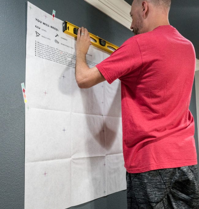
When you’ve got the template taped up to the wall, make sure the marks for the nails are level.
When everything is level, you’re ready to nail right through the template using the color guide. For our size, we needed nails in the middle of all the green symbols.
When you’ve got all 9 nails in the wall, carefully remove the template and you’re ready to hang your new art!
You can see the scale of the 5′ x 5′ wall art in the below image. I’m so impressed with the value when I compare the massive size to the price.
If you’re torn on which size to order, grab some painters tape and mark the edges on your wall for both the width and height to get a visual. It’s nice to be able to step back and see the scale before purchasing.
I’m sure you noticed we changed the orientation of the dining room as well. When we bought the new storage cabinet, we didn’t want to hide the pretty front behind the table. But the room just didn’t feel balanced.
It’s so much better now!
If you aren’t familiar with Society6, they bring together hundreds of independent artists to make it easier to find unique art at affordable prices. They sell way more than these awesome wood panels.
For wall art, you can also order framed prints, canvas, and even metal. They have other home decor as well. I really love browsing through their throw pillow section!
Update: We are still LOVING the art and recently updated the rug. Now the room looks even better!
Jan 2019


MAC Clark says
I like the idea of the wood panels – but none of the options appealed to me very much. Your subway map would certainly be my favorite. Do they have other design options?
Melissa George says
They do! There are hundreds in many different styles!
Laura Keenan says
Not my taste. Way too modern for us, but if I had only one choice? I would have picked the quote wall. It was my fave of what you are displaying. My preference Is of my favorite Artist, Thomas Kinkade. I love everything he has done. I have pieces of his art in my dining room, family room, bonus room, master bedroom and guest room. Thank you fir the different ideas. I am now going to take some of his art and place it around 1 great big piece. It will look cohesive and not cluttered that way.
Melissa George says
So glad the post inspired you to swap some things around even though our art styles are different!
Christine says
I love it! Are the panels heavy? I was wondering if they’d be possible to hang with velcro strips making them renter-friendly.
Melissa George says
I wondered about that myself. They aren’t super-light, and I’d say the huge size we have would be on the cusp of working with the heavy-duty command strips. Our panels are 20″ square each to create the 5 ft x 5 ft size, but the panels for the 3 ft x 3 ft size are only 12″ each, so would be substantially lighter.
And that still a pretty big piece of art for the wall. I’d feel more comfortable saying that size would work with the Command strips. I still wouldn’t put it over a crib or toddler bed, but other than that it could be a fabulous solution for you! Actually, I just remembered that I actually had some 12 x 12 wood panels I made on the wall for about 3 years with the Command strips, so that makes me feel even better.
Candice says
I’m absolutely in love with the girl blowing a bubble! It would look perfect in my living room! The colors are perfect and the picture is fantastic!
Melissa George says
Isn’t she fabulous!?! Send a picture if you order it so I can be jealous you have the perfect spot!
Bethany Allie says
The ocean waves ? pulled me into the room and is my choice for my home. And it don’t have the need to complement a Jackie print. This post was very helpful!
Melissa George says
YES! I’d love to have that one somewhere else in our house. It’s my mom’s favorite too!
RACHAEL LAMB says
OMG, I love all of these! I’m in love with Fitz, always have been so I’ll be ordering something from their site with his quotes soon! Thanks for the ideas!
Melissa George says
You’re welcome! I wish I had a good spot for that one because it’s such a great quote and unique piece of art!
RW says
I like the waves but think (1) they look a bit like a business conference room and (2) they don’t compliment Jackie.
Melissa George says
Totally agree! They’d be great in some rooms, but weren’t a fit for ours!
Donna Jean says
Love the pictures Need a change in our home. Looking around to see which room to put one in and size. Some are too busy but liked them. Just not the right room here to put one. Like the You are Beaufiful one. Would look nice in our family room. Blue Water one in our extra bedroom. Will send a picture if we get one. Think I’ll look at some more too.
Melissa George says
Yes! Definitely, spend some time cruising through the other options to see which ones speak to you the most. There were lots of others I love, and also some that aren’t my style but would be beautiful in someone else’s home. I can’t wait to see a picture if you decide on one!
Beth Gentry says
This is great. I’m decorating my husband’s office & I need to fill several large walls. Definitely checking out this option ASAP.
Melissa George says
The wood texture is a great way to mix things up when you have several large walls in one room!