Has it really already been a full week since I impulsively decided to join the One Room Challenge (ORC) for the 6th time?
If you missed it, you can catch up with Week 1 of the Kitchen Gets Botox series here.
We’re going to be in trouble if the rest of the weeks go as fast as the last 7 days have flown by. I even forgot to start my tradition of binge-watching Gilmore Girls from the beginning until today!
The good news is that we’ve got a plan…at least for what the kitchen will look like. I still have to do the scary task of figuring out how to fit all the work into the next 4 weeks.
As I was trying to create the plan, I kept finding myself pulled in different style directions. One moment the plan would be too far mid-century and the next it was too glam. It’s no secret I love conflicting design styles, but if the balance is wrong, it can be very bad.
FINALLY, I realized that if I paused and followed the same design method I teach others, things come together. That was facepalm moment one of the week.
Moment two came shortly later as I filled out the Feel & Function worksheet. The first three words I came up with were…
Modern. Glam. Industrial.
Not so revolutionary since I wrote a whole post a couple years ago showing how those words work together throughout my house! Yet, I still needed to pause and remember that finding the balance was possible when done with intention.
Going through the Feel and Function process helped me narrow my choices and feel more confident in the decisions I needed to make to finish the plan so we could move into the action phase.
For example, I was torn 50/50 between leather and acrylic for the seats of our new barstools.
In the end, I realized that the cushioned seats would help meet my goal of retaining a welcoming feel, while also meeting the functional need for comfort since we sit in the barstools ALL the time.
The leather will also provide a warm balance to the modern light fixtures & an industrial touch to counter the other glam details we’re pulling into the kitchen. True to my ORC past, the gold spray paint is coming out in full force!
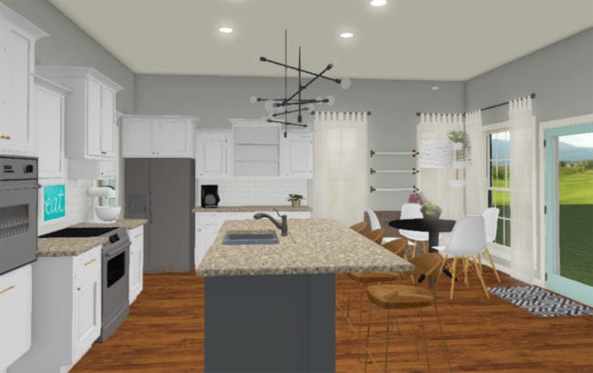
I got the basics of our plan rendered to show you today, but I’ve also got some surprises up my sleeve that you’ll have to follow along each week to see!
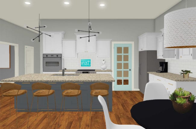
Here’s the view from the back door looking into the kitchen. I’m so excited to have a light fixture over the table again. Bonus points for it being white on the outside and gold on the inside!
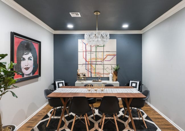
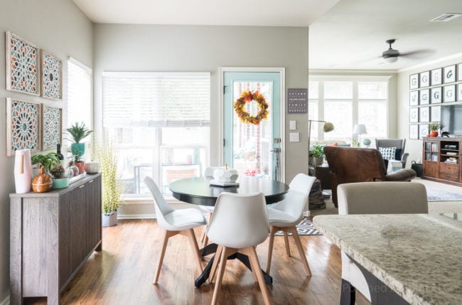
After debating a wide range of colors, I’m 95% sure I’m using Web Gray for the island. It’s the same dark bluish gray that’s on the ceiling and back wall of the dining room AND the inside of the front door.
I think adding the same color to the island will help pull everything together. And it’s still neutral enough to work even if I decide to pull in different accent colors at some point. Win-win!
Painting the pantry door the same Tame Teal that is already on the back door has been on my mind for MONTHS.
It’s such a fun pop of color. I can’t wait to see it on the pantry door!
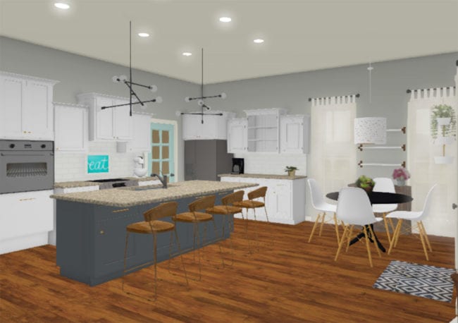
The final rendering view is missing some of the design details that will make it stand out, like the pattern inside the open cabinet. And it’s making me crazy that I can’t change the digital version of the faucet, but that’ll just make the real reveal even better.
It’s hard to tell in the computer view, but the cabinet doors will all have leather & gold pulls, while the drawers get 10″ gold bar pulls.
Did you notice the little hanging herb garden in the corner by the windows? I’m excited by the possibility of having an ongoing stash of basil and cilantro in the house. Mmm!
So that’s the rough plan! I can’t wait to work in some of the other special touches that will make the space more unique.
Hmm…I guess this means I need to get started on the work now? All the work I did this week involved hour after hour of internet shopping/research, but next week I’ll have some actual progress to show you. Hooray!
Don’t forget to check out the One Room Challenge site to see what everyone else is up to this week!




Jill Steinwender says
Is the light over the table from IKEA? It looks very similar to one they have, but the inside is more copper, not gold. Will this be a spray paint target? Looking forward to seeing it all together!
Melissa George says
It is! I just opened it to make sure I wasn’t crazy about it being gold, and in the rainy natural light and in the light of our cool spectrum bulbs in the kitchen, it’s gold for sure. But when I was walking between the office and the kitchen through the warm light of the entry lights, it was as copper as a penny! I’m glad you mentioned it because clearly we need to make sure it gets a cool bulb! So thankfully no, it’s about the only thing I don’t have to paint gold. 🙂 However, the base of the chairs UNDER the light aren’t safe from my paint can!
Robyne says
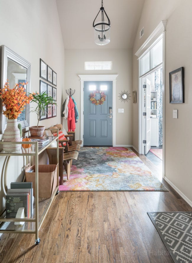
Still can’t get your entryway rug out of my head … absolutely love those colors!
Melissa George says
Thank you! I’m so glad it worked so well in the entry. We bought it for the dining room and it wasn’t quite right, but I love coming home to the pop of pink!
RW says
Melissa, I wanted to tell you that this week, when a friend was all confused about paint colors for a new room they’ve converted, I pointed her towards your “how do you want the room to feel” post, and it helped her! Of course, I thought I knew her style and colors. But as it turned out, I was quickly proven wrong. Her interpretation of the words she came up with, ” brighter and cheery” even knowing her past is very different from my interpretation. But that does not matter. I’m glad it helped her move out of the stuck morass she’s been in about finishing this room — since last winter. I think she’s got more of an idea herself of the direction she wants to go in. Kudo’s to you! And good luck with your kitchen and the family center finish!
Melissa George says
That is SO great to hear. Thank you so much for sharing that post with your friend! And thanks for the well wishes – you wouldn’t believe all the stuff I’ve accumulated to take to the center. It’s taking over the house!