
After dreaming, scheming, and then implementing over the last 5 weeks, our master bedroom decorating project is DONE!
We went from a messy, generic space to a bold, but relaxing bedroom that has personality in spades. I’m going to TRY to keep the talking to a minimum because I know on reveal days we all want to see the photos. But gosh darn it, there is so much I want to SAY. Conciseness is not my biggest skill. I’ll do my best though!
Just ONE little thing first. I couldn’t have finished this room without lots of help. Linda from Calling it Home created this wacky One Room Challenge event, and because of her, FOUR rooms in our home are now better than we could have imagined. Thank you, Linda! And then we have my husband, who let’s me do things like paint bedrooms pink and design crazy walls. Then he comes home after long stressful days at work and helps my ideas turn into reality. Without his help, none of my One Room Challenge spaces would be the same!
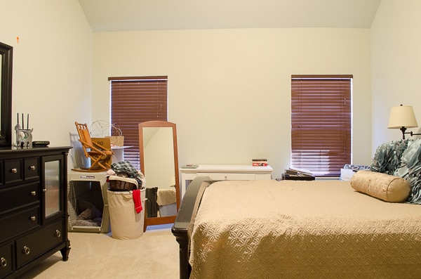
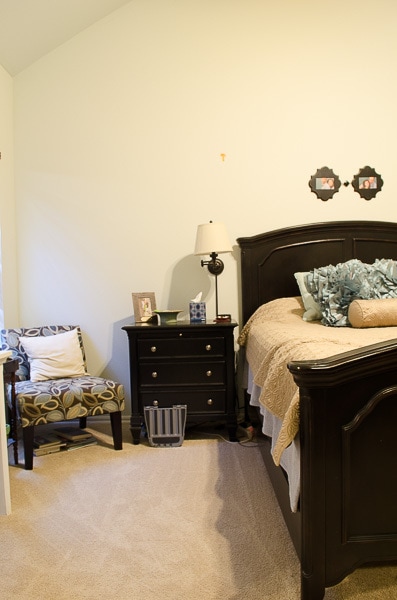
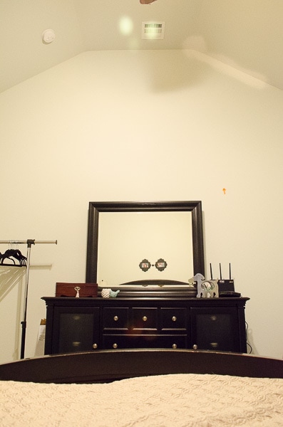
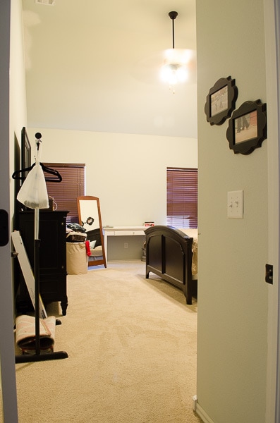
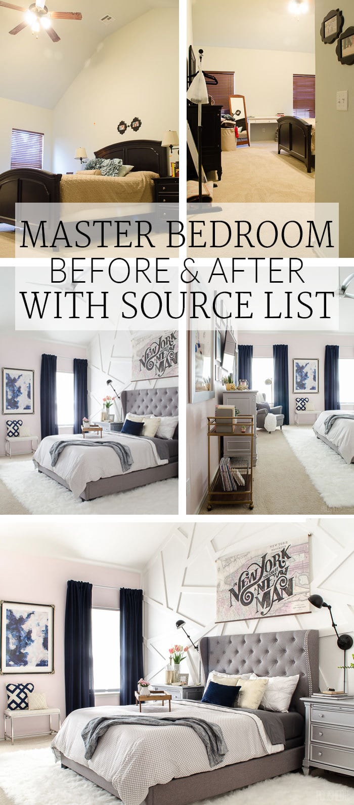
That’s enough chatting, here come the photos! Let’s go back in time five weeks and remember what the bedroom looked like before.
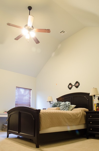
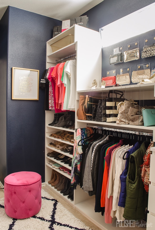
As much as I love our master closet, I think the bedroom photo is my new favorite of all time.
Queue the total surreal feeling that the One Room Challenge brings me when a space is done. I feel very Urkel-esque – “Did I do that!?!?” Of course, there is also a big dose of embarrassment that we lived in the before photos.
The window wall before was a big mess of clutter and faux wood blinds that were way uglier in person.
Now it looks like competent, responsible adults live here. Looks can be deceiving, right?
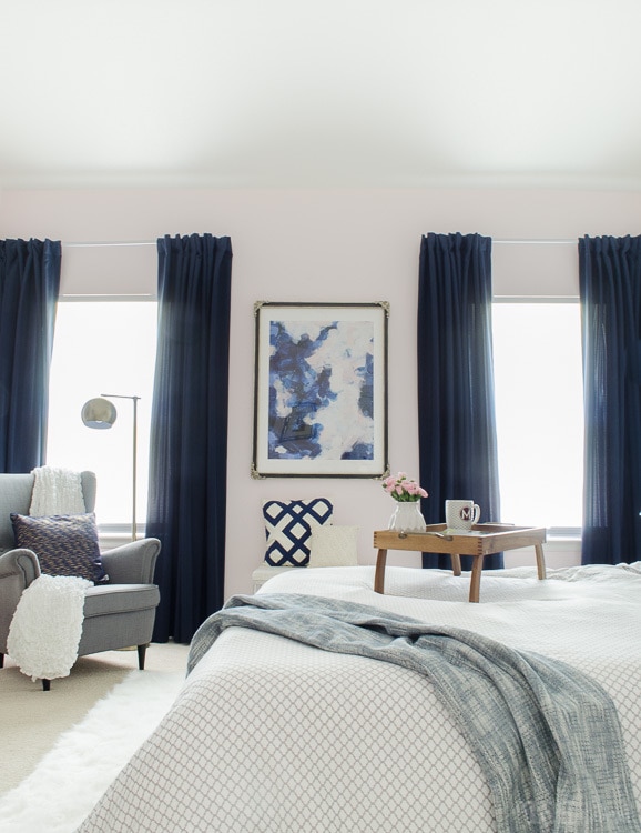
When I saw the print, I realized it was possible to combine both together. It gave me the confidence to blend a glam uptown space with downtown loft inspiration. Kind of a wacky combo, but I love both of those vibes passionately and equally, so why shouldn’t I make our bedroom represent both sides of me?
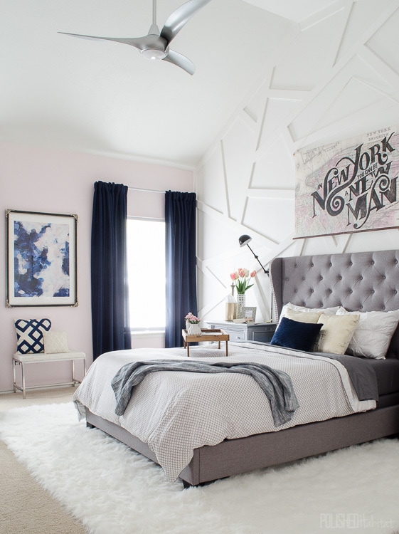
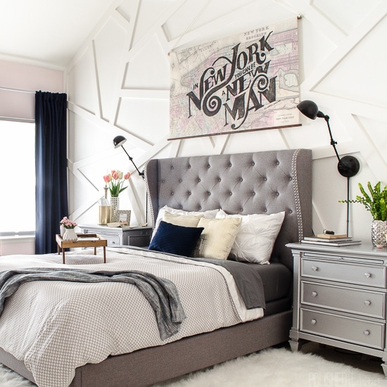
The bed wall also had a MAJOR transformation. The before was just sad.
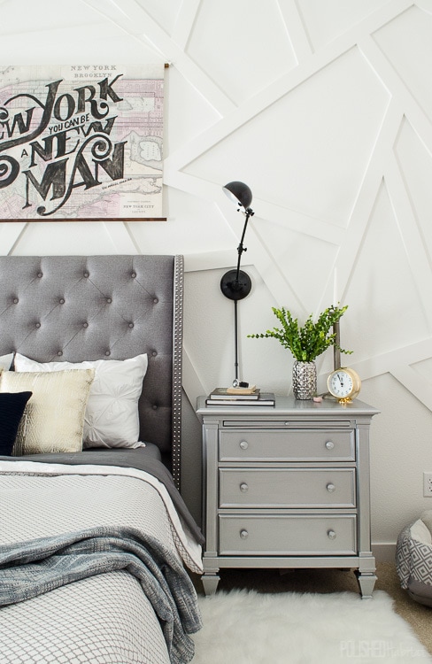
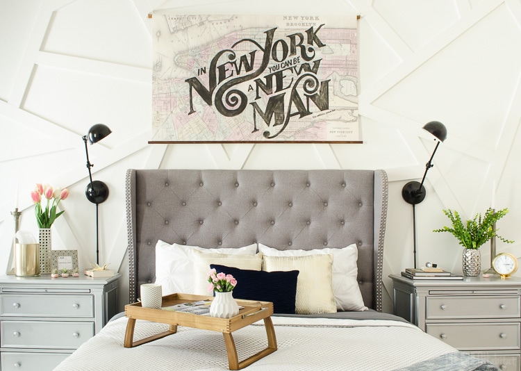
Painting the existing nightstand gave it a totally different personality. (To get the same feel, try mirrored nightstands. I linked to 10 affordable options here.) 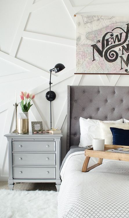
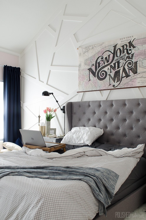
The artwork above the bed is a custom piece by my talented husband. We found a public domain map of NYC and had it printed to canvas.
Then, he painted a quote from Hamilton/Lin-Manual Miranda over the top of it. We were beyond lucky to see Hamilton on Broadway right after it opened. Since then, we’ve been OBSESSED. It’s just so brilliant.
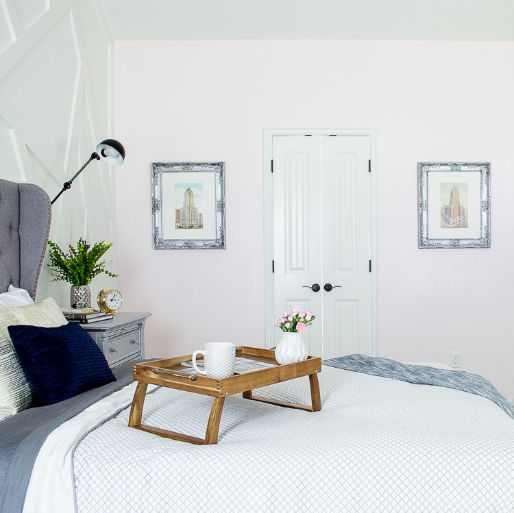
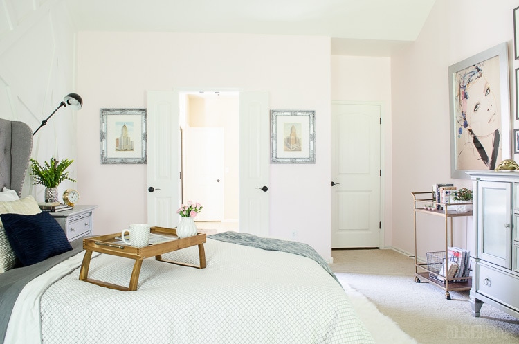
Spinning around to the next wall, I finally found the perfect home for some vintage prints of my two favorite buildings in downtown Tulsa.
The final wall in the room used to look like this. Not exactly the most pleasant thing to see when you wake up.
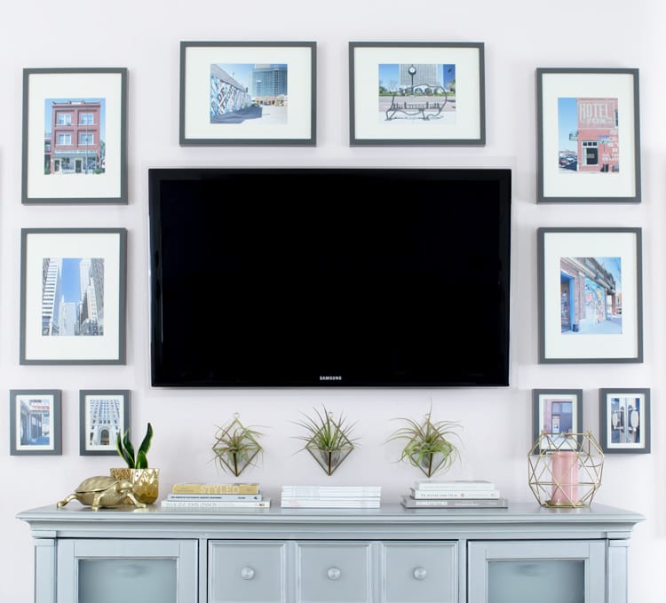
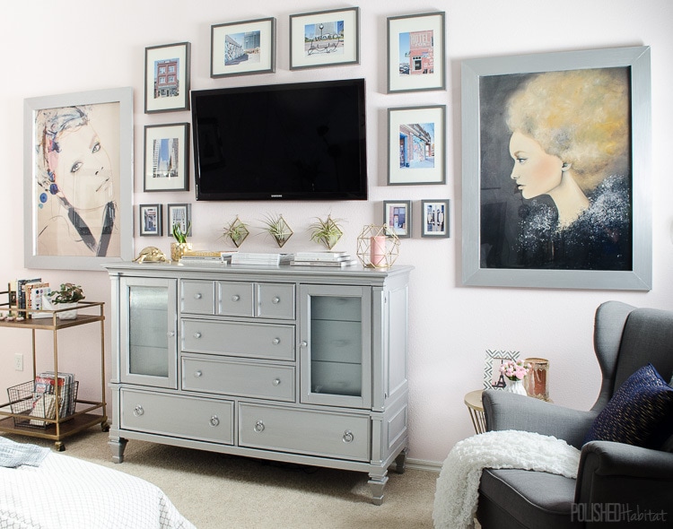
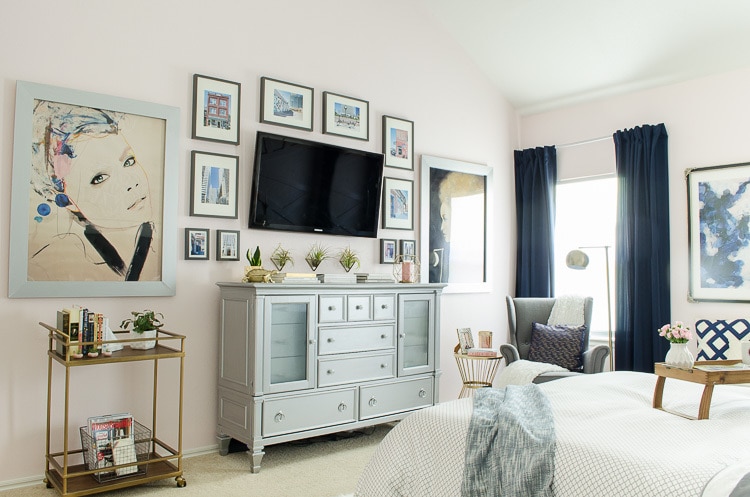
Now we have a gallery wall around the TV!
Those big prints are by the talented Leigh Viner and you can find them on Etsy. I took the rest of the photos myself all around downtown Tulsa.
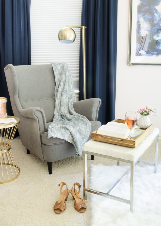
I could never find the perfect chair at the right price, so I pulled a chair from the living room in temporarily. It wasn’t the exact look I wanted because it’s too similar to the bed, but sometimes you just can’t find the right piece on a deadline.
On the left side of the TV, I needed something to balance out the chair. I brought in a bar cart to serve as a mini library. Now our books that are in queue to be read have their own space.
On the bottom, I added a basket for new magazines. I’m so excited to have one spot for all our new reading materials. Before they’d get mixed in to the office bookshelves and forgotten about!
Here’s a closer look at the photographs around the TV. I kept the dresser styling pretty simple, but love the wall-mounted air plants!
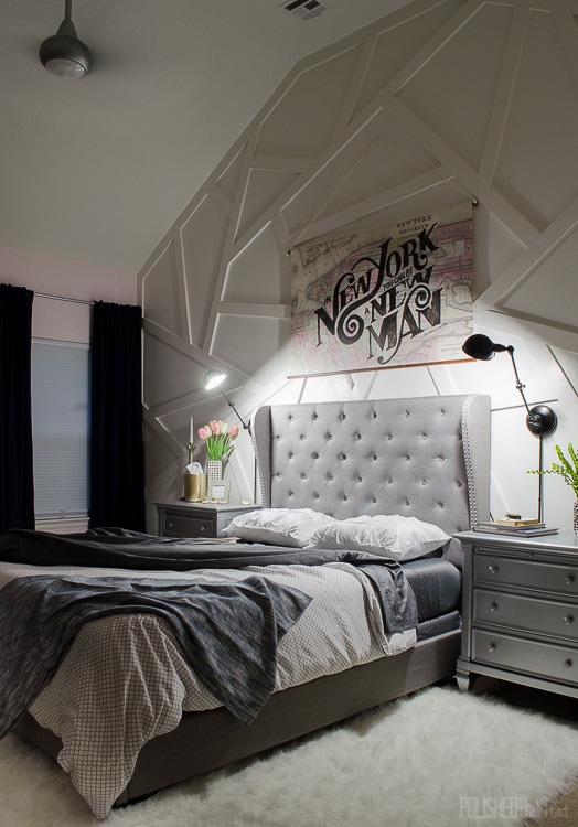
Now it’s bright and happy with a bit of drama. How great is that ceiling fan by the way? It puts out some serious air AND light too. We were worried it would be dark, but it’s brighter than our old ugly 3 bulb fan. 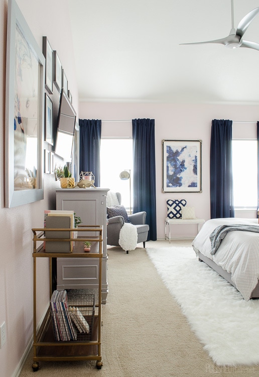
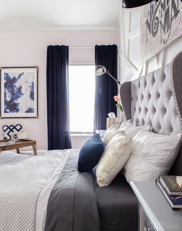
The breakfast tray also serves double duty as the perfect in-bed workstation!
The window situation is SO much better than before thanks to SelectBlinds.com.
Can you believe in the picture below there are actually privacy blinds letting in that much light? They are amazing! In seconds, they also transform to full black out blinds. If that wasn’t enough, there are NO ugly, safety hazard cords involved.
The gorgeous navy drapes also came from SelectBlinds.com. I used their back tab curtains in Nautical Sateen.
The room gets extra dramatic at night. And the fan looks so cool when it is moving. The center/light stays put and the blades rotate around it.
Whew! That’s all the photos, but I’ve got a complete source list for you below!
Paint: Sherwin-Williams Verbena (Pink) & BM White Dove matched into Sherwin-Williams
Rug: Home Decorators Collection 8′ x 11′ white
Ceiling Fan: Minka Aire via Amazon
Abstract Art: Minted ( Also their Antique Filagree Frame)
Drapes & Blinds: SelectBlinds.com
Bench: Target (no longer available – similar option)
Bench Pillows: Navy patterned was from Target several years ago/Small pearl beaded is from Tuesday Morning
Bed: Overstock.com
Mattress: Tuft & Needle (More on this later, we are LOVING it so far!)
Sheets: Target Threshold Dark Gray (LOVE that these have double elastic to fit less deep mattresses)
Duvet: Crane & Canopy
Gold Bed Pillows: Target (no longer available, alternate here)
Navy Throw Pillow: Gordmans
Navy Throw on Bed: Lowe’s
Breakfast Tray: Target
Nightstands: We have an older version of this Ashely model, I painted them with Rust-Oleum Metallic Accents in Sterling Silver
Bedside Sconces: Lowes (clearance at local store)
Candlesticks: Vintage
Vases: Gordmans
Big Art: Leigh Viner
Bar Cart: Target (not currently available)
Dresser: Old version of this dresser (we’ve had this set 11 years and it’s still holding up great) painted with Rust-Oleum Metallic Accents in Sterling Silver
Air Plant Wall Vases: Target (no longer available, alternate here)
Air Plants: Retro Den (Tulsa)
Reading Chair: IKEA STRANDMON
Side Table: Lowe’s – spray painted gold with Rust-Oleum
Reading Chair Floor Lamp: Target
Vintage Building Prints: Decopolis (Tulsa)
Silver Frames for Building Prints: Hobby Lobby, painted with Rust-Oleum Metallic Accents in Sterling Silver
Some of my favorite brands jumped in to make this room possible by providing products and/or sponsorship. I wholeheartedly recommended every one of them!
HomeRight / SelectBlinds.com / Minted / Tuft & Needle / Rust-Oleum
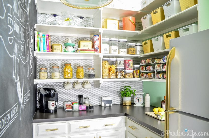
If you liked this space, you may be interested in some of my other rooms. The closet and the pantry both have an infusion of glam as well!


Cat Braun says
Wow! Stumbled onto your site via Pinterest & love this room. Even better was seeing the Tulsa stores listed as sources for some of your decore items! We just moved from SoCal to Stillwater and closed on our new (to us) home 3 days ago. So, perfect timing for house inspirations!!! Love the dark closet color too. (Our house is going to be three shades of gray throughout — a light almost-but-not-quite-greige grey will be used everywhere, except a medium gray in the master bedroom and a dark, inky nearly-black gray for the den and a few accent walls.) Look forward to seeing more & staying inspired. Thanks!!!
Melissa George says
Your triple gray color scheme is going to be gorgeous! I love a dark room. Welcome to Oklahoma! Hopefully you’ll get to see some gorgeous sunny days soon, it’s been so gloomy.
Dani says
Gorgeous makeover, your bedroom is lovely! That Hamilton artwork you guys made is fantastic!
Any tips on painting the furniture? I have the more recent version of that dresser and would love to do it but I’m intimidated by the task. How much sanding did you do and with what? How many coats did it take and did you seal it somehow?
Also in love with your lights, theyre so prettty, and that night shot is dream.
Melissa George says
Hi Dani, I did ZERO sanding! Instead, I used two coats of primer and two coats of the silver Metallic Accents paint. I applied both with a foam roller and then lightly brushed over it in one direction to get a uniform finish. I haven’t sealed it because we ran out of time and it wasn’t essential before the reveal deadline. I think that the front and sides will be fine unsealed, and to really protect the tops, we are going to have glass cut. Hope that helps!
Dani says
That’s amazing! Having glass cut really is the way to go with constant wear furniture like nightstands. Do you happen to know what primer you used? Thanks so much! I’m loving your site!
Melissa George says
Yeah, I used the brush on Zinsser 1-2-3. A spray primer would be even easier. We couldn’t get the big dresser outside, so just went with brush products I could use right in the bedroom.
Jenny Utting says
You did a fantastic job! So inspiring!
Janine says
Your room is gorgeous! Such a great mix of hard and soft. You mentioned your husband made the NY picture behind your bed. Would he be interested in creating another one to sell? My husband and I are both born in NYC and always looking for ways to bring it into our home in SC. Please let me know! Love the room!!!
Melissa George says
Thanks so much, Janine! While we’d LOVE to sell the art, we have to get a license from Lin-Manuel Miranda to sell it with the quote from Hamilton and I haven’t been able to figure out how to do that (and it may be totally cost-prohibitive). If you’re more interested in the map and open to different wording on it, email me (melissa@polishedhabitat.com) and we can talk about options and prices!
Lynette Mincks says
It’s amazing! Is that the Mincks Hotel in Tulsa? I’m related to them!!
Melissa George says
Good eye! It is in the street view photo. How fun that you are related to them. It’s a GORGEOUS building!
Kristen Johnson says
This room is awesome!!! What size rug is that under the bed?? I love it!
Melissa George says
Thank you, Kristen! It’s the 8 x 11 size and works perfectly under a queen bed. Here’s a referral link to the exact one I used: http://www.anrdoezrs.net/links/7633974/type/dlg/http://www.homedecorators.com/p/faux-sheepskin-area-rug/40/410/?aid=cj
Rebecca Ratzlaff says
I adore this room! It’s been a big inspiration in coming up with ideas for our new home that we are moving into. Love the navy and neutral color palette. What size artwork did you use for the Leigh Viner prints? Her work is so cool, but I don’t know what size to get to make a big impact in our living room. Thanks a bunch!
Melissa George says
Thank you, Rebecca! We did 30×40 prints and our ceilings are 13 ft tall on that wall.
BARBARA BOZEMAN says
Well, its about time someone did such a thorough and fantastic makeover and shared the details. I especially appreciate that you included an image from evening with the lights lowered.
What a wonderfully inspiring room.
Thank you!!!
Melissa George says
Wow! Thank you so much Barbara! I’m glad you enjoyed seeing the space!
Kendall Burns says
No joke, I have had this post open on my computer for a month. I study it every day! It is absolutely remarkable! My room looks very similar to your before pics currently. You have given me hope that I can transform my room too! Thank you so much for sharing! Do you have a tutorial or a link to a good furniture painting tutorial. Also, how much paint did you need for all 3 items?? Thank you so much!
Melissa George says
Thank you so much, Kendall! I think I used about 1 1/2 of the 32 oz size for all three pieces. Before painting, I used the Zinsser 1-2-3 primer, then let it dry. For the silver, I used a foam roller to apply the paint, then gently brushed over the wet paint in a consistent direction (only up and down on the sides) to give a somewhat consistent texture. I think I did one coat of primer and two coats of paint, letting everything dry several hours between coats. I’ve noticed the Lowe’s carries the silver paint now and it’s WAY cheaper than the current Amazon price. You can order online or check stock in your local stores here: https://www.lowes.com/pd/Rust-Oleum-American-Accents-Sterling-Silver-Gloss-Metallic-Latex-Interior-Paint-Actual-Net-Contents-32-fl-oz/1000043707 Sorry I don’t have more details, I was seriously winging it and hoping for the best so I didn’t do a full detailed tutorial along the way. I do remember that there was a point I thought it was going to be a huge failure, so they definitely hit the point of looking worse before they look better.
Kristy says
I’ve been thinking about the NYC map/Hamilton quote for months. The room is stunning, but this is my favorite part. I took YOLO to a whole new level when I flew to NY from TX 3 times last summer to see the show. Did I spend more than most people would? Yes. Was it worth it? Absolutely. (Flights were free thanks to Southwest points.) Anyway, I love the colors in the map. Can you tell me how to find this specific one?
Thank you!
Melissa George says
Oh my gosh, that’s amazing! We’ve only seen the show once, but we lucked into being in NYC opening month, so it was the full original cast. I’m dying to see it again since the soundtrack still lives on repeat here. Here’s the map file we started with: https://commons.wikimedia.org/wiki/File:1867_Mitchell_Map_of_New_York_City,_New_York_-_Geographicus_-_NewYorkCity-mitchell-1870.jpg
Kristy says
Thank you so much! This is great! I was really excited to see the original cast, too. My last trip was actually for the matinee on Lin, Leslie, & Pippa’s last day. #HamilfansUnite