It might be a stretch to call this post a tutorial because I’m starting with marquee letters you buy. I wasn’t even going to write about them, because it’s so easy! BUT, once I saw how amazing they were, I couldn’t keep them to myself!
Remember my word of the year post? I also wrote a corresponding one over at the SNAP Creativity blog. As a thank you, SNAP’s awesome founder Tauni arranged for me to get the new Heidi Swapp marquee letters spelling out my word. So generous!
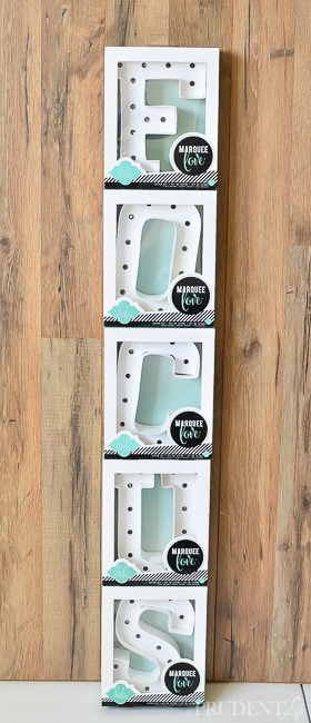
Here is what they looked like when I received them. If you love them as much as I do, you can find them at Michael’s!
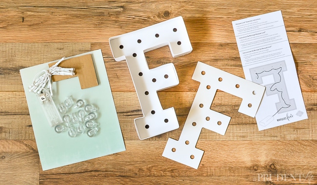
When I opened up the box, I found the letters, lights, bulbs, and a handy template in case you want to cut out something fabulous to decorate your letter.
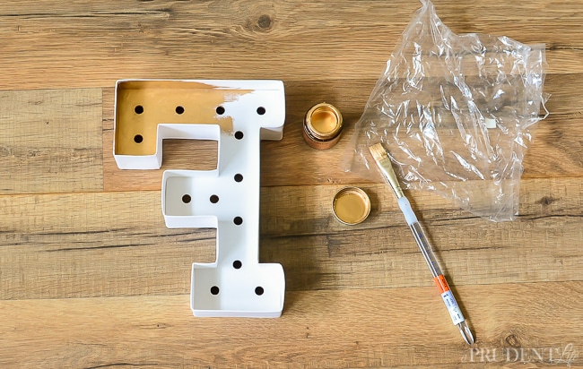
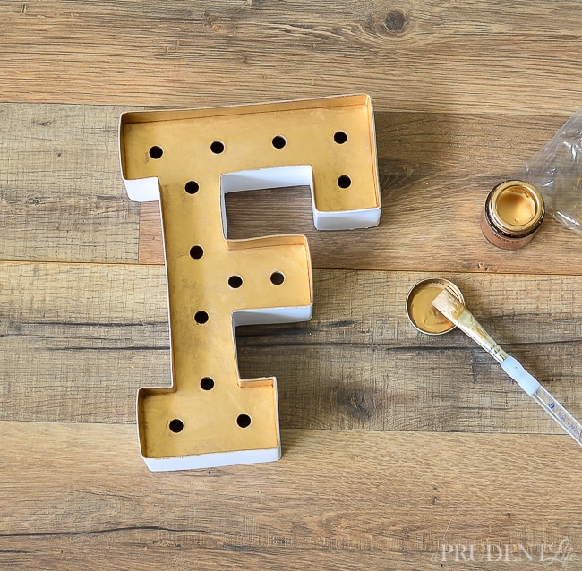
I’m sure no one will be shocked to read that I decided to go gold! I wasn’t sure how the oily Liquid Leaf would do on the letters because they are a paper-ish material. I tested it out on the back and it passed with flying colors!
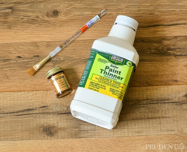
As a little side tip, I found the BEST stuff to clean up brushes. It works brilliantly on Liquid Leaf and isn’t flammable or stinky. It’s called Safer Paint Thinner and I found it at Lowes when I was looking for the chemical recommended on the Liquid Leaf bottle. The chemical they recommend only came in a gallon container AND requires a license to buy in several states. I thought I’d try this out before going straight for the hazardous stuff and it worked better than I had hoped.
My original plan was to paint the inside of all the letters gold, and then frame them by using black around the outside. Silly me to think that once I started painting something gold I would be able to stop myself. The inside was so shiny and metallic that I decided the whole thing should be gold. Shocker, right?
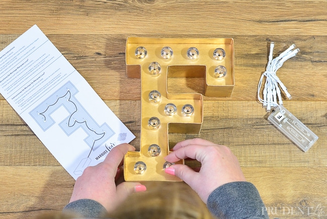
Once my paint had dried, it was time to insert the bulbs into the front.
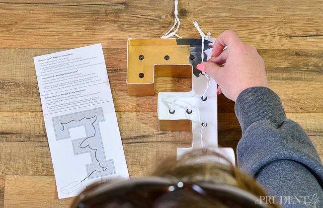
The last step was adding the lights according to the diagram that comes with each letter. You can see where I was testing the black paint with the gold. It would have been fun too, but going all gold left the letters looking like they were made from metal.
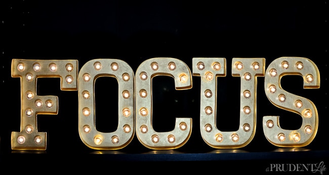
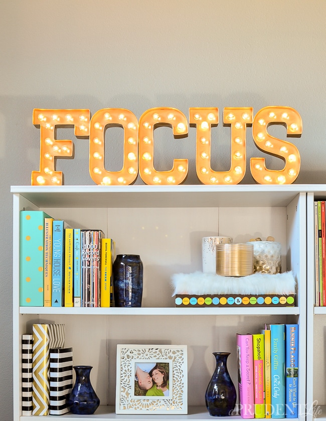
Have you ever seen a more glamorous word of the year???
I can’t wait to finish staging my bookcases now that I have this great new art for the top! The bookcases have been a disaster since I took the Christmas decor off of them. I did some temporary staging of a few shelves so I could show you the marquee in action.
As you are deciding where to put your marquee, remember that you’ll need to be able to easily access the back to flip the lights on and off. Make sure you also stock up on AAA batteries. Each light takes two of them and you don’t want to do what I did. I got the lights all finished, then realized I didn’t have any batteries to test them out. Whoops!
What do you think? Do you like the all gold look or should I have done the sides in black?


Jaclyn Lorimer says
I love them all gold! Very glam and you’re right, it gives it that metal feel. So cute!
Melissa George says
Thank you Jaclyn!
Colleen says
The all gold gives a very glitzy look and is kind of your obsession so….
On the other hand, painting the outside of the letters in black would bring them forward and give good outline. You can always add the black if you decide to at a later time. It’s only paint after all and sometimes screams ‘Change me’!
Melissa George says
So true!! That is why paint is so wonderful!
Robin S. says
i actually love your idea!! Looks great on top of your bookshelf. I may have to go give Michaels a visit! Thanks for the idea.
Sophia says
That is fantastic! i love the look… And I just might have to try it!
Sophia
someplaceinthemidst.blogspot.com