Hello fabulous Polished Habitat readers! I hope you had a fantastic Thanksgiving – it’s truly my favorite holiday of the year. Yummy food, warm bellies, and enjoying a day with family and friends celebrating all that we are thankful for without the pressure of gifts. Doesn’t get any better than that!
It seems like the blog world has been going nut-so for Christmas this year and seemingly way earlier than usual!!
My Instagram feed is filled with sparkling Christmas trees, garlands, and gift-giving guides. Don’t get me wrong I LOVE Christmas but I haven’t even taken my tree out of the box yet!
In preparation for operation #decoratefortheholidays I like to start with a clean slate. I want the house clean and picked up and everything in its’ place – I’m sure I’m not the only one!
As I prepare the house I’ve picked up on something that may be helpful to you – creating a cozy color palette for your home.
When I talk to friends and family often times they are asking me for the same advice – what color should I paint the walls? What accent colors should I use?
I almost always offer the same advice – keep it neutral on the walls and pick a fabric or piece of art that incorporates colors that speak to you and use that inspiration piece to create the color palette for your space!
Let me show how I did this in my own home!
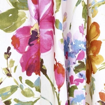
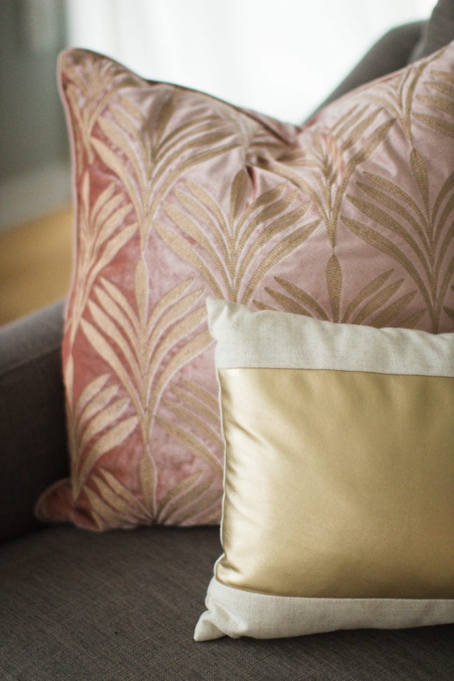
One of the first purchases I made when we bought our home a few years ago was this dreamy fabric from Tonic Living.
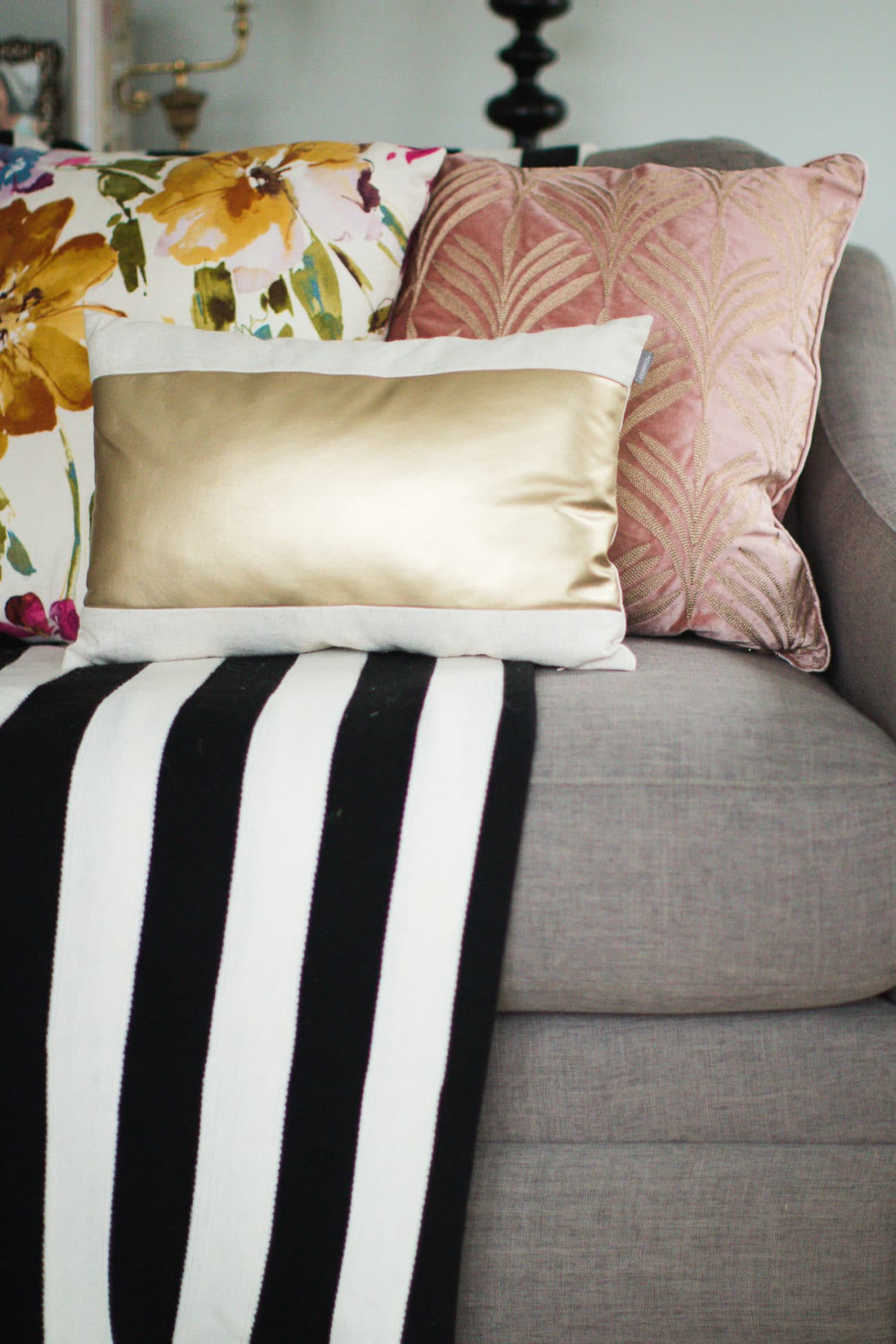
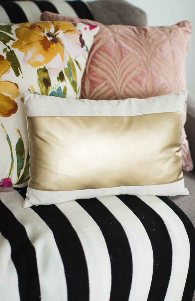
My superstar Mom was able to make 4 pillows from it and this color palette really set the stage for my living room and subsequently my whole lower level since I have a pretty open floor plan.
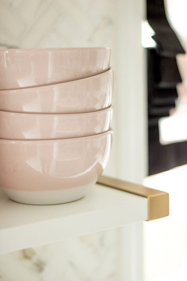
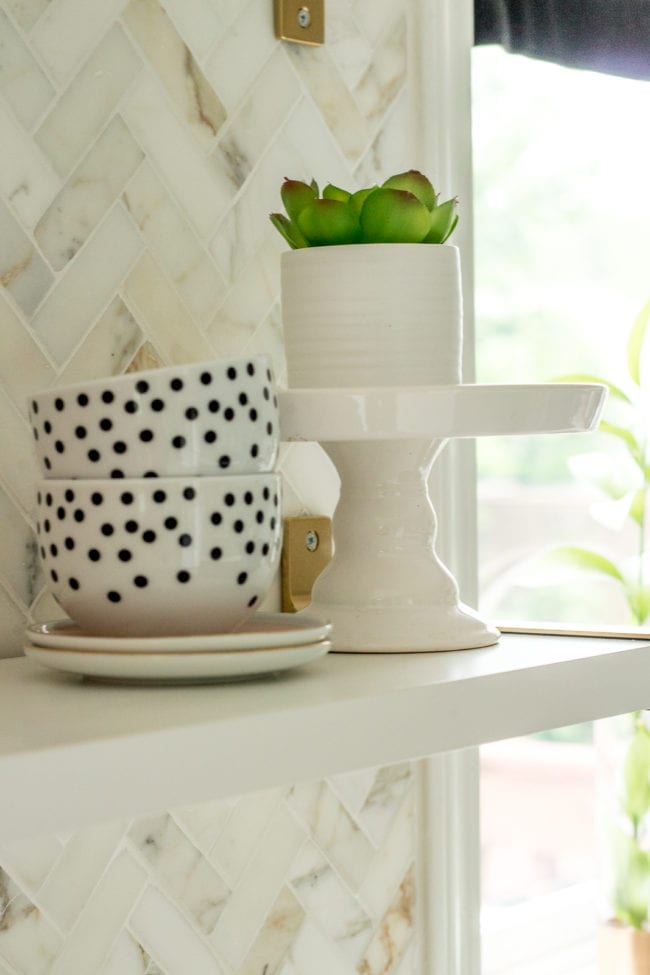
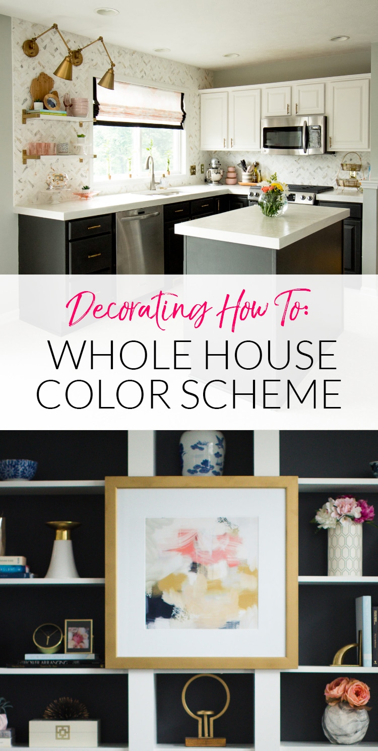
This color palette continues into our newly renovated kitchen.
By keeping the same color on the wall (Sherwin Williams Silvermist) and incorporating the colors from our palette, the connected rooms look cohesive.
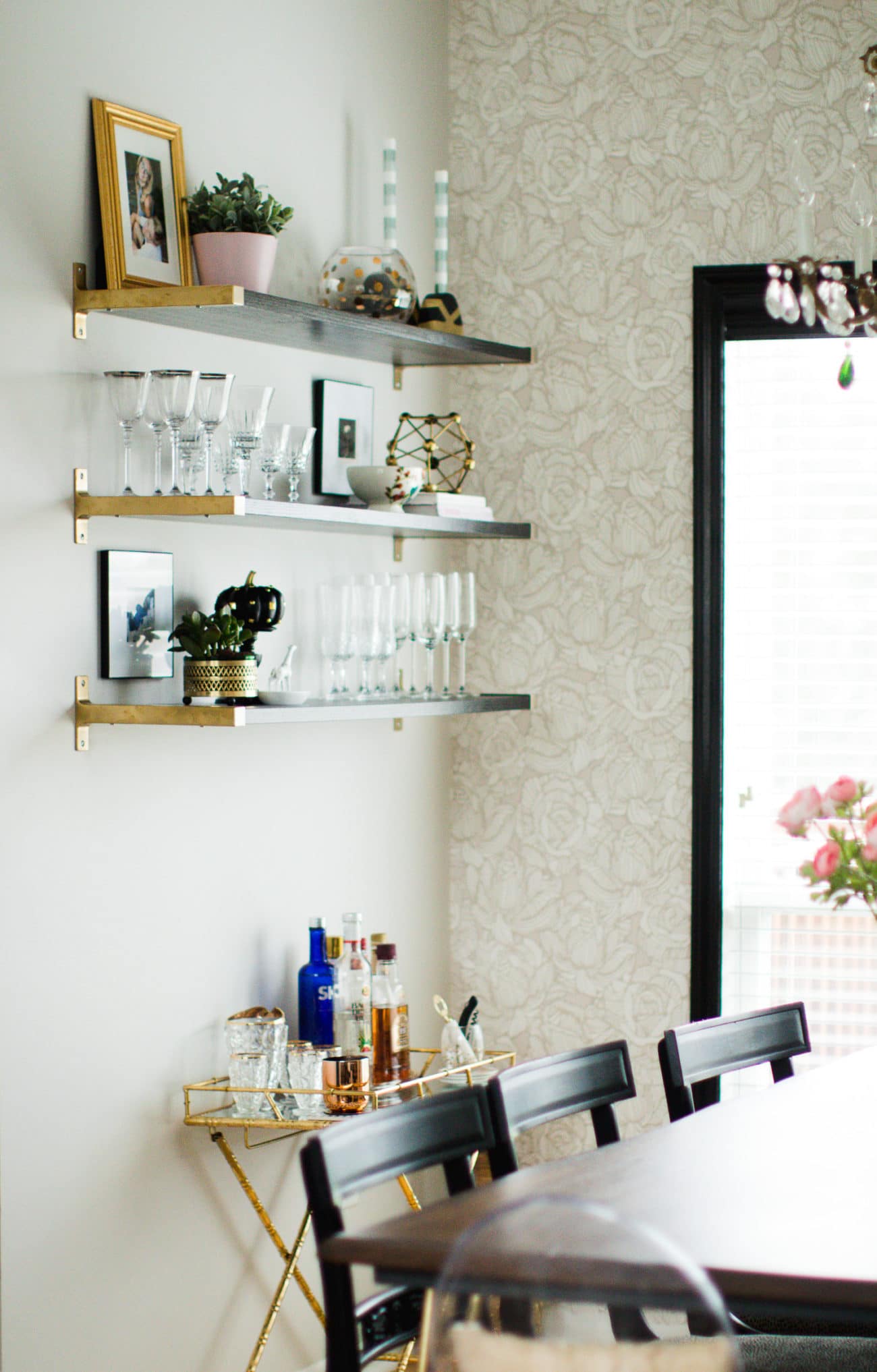
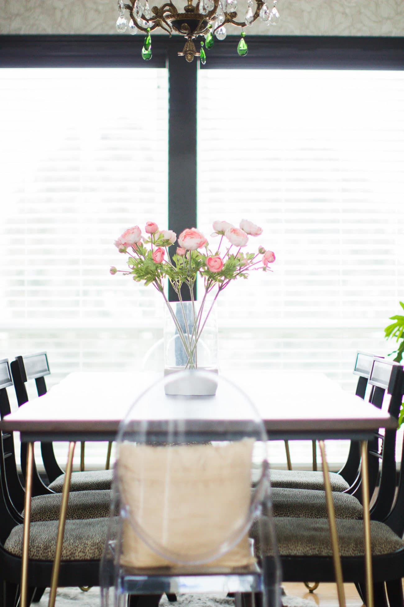
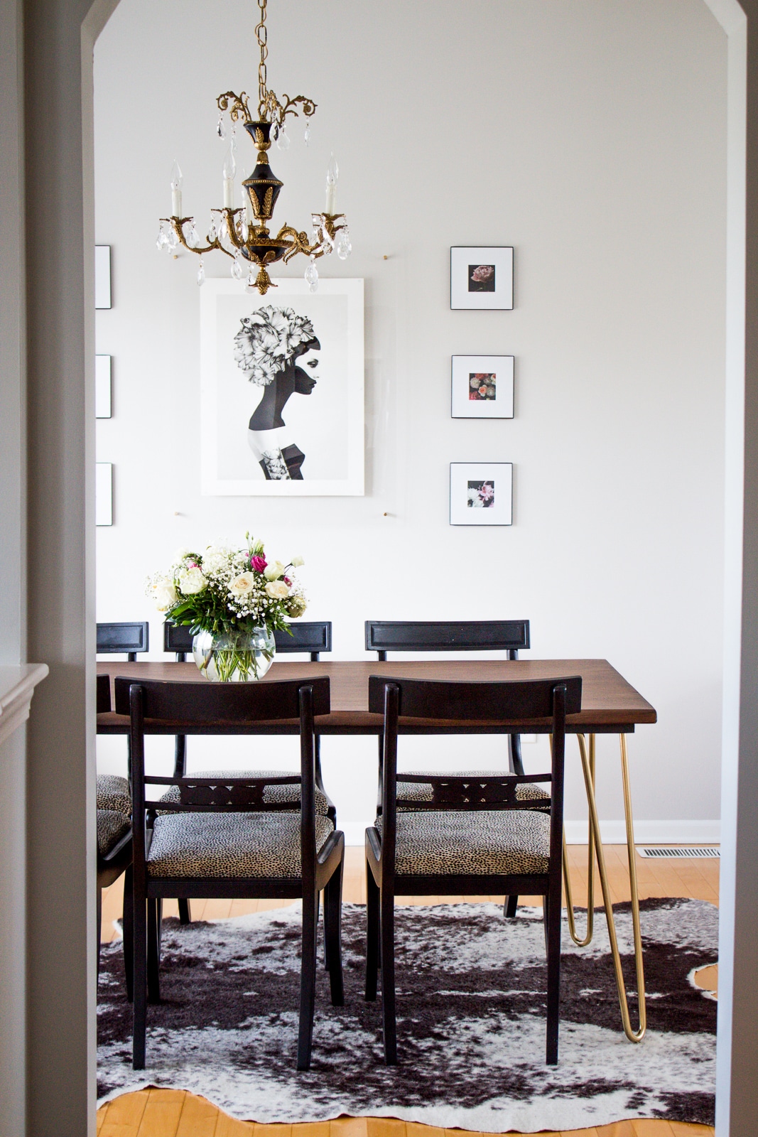
Making our way through the kitchen to the dining room the pieces get moodier, but I maintain the same pinks, golds, and greys.
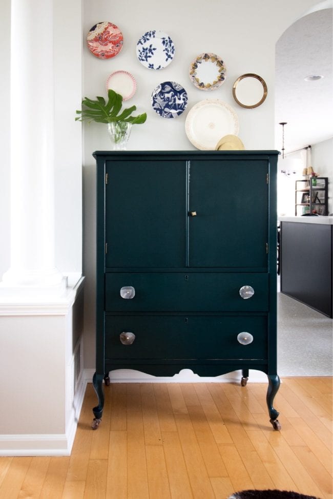
However, I also added in forest green through a painted hutch. That green is also in the inspiration fabric, so it all works together!
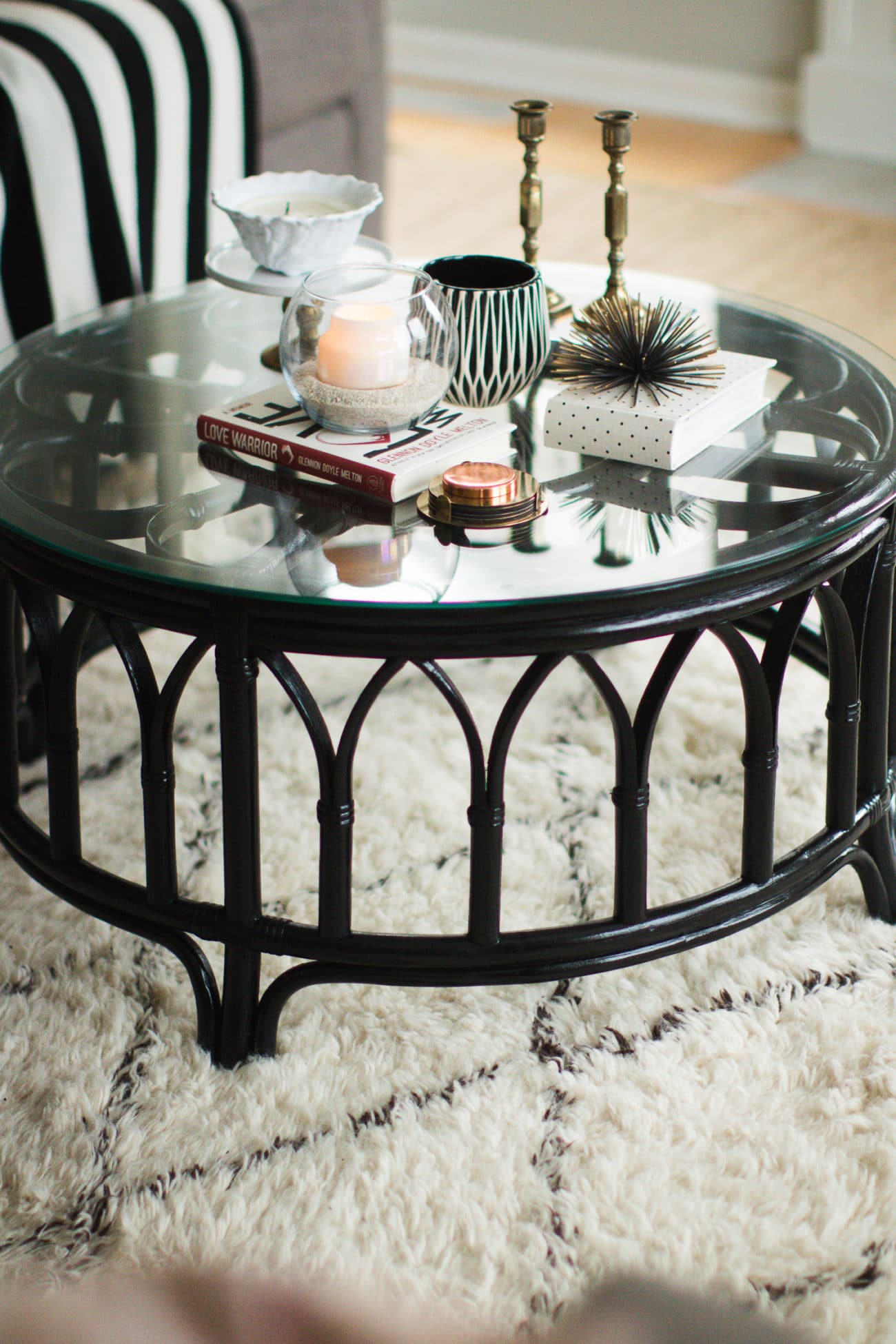
Notice how I also have a pretty consistent use of black. Even though this color isn’t in my inspiration fabric, I consider this color a neutral and use it much like one would use white throughout my home. I think black is elegant and sophisticated and simply fantastic. It’s one of my favorite neutrals to use!
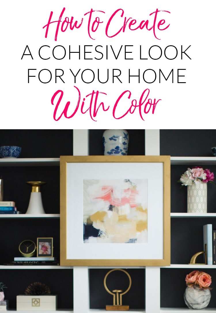
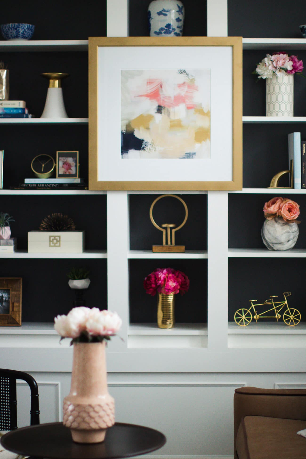
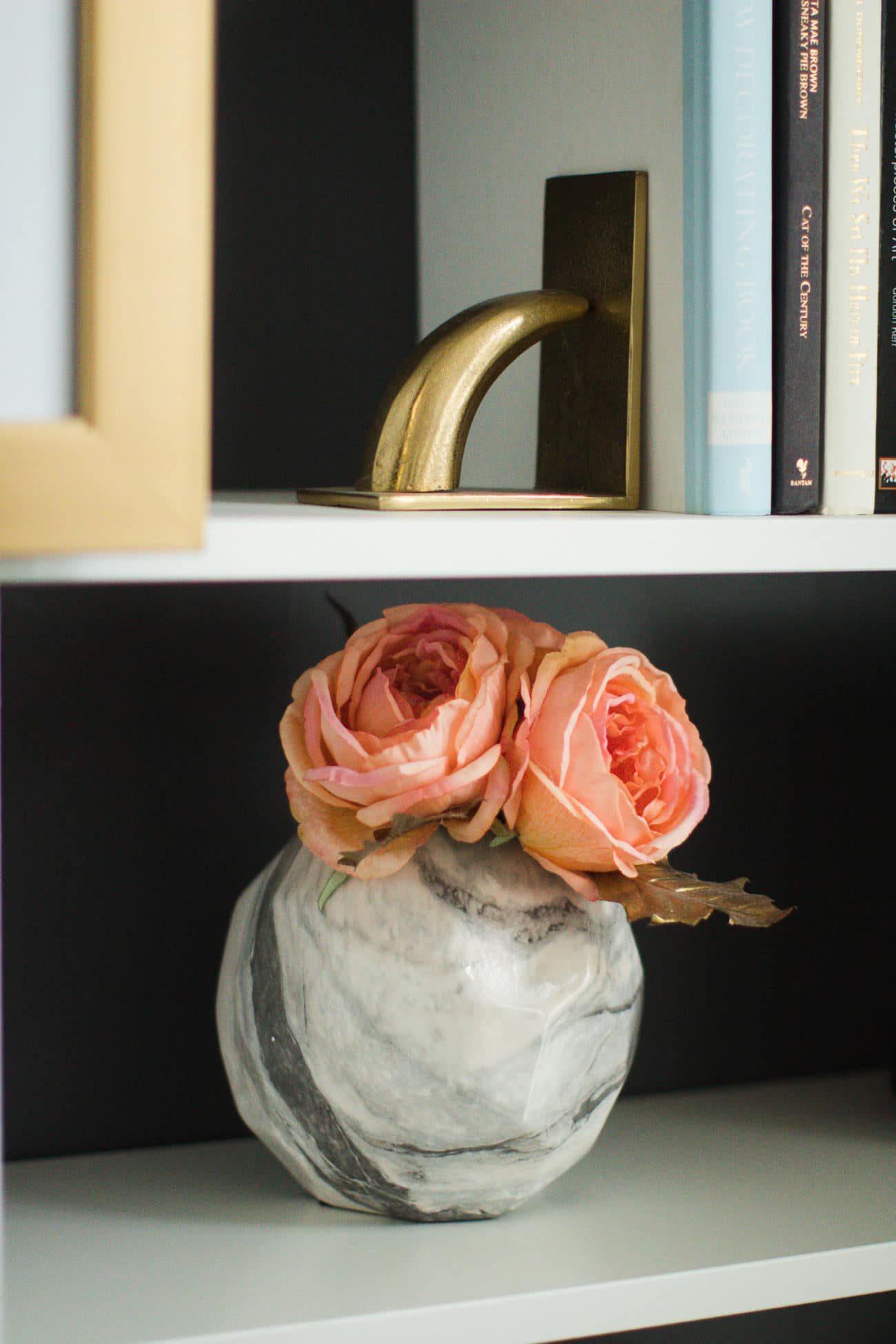
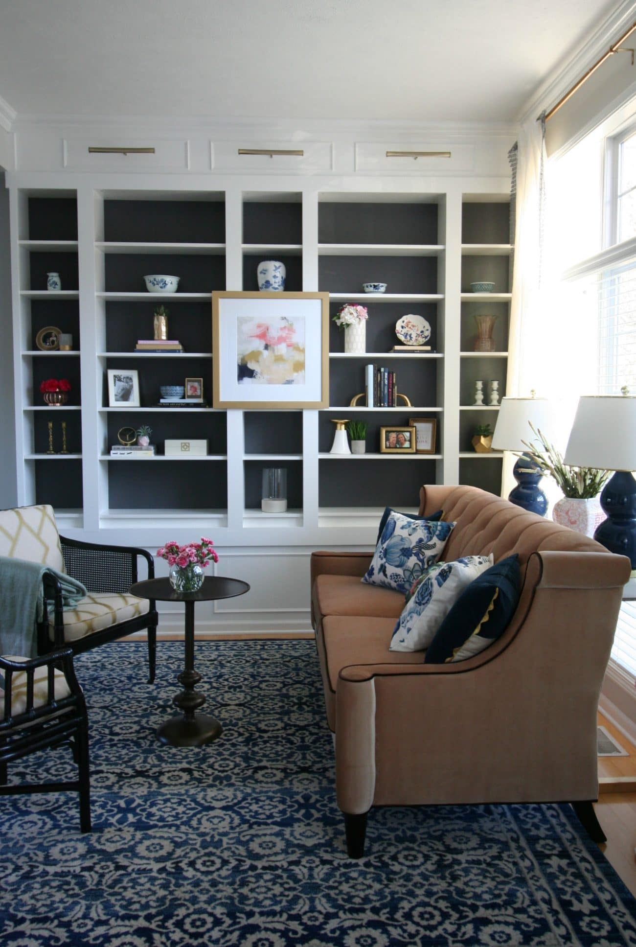
Next on our color palette tour is our formal living room that is attached to the dining room. In this case, I chose a painting from Parima Studio that truly embodied my home’s palette. I pulled some navy blue from this artwork with accent pieces and that fantastic rug that pulls it all together.
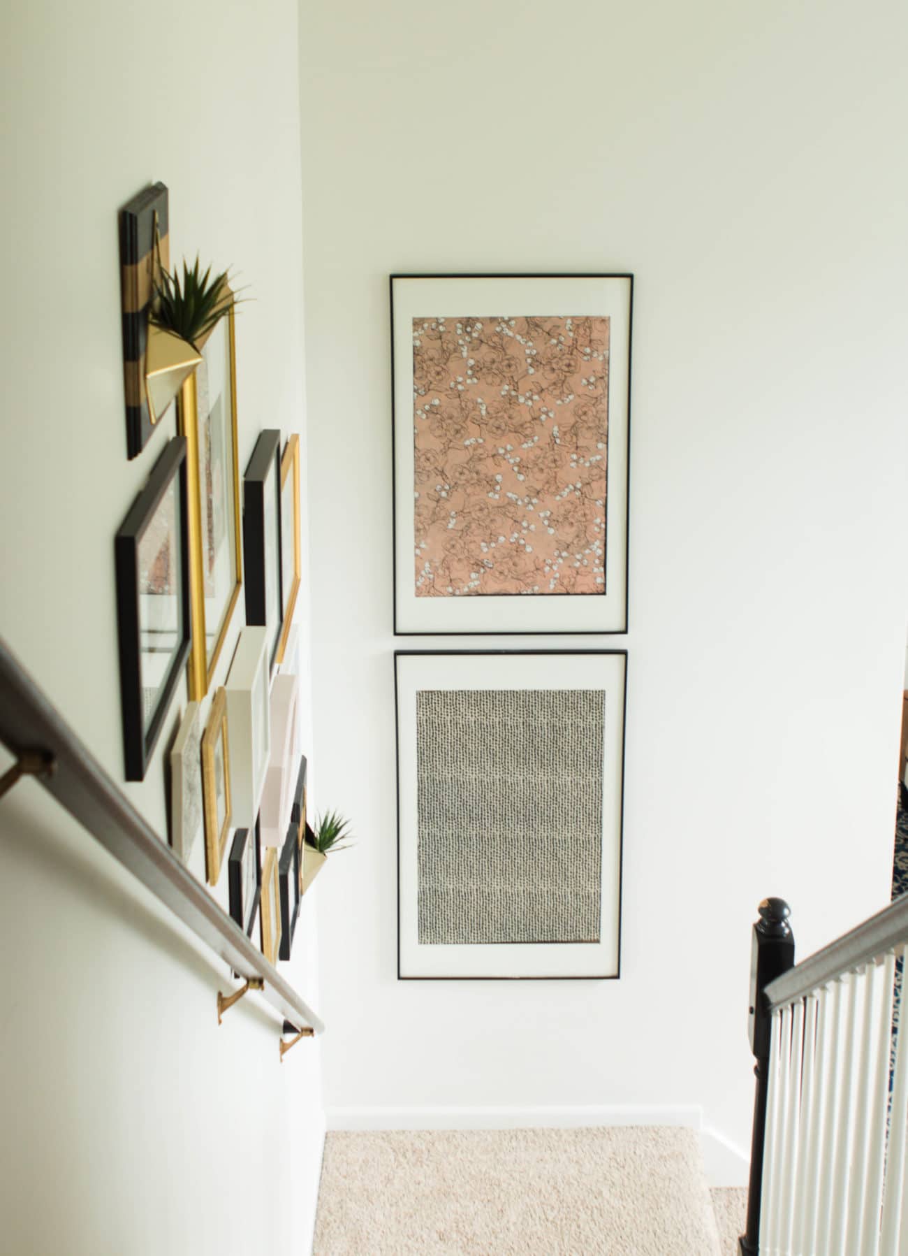
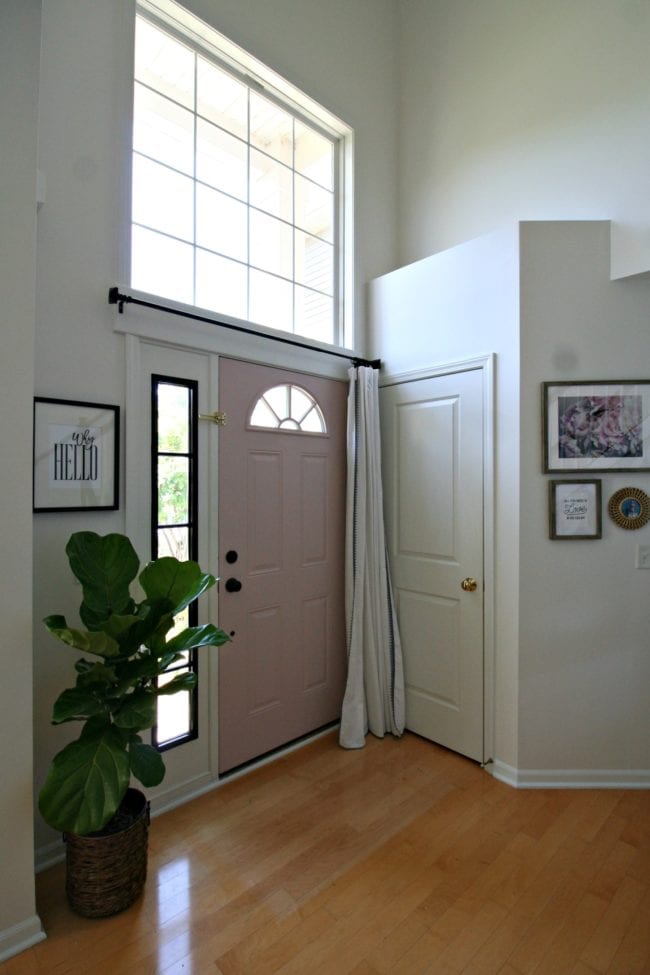
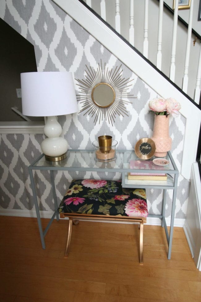
This palette continues into our foyer and entrance into our home – there’s no mistaking what colors I love!
So YES the back of my door is painted pink and YES I have a floral thing going on, haha.
Some may say my home is very feminine – and it is – but it’s still sophisticated and balanced. I love mixing patterns, but the thing that keeps the whole space cohesive and not overwhelming is the color palette.
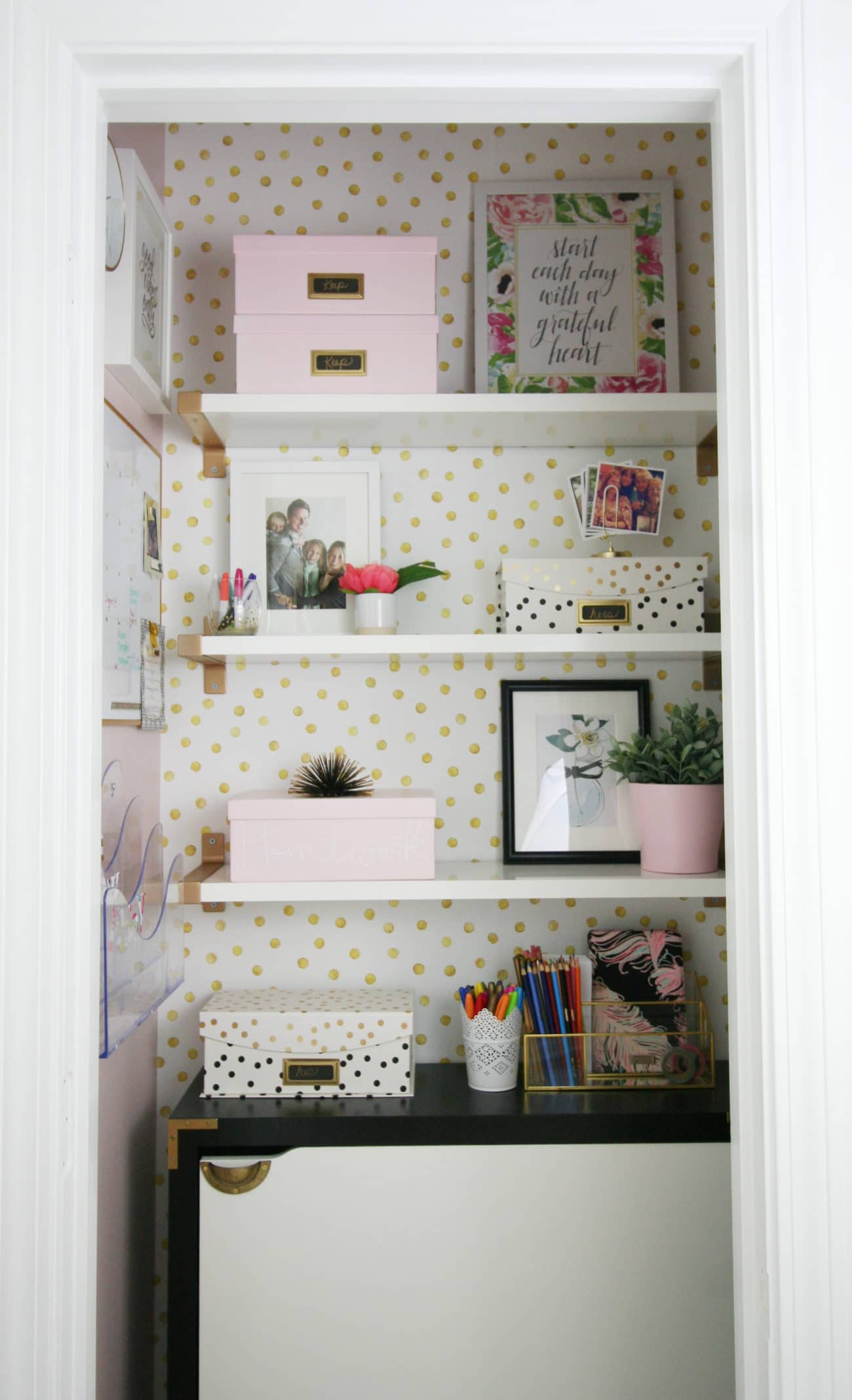
Heck – even our mudroom closet wasn’t safe from my favorite colors!
Now that I have the whole house color palette strategy, shopping is easier. While I love adding different accents, I can think about my inspiration pieces before every purchase. If the item would work with the fabric, there is a great chance it will work in my home!
How do you incorporate a color palette into your home?!





Cindy Craw says
Thank you so much, Colette! I have been dealing with the dilemma of my color choices/wants. The kitchen and diningroom are a single area that lead directly into the living room. When you enter, the first wall you see is what I plan to have as the accent wall of the livingroom. It’s all the way across the rooms–on the far side of the space. I wanted the kitchen/diningroom to be in burgundy, mustard, and yellow. (Sounds horrid, I know, but it’s based on a photo of the interior of the huge lobby of a hotel.) I wanted the livingroom to be a combination of dark blues and/or greens. There’s a corner in the diningroom where I’d have to paint one color and change it mid-wall. I have a wonderful collection of black, green, and clear accents worked into the livingroom. My color schemes weren’t going to work together at all. It’d be horribly jarring. I’ve been delaying painting my spaces *any* color because there was absolutely no flow. I’ve gone back and forth with my choices in the kitchen and have finally settled on either a cobalt blue or emerald green on the cabinets. (Whew!) I don’t want the wall color to remain the boring off-white that it is. If I can find a light grey that will work with either the blue or the green, I’m set. It’s all because of you and your insightful, inspirational article that I now have a solution in sight! I’ll finally be able to create the environment I truly want to live in.
Cindy
Colette Wright says
thanks so much Cindy!! I think the emerald green cabinets will be beautiful!!!
Cindy Craw says
Colette, I can’t stress enough how your article made such a wonderful difference in my mindset. I can move forward!
Cindy
Melissa George says
This makes me so happy to hear, Cindy! And I’m sure it warms Colette’s heart even more than mine. Thanks so much for taking the time to let us know how helpful the post was to you. We both appreciate that more than words can say! -Melissa