If you missed Day 1 of my Parade of Homes recap, make sure you check it out. The house was over the top and still liveable – quite an accomplishment! I visited the house I’m about to show you right after the house from Monday, so I was prepared to be totally let down. How could anything compete with that bold design?
Then I entered the next home and it confirmed that this was a standout year for Tulsa new construction. Today’s house was built by Brian D. Wiggs Homes with interior design by Grace Markes. They knocked it out of the park! Sadly this house was more crowded when I was there, so blame the other house-loving citizens of Tulsa for the imperfect photography 🙂
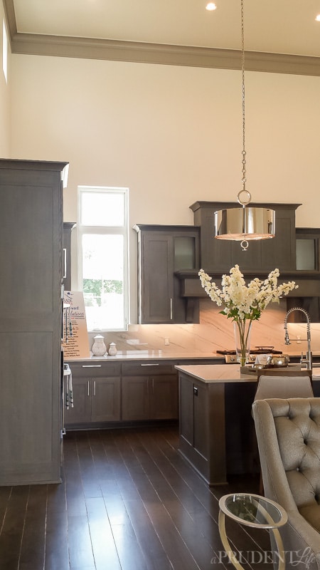
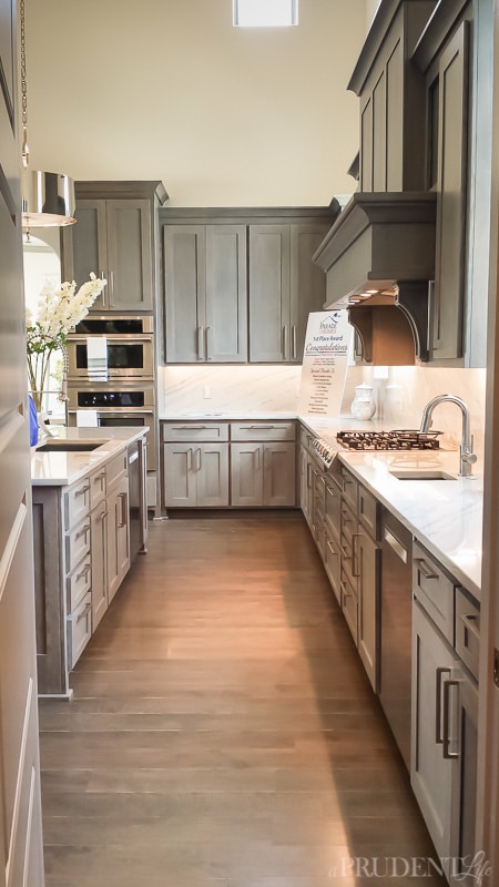
The gray, silver, and marble combo in the kitchen was pretty perfect. The metal drum pendants over the island make my heart go pitter patter!
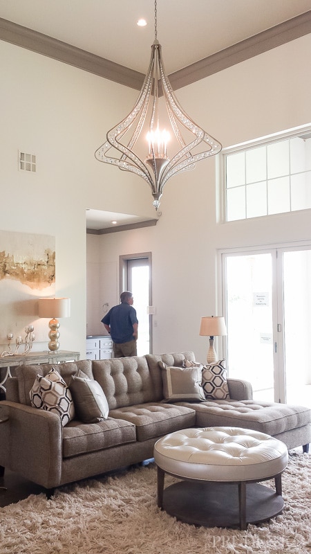
The ceiling height was incredible and left plenty of room for bold lighting. I love how the fixture fills up some of the vertical space and helps the grand room feel cozier.
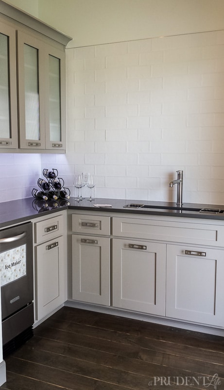
See where that stranger is standing admiring the pond and pool out back? The space is a mini-kitchen, ideally located right by the door to the pool. You know I love a full wall of tile! And that flooring was pretty great too.
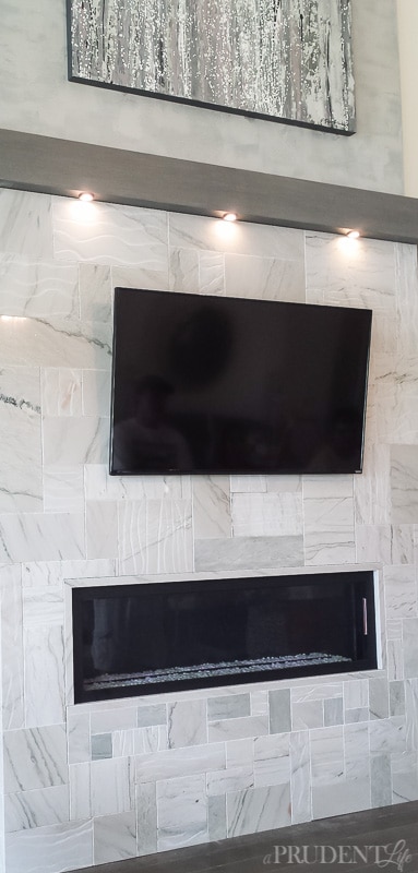
On the other side of the living room, there is an awe-inspiring modern marble fireplace. As you can see marble was definitely a trend this year on the parade, which was great news for my marble-loving self.
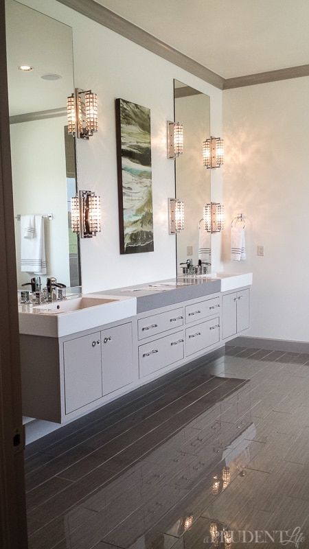
The master bathroom was super sleek with high gloss tile and a floating vanity. Those sconces are amazing!
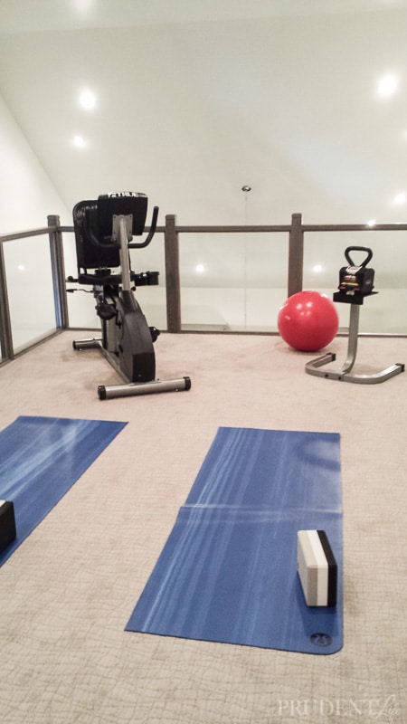
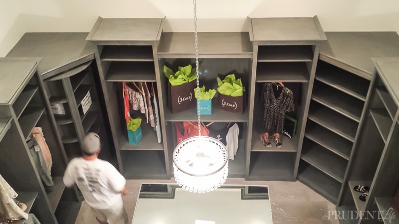
From the bathroom, you wrap into the master closet. Imagine my shock when I saw a full staircase in the closet! There was a lofted exercise area for your morning workout. Brilliant. Don’t miss the gorgeous patterned carpet. It was in all the upstairs bedrooms as well and looked fabulous. I wanted to cut it out and take it home for the living room, but it probably wouldn’t have fit in my purse…or in the car.
Here’s the view from the exercise loft. Check out the left side. Nope, not the guy that wouldn’t leave, the huge spinning lazy susan for shoes. Genius use of a corner!
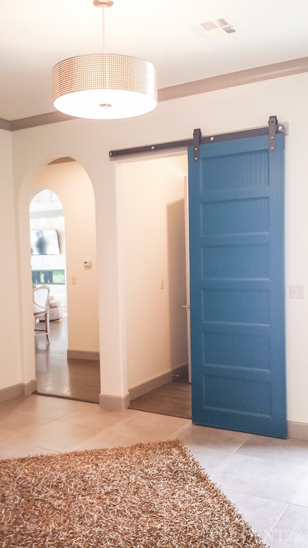
From the master closet, you could also get out to this back entryway which was a bit of a launch pad for the house. It took you upstairs, to the kitchen, the living room, the master, etc. The blue barn door was a great touch! And we have yet another gorgeous light fixture.
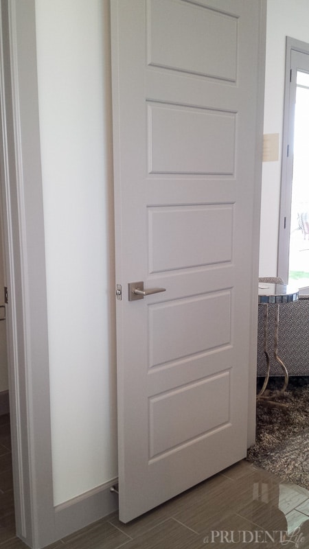
The last little perfect detail from this house was the sleek door handles and great door design. It’s all these little details that pulled the house together into the perfect livable modern home.
There are a few other pictures I have from random houses that I liked little parts of, so I thought I’d throw in two today and the rest on Friday.
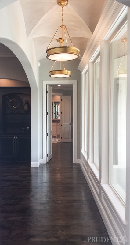
Remember when I said there was SO much good lighting this year. Check out these beauties. I’m obsessed with them. Completely obsessed.
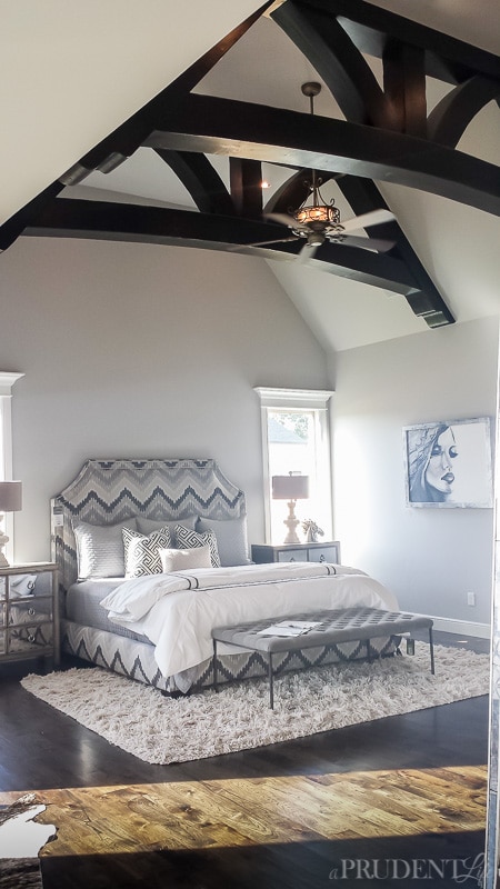
While I wasn’t sold on the design of the ceiling fan in the bedroom below, the space had a ton going for it. Those beams are so chunky and good! The mirrored side tables, bench and artwork were also inspire-worthy.
Okay, that wraps up day 2! Don’t miss the downtown quad level AND our dream house from the day 3 post.



Ann c says
The very last photo posted on Day 2: it looks like there is two different woods on the floor, almost like a path. Can you remember anything about it?
Melissa George says
The bedroom pic right? The floor was all the same, it was just crazy sunny outside and the light was streaming across the floor. The lighter part was what the whole floor looked like. It was really pretty wood.
Debbie says
I love the hard wood floors and the big windows I also like earth tones with some color accents