Hi everyone! Excited to be back sharing another fully renovated space in our home. If you missed the kitchen and front entry before and after check it out here!
The master bathroom was at the top of the list in the renovation budget and timeline when my husband and I purchased our house. However, as our move in day came closer, it became unrealistic to try and get it finished. This was disheartening because the whole plan was to purchase the house and renovate before moving in.
So what do you do when your general contractor isn’t able to take on the project? Hire your husband’s best friend! He agreed to do it, was so helpful in designing the room, and worked tirelessly to get it done for us. I am grateful to have people in my life who are experts at this kind of thing since my husband and I are definitely not skilled DIYers.
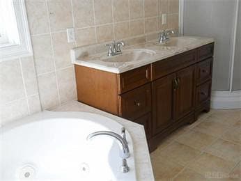
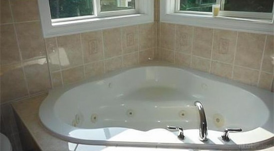
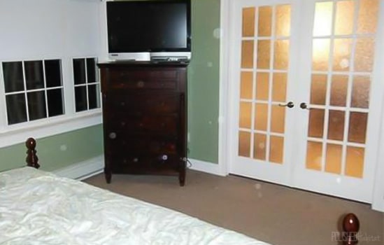
The master bathroom is a great size and the large windows allow for a lot of natural light to come in. As you can see, just like the kitchen and living space, it was move-in ready before, just not our style.
We decided to turn it into the space we would have created ourselves if we had built a new home.
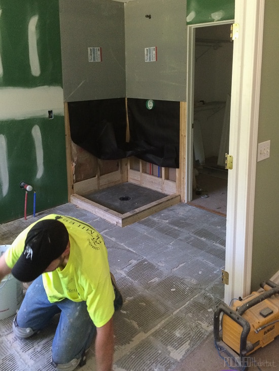
The entire room was gutted. Tile was removed from the walls and surrounding the tub.
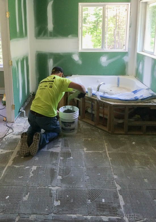
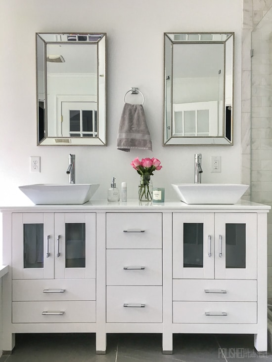
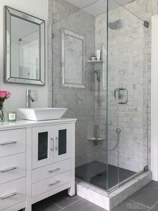
At one point we discussed combining the tub and shower, but decided it was way too much money and hassle. Instead, we tightly squeezed in a vanity with two sinks next to the stand-up shower. The glass shower door makes the shower look bigger than it is and really glams up the room.
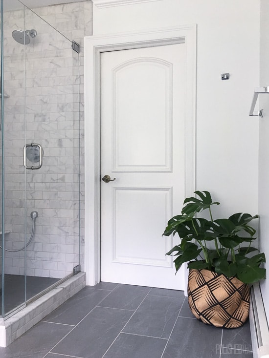
Keeping with the theme, the shower fixtures are a sleek and modern chrome. The walls and trim were just painted white because I knew eventually I wanted to wallpaper the room.
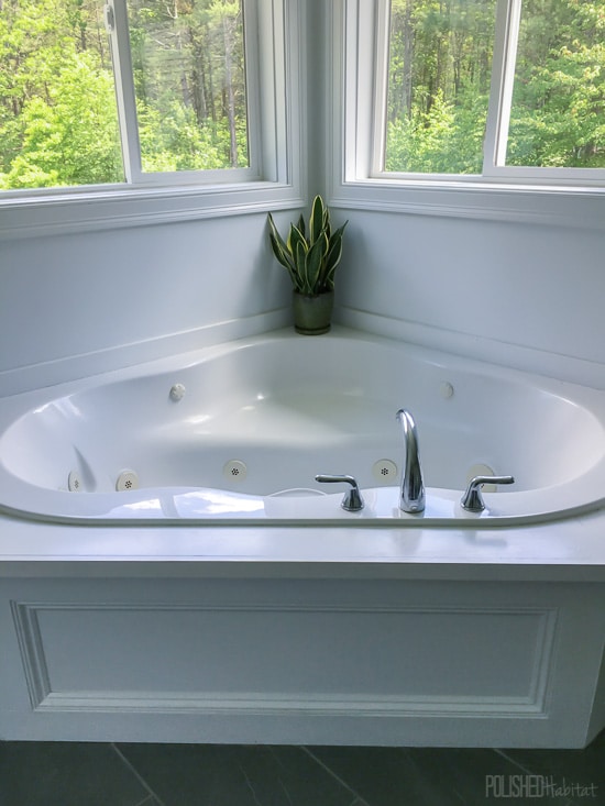
Here’s what they looked before with the film.
There is not a linen closet in the bathroom and the only storage space are the small cabinets and drawers in the vanity.
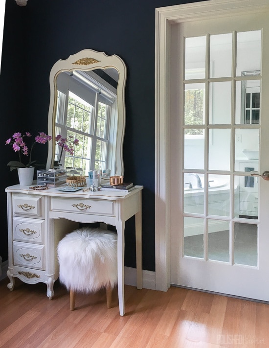
For extra counter space, I took an old mirror and desk from my parent’s basement that used to be in my room growing up. I painted it and turned it into a vanity right outside the bathroom. The paint job is terrible, but it was a cheap and chic fix! I got the idea from my sister who had taken the dresser from the set last year and turned it into a changing table for my niece. Instead of using the chair that belonged with the desk I added the stool.
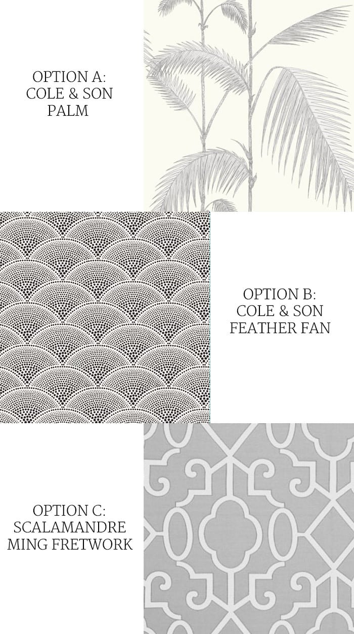
Option A / Option B / Option C
(Links above are affiliate links)


Victoria says
I prefer a or b as papers, but b might be too busy. I think a would be great. I don’t like c as much personally as a paper, but I think it would actually look good in the bathroom.
Melissa George says
I totally know what you mean about the 3rd one, Victoria. I wouldn’t have gravitated to myself, but I could totally see it looking great in her bathroom!
Tamara Geffin says
Great points! I ordered the palm!
Deb says
They are all good choices, but I like the fluidity of the 1st one.
Tamara Geffin says
I’m going with the 1st one. Thank you!
Sarah Vogel says
Definitely, 1000%, Option A. Keep it light and airy. The palms achieve this. Great job so far, look forward to seeing the finished room!!!
Tamara Geffin says
Thank you! I chose the palm print!
Sarah Vogel says
Yay!! Pictures soon??
Brittany says
I would choose C. The pattern is chic and sophisticated. I think the geometric design would play well off of the rectangular shapes in the bathroom. Everything is so neutral it would be bold enough to punch it up, but subtle enough not to overwhelm the space.
Melissa George says
Great point about the geometric shapes mimicking the rest of the bathroom! I can’t wait to see what she chooses!
Tamara Geffin says
Thanks for the input! I went with the palm, but would love to do a geometric pattern somewhere else in the house!
Dee says
What a dilemma! I like option A and C. I like breeziness of A but C’s geometric design would be more of a contrast against the tile. So, I would choose C. I cannot wait to see what she chooses
Tamara Geffin says
I decided to go with A. Thanks so much for the input!
Pamela says
Option C definitely!!
Joy Lynn Shanor says
I like option A ok but I think I would go for option C.
Tamara Geffin says
I went back and forth between these two as well, but I ended up going with A!!
Laura says
I love all of them but I think option C would look best with the other decor and surrounding area.
Tamara Geffin says
C is gorgeous. I love it in the other colors as well, but I’m going with the palm!!
carol clark says
its so pretty i love it