Last week, I was in a total creative slump. I tried brainstorming, I tried NOT thinking about the blog, and then it started raining again which really didn’t help. BUT, Friday the sun was back full force. Perfect weather for touring houses in the Tulsa Parade of Homes. I might be biased, but I think we have one of the best Parade of Home weeks. This year, there were 151 homes on the tour ranging from $150,000 to $1.6 Million. Something for everyone!
I was hoping to find some great inspiration in a few homes, but worried that there would be French Country overload as that style seems to dominate new home construction. I was THRILLED to find that several builders and designers stepped out of that box and brought fresh ideas. Like jaw-dropping, unbelievable, over the top inspiring ideas. I was absolutely giddy going through some of them. GIDDY, like I felt like twirling through them Sound of Music style. Like, I could barely breathe they were so good.
It was darn tricky to capture the goodness with a cell phone since there were other people roaming the houses. I thought it would be frowned upon if I tried to kick all the other visitors out, so I did my best to work in stealth mode so I could share the awesomeness with you. It’ll take two to three posts this week to get through all the pretty pictures. Get ready for a week of gorgeous inspiration!
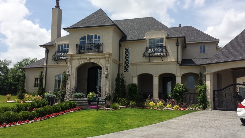
Today’s post is all from one home. It was jaw-dropping around every corner. If I had a spare $1.2 million, I probably would have gone off the deep end and impulse purchased this one the moment I stepped in the front door.
The outside was pretty, but had me concerned the inside would be way too French Country inspired for my taste.
BUT, Key General Contractors and Caitlin from Crown Chic Designs went BOLD on the inside and managed to create a new construction home that feels like it was built in the 20’s but decorated today.
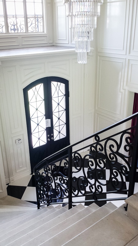
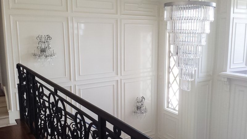
How’s this for an entryway????
Miles of molding, exquisite lighting, and that bold floor make this my favorite entryway of all time.
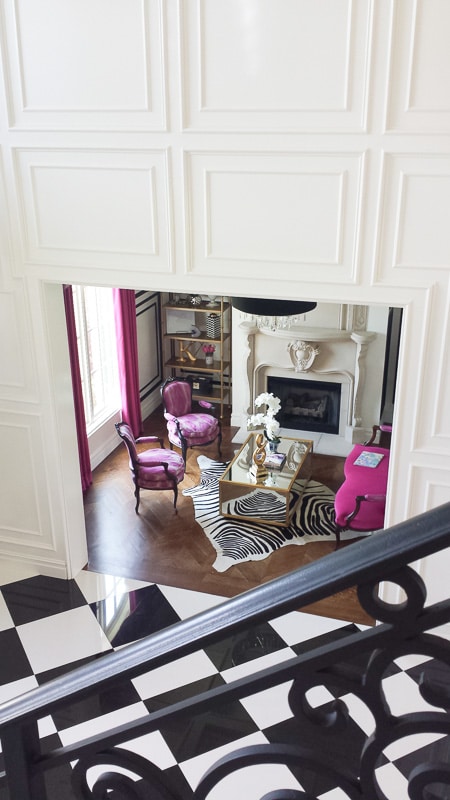
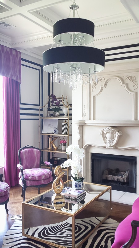
Right off the entry, there is a parlor that is a welcome contrast to the extremely masculine offices that typically show up at the front of new construction.
That black molding is so good. And the fireplace. And the ceiling. And every single other detail.
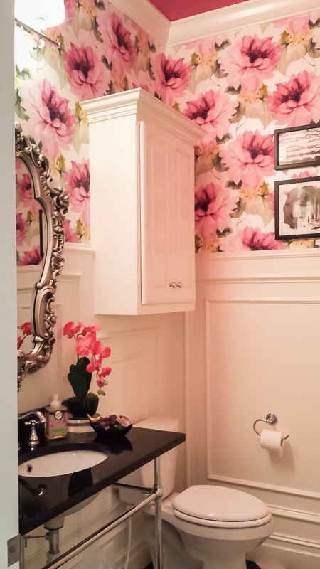
Down the first hallway, I found this amazing powder room. Classic fixtures and molding are balanced with a modern floral wallpaper and a pink ceiling. Yep, a perfect pink ceiling.
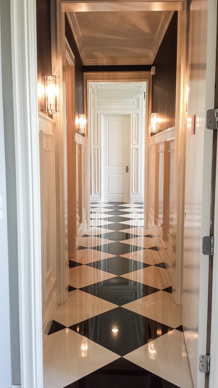
This is the hallway between a secret door to the laundry room and the entry. Even the hallways are gorgeous.
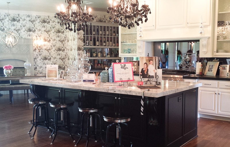
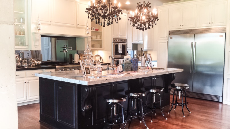
The kitchen was the hardest to photograph because people kept gathering here. Get out of my pictures, people!!!
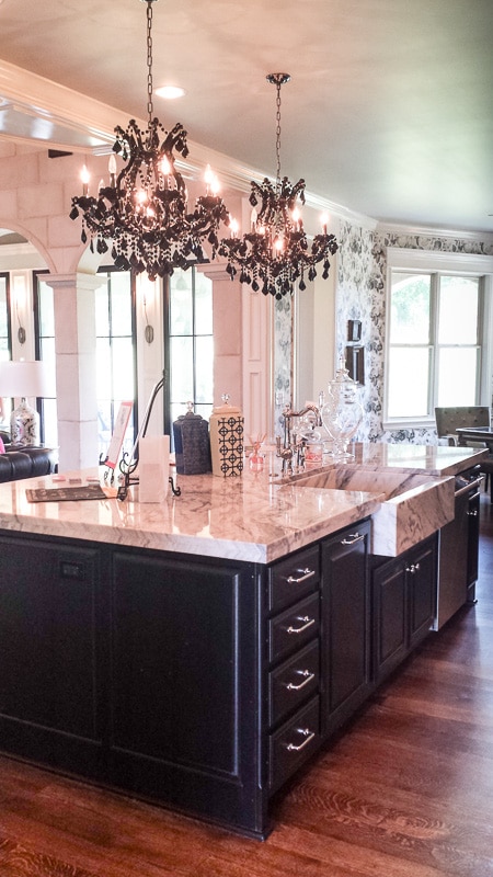
The twin chandeliers over the island were even better in person.
Why yes, that is a marble farmhouse sink. I suppose we could be practical and wonder about staining in a marble sink, but since we’re living in dream land today, let’s just pretend that isn’t a concern.
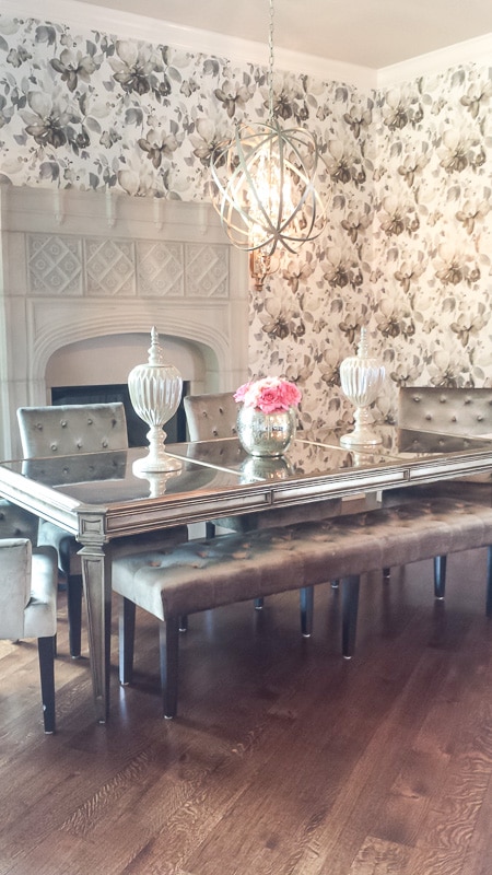
The dining space had another unique stone fireplace. Fireplaces in dining rooms were a big trend this year throughout many of the homes. I’m suddenly wondering if I can work one in to our house 🙂 This was the only wallpaper I’m on the fence about. I can’t decide if I want it to be more bold, less bold, or if it’s just the right balance. But the fact that it’s the only major design element I’m even questioning in this 6500 square foot house just speaks to what an amazing job the builder and designer did.
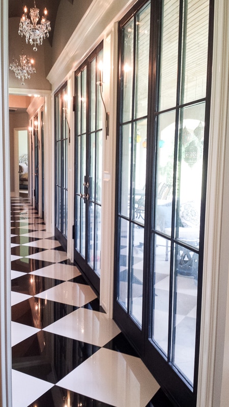
On the back side of the house, there is another hallway just as dreamy as the one up front.
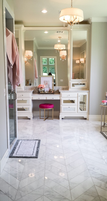
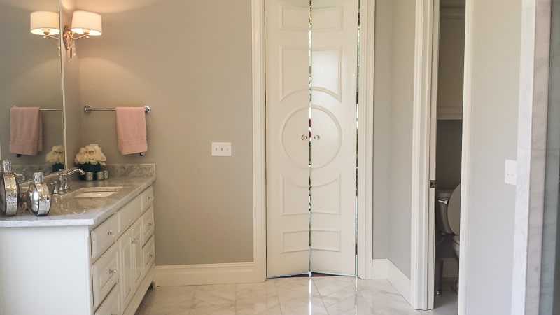
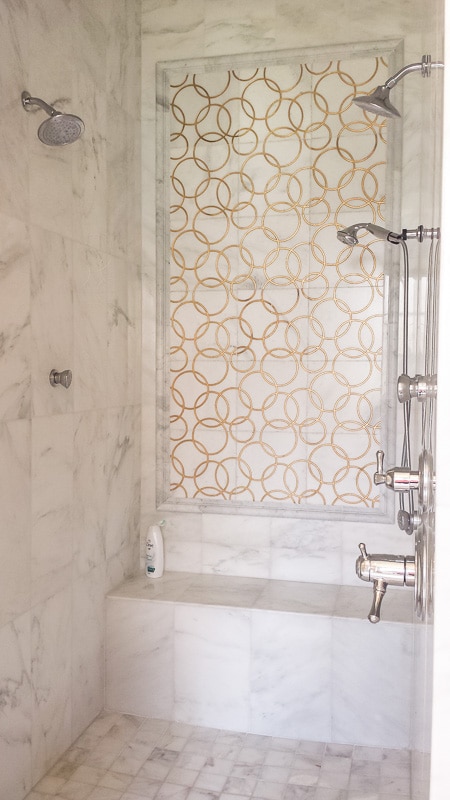
Then we had my dream bathroom…
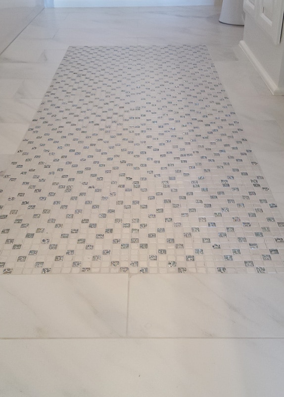
Hello beautiful tile. Why yes, it is gold and marble.
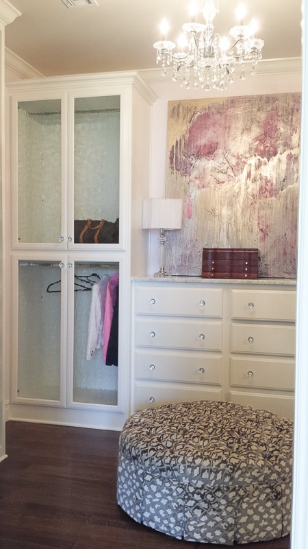
The master closet didn’t disappoint either.
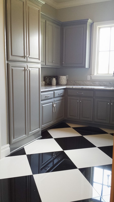
The laundry room attached to the master closet, and also to the front hallway via the secret door.
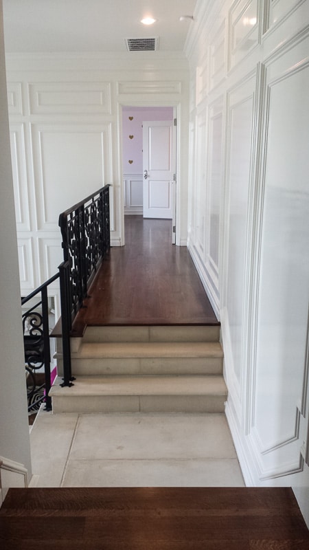
The upstairs was separated into two wings.
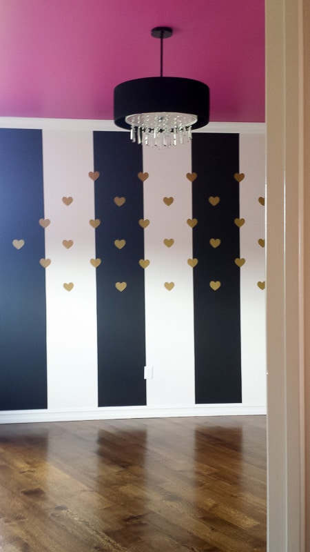
One of the bedrooms had the same pink ceiling as the downstairs powder room.
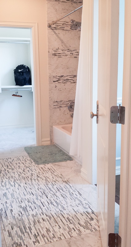
Both of the upstairs bathrooms had marble tile with unique accents to make the spaces more fun for kids.
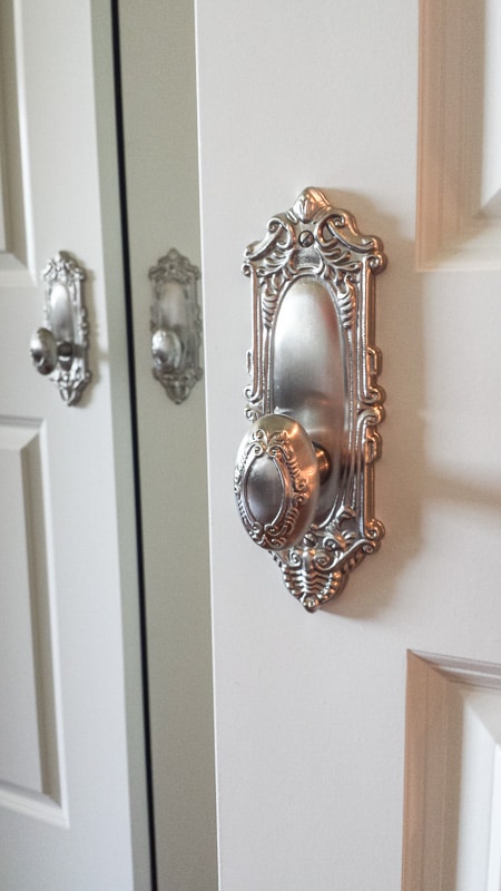
The door knobs really lend to the feeling that this was an old house updated instead of new construction. I can’t congratulate the builder and designer enough!
Quite a house, right? Can’t wait to hear what you thought of today’s house – I’m sure they’ll be some strong feelings!
Don’t miss Day 2 & Day 3 of my series – so many more great houses including our favorite!


Angela, Blue i Style says
OH MY GORGEOUS! I am drooling over these pictures {nice work with the cell phone camera, by the way}! I would move in in a heartbeat!!
Melissa George says
Ha, thanks! I got lucky that a bunch of the rooms had great lighting. And Lightroom was a big help.
Colleen says
Love love love this house. Well, except for the dining room wall paper; I’m in the fence with that one too. Maybe if the upholstery on the chairs and bench weren’t so close in color it would be better…..
Melissa George says
That’s a good point!
Andrea W says
I went in that house too!!! I loved it!! I loved that bar they had off the kitchen and the huge pantry. We always look forward to going to that.
Melissa George says
Oh, how fun that you went in it too! That bar was amazing!!!
MICHELLE WILSON says
My heart is pitter patting over the door hardware – those antique looking knobs and plates. I’ll bet they cost a pretty penny. But oh so gorgeous. Do you think someone could stow away in this house? Dreamy. Thanks so much for sharing. Good inspirations.
Melissa George says
Yes! Stowing away was exactly what I wanted to do!
mary lou says
beautiful pics! i am in love with the chandelier in the parlor! any idea who the manufacturer or where it can be purchased?
thank you!
Melissa George says
I don’t have an official source list for that house, BUT I think I found it! The manufacturer seems to be Golden Lighting & the model name is Echelon 9 Light Chandelier in the Tuxedo color. Here’s one of the sites I found it on: http://www.wayfair.com/Golden-Lighting-Echelon-9-Light-Chandelier-8981-9-BRI-GNL1870.html?PiID[]=7031969