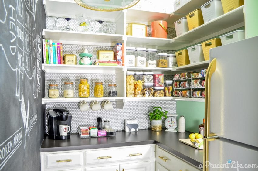
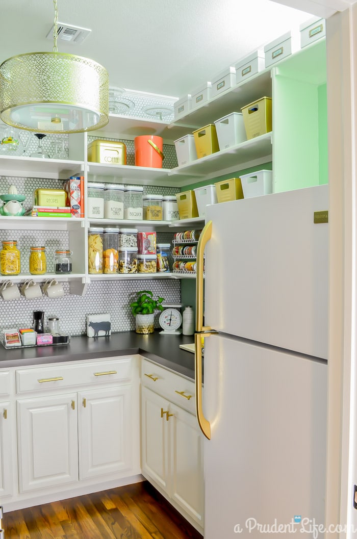
I feel like this post should begin with a big drum roll…after 5 weeks of One Room Challenge chaos, it’s time to show you the finished and organized pantry!
Let’s get to it!
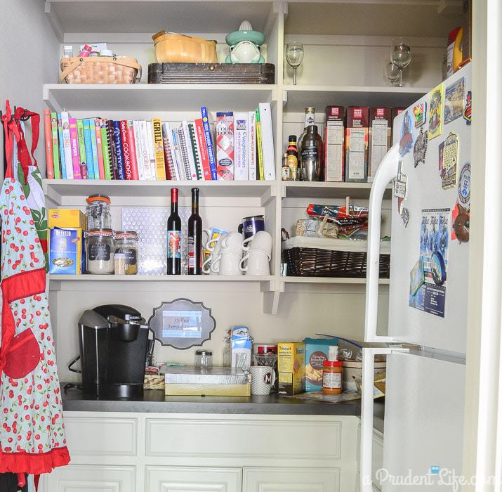
As a reminder, here is what the pantry looked like Week #1. It is a GREAT space that was a big factor in us selecting this floorplan, but the room wasn’t as organized or stylish as I knew it could be.
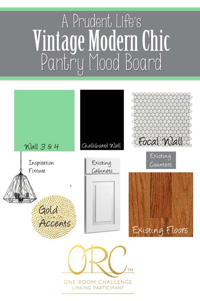
I put together a plan to give the pantry a Vintage Modern Chic vibe with tons of storage.
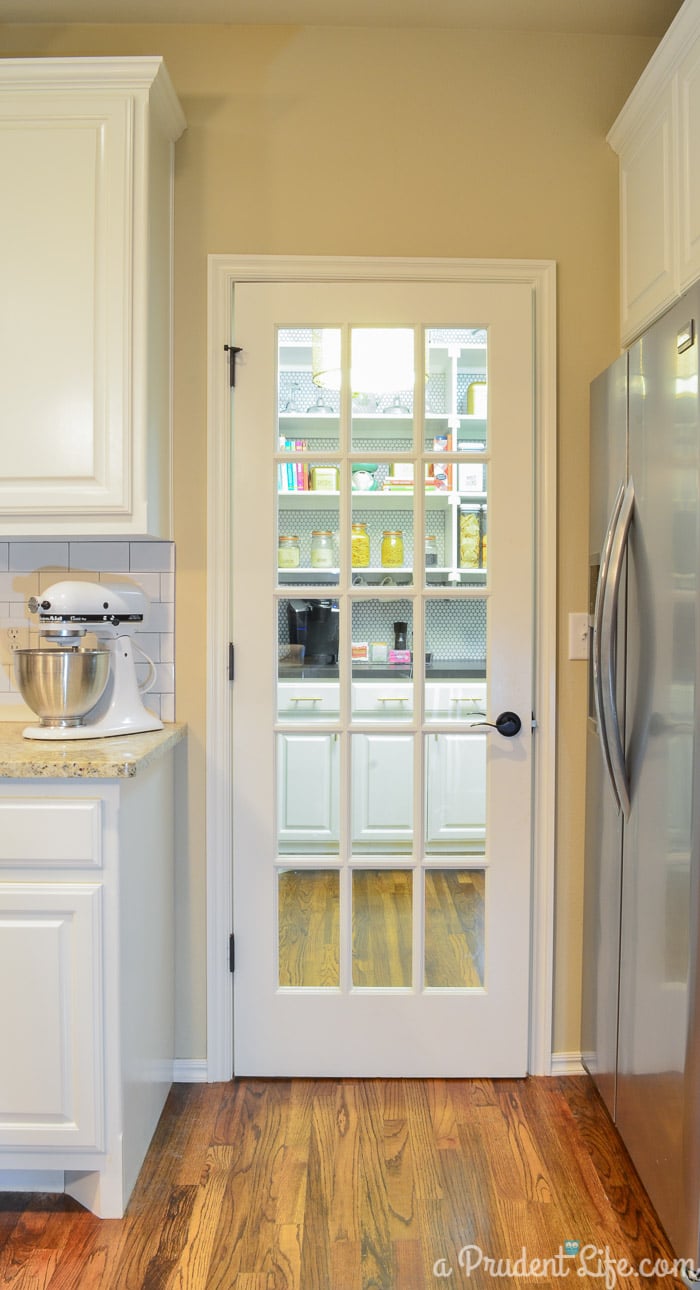
Ahh…it looks so much better through the glass door now!
Ready to step inside?
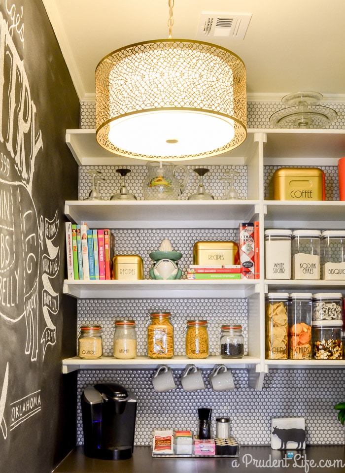
I’m in shock that the mood board came to life better than I could have ever dreamed.
Side note: I moved many cookbooks to the garage sale tub. I’ve had a LOT of comments about “missing cookbooks”, but part of EVERY organizing project should start with purging the items you don’t need.
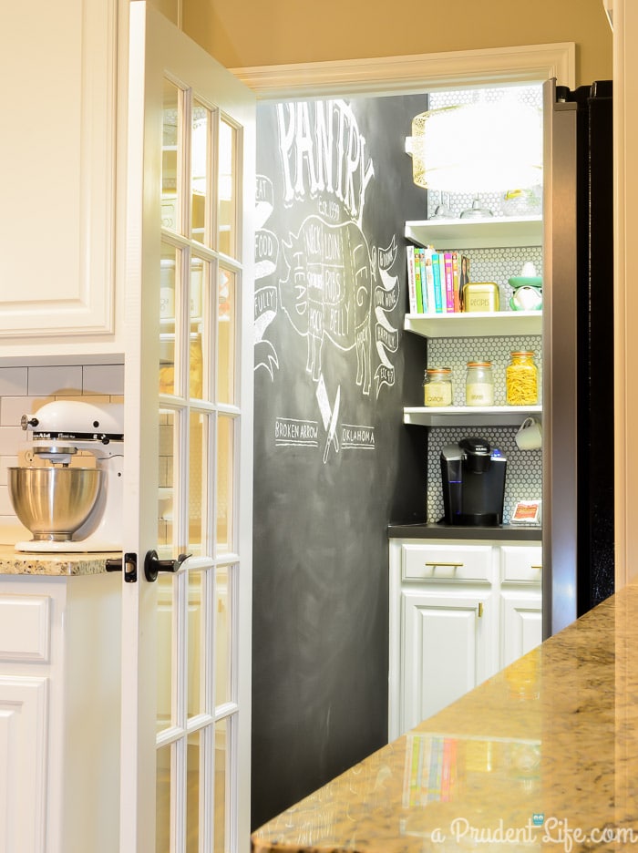
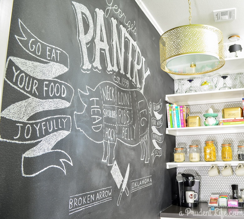
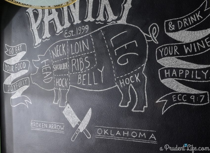
Let’s go back and talk about that ridiculously amazing chalkboard wall art for minute.
I believe my words to my husband were “Can you draw me one of those butcher cow or pig things? Make it big”.
I left the house while he worked, and before long started getting text messages with photos of his progress and I was blown away. He drew the pig exactly as I imagined!
Then my phone chirped again and it was a drawing of a much more elaborate scene and he wanted to know if he should add it to the wall as well. Ummmm…Yes!!!!
The new art incorporates our last name, the year we were married, our home town, and the PERFECT scripture for the space. The ribbons on the left and right say “Go eat your food joyfully & drink your wine happily – Ecc 9:7”.
Seriously, how did he go from a pig to this whole brilliant thing while I was gone for a few hours? Mind-blown.
I can’t really top his artwork with the rest of the room, but I love it all anyways! Let’s take a closer look.
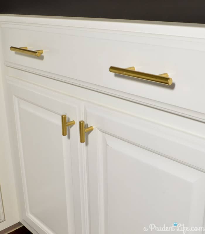
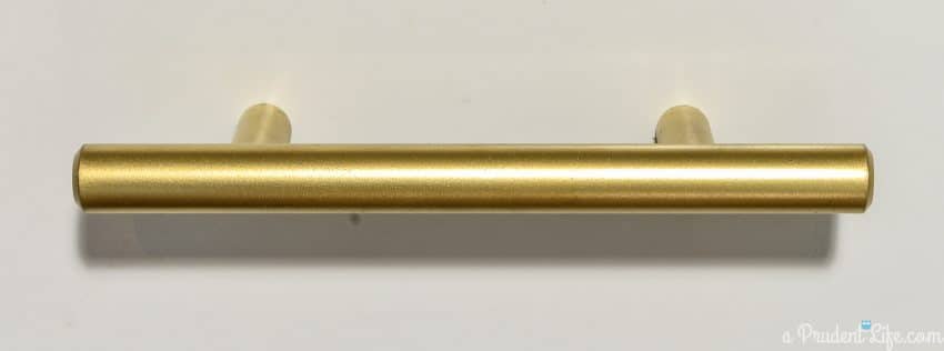
The drawer hardware is gorgeous, and you’d never know I saved 84% on it!
I was totally bummed when my beautiful DIY orb wasn’t bright enough to light up the space, but all is good now.
This drum pendant from Lowe’s is perfect! I had to paint it gold, but I was so relieved to find such an awesome fixture without breaking the bank.
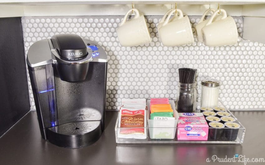
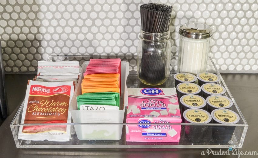
I used to have a shallow wicker tray for our coffee/tea/cocoa, but as I was putting the room back together, I had a sudden and overwhelming desire for the tray to be Lucite. It’s divine, right?
Now I skip joyfully to the pantry for my coffee in the morning.
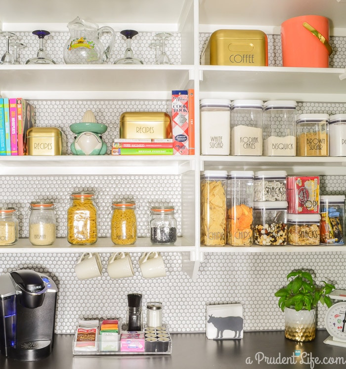
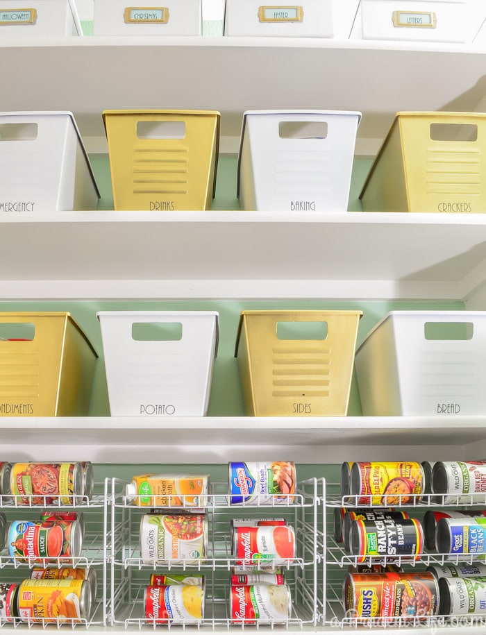
Above the coffee station, I used some jars from the “before” pantry to hold our dry bulk goods. I love the new labels!
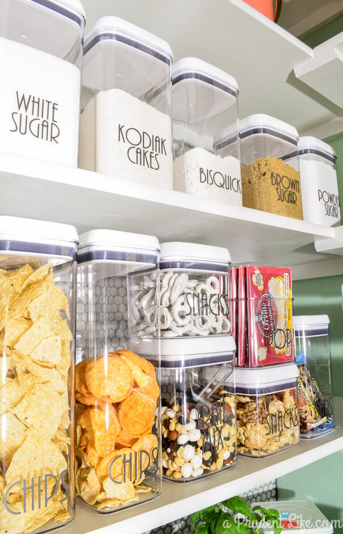
These clear food storage containers are an affordable alternative to the popular Oxo containers.
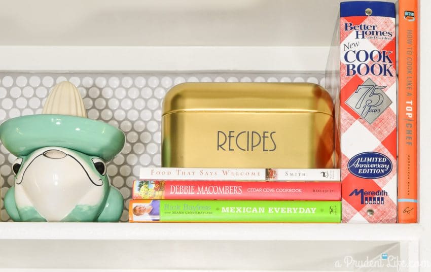
The tile wall was absolutely worth the drama queen grout. And seriously, isn’t that sombrero-wearing frog juicer the cutest thing ever?
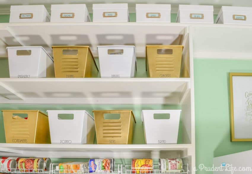
The photo boxes along the top are for cookie cutters!
Can I be sappy again? This is the first time I’ve completed a room that is a total reflection of me without compromise.
The space embraces pretty much every varied aspect of my personality. It’s a contradiction between splurges and frugality, between glamour and functionality, and between modern and vintage.
I relate completely to all of those contradictions – I am the lady with the Kate Spade purse in the Dollar Tree.
To see what the room looks like a few years later, check out the real life pantry follow up post next!
Since this post was originally written, I’ve completed the One Room Challenge many times. It pushes me to be my best, and I still have trouble believing the rooms we’ve created our my designs or mine in general!
Here’s a list for you to visit next:
Girly Glam Office
Dreamy Organized Master Closet




Janette Beougher says
Where did you get the gold recipe boxes?? Love them and your awesome pantry!!
Melissa George says
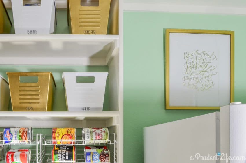
Thanks Janette! They were clearance green metal boxes from IKEA that I painted gold and added then added labels cut with my Silhouette machine!
Judith Pohlers says
I loved everything about this makeover! Not that you would change the drawing on the chalkboard, but you COULD for special occasions. This will really keep your husband busy!. I was also enamored by the white mesh shelves for canned goods, like the soup display in the grocery store where you pull out one can at a time.
Melissa George says
Yes! We haven’t changed the top of the chalkboard yet, but all the niece’s and nephews love adding their own touch to the bottom. And those can dispensers have been great! I love being able to see everything “in stock” at a glance. Oddly enough, I always get excited when anything at home looks like store display!
Debbie says
I’m new to design space. I just got a Cricut Joy. I’ve had Expressions 2 previously.
Whant font is that you used for your containers?
Melissa George says
Hi Debbie, I’m so sorry I missed this question last week! The font for the pantry containers is a really old one from my computer called Ar Bonnie. For almost everything I label now, I actually really like the simple Cricut Sans. It’s clear and easy to read, but something about it still feels a bit clean and modern. You should see it in the default fonts in Design Space for your Joy if you want to try it!