Do you have any big empty walls that you just aren’t sure how to fill? We FINALLY have art in our living room and it only took us three years! It wasn’t for lack of trying though, we have purchased several things over the years, but they are never big enough when we get home. All the waiting was worth it though. One day out of the blue, I became obsessed with the idea of doing a giant typography gallery wall showcasing the initial from our last name in all of our favorite fonts. My graphic designer husband was on board with the idea so I just needed to find frames. If you happened to see my Fall Home Tour, you may remember that we started this project several months ago.
I told my sob story in the fall tour post that I bought 10 of the 11 3/4 x15 3/4 RIBBA frames at IKEA thinking they would be perfect. I fully admit that actually measuring, or even better, taping the wall to represent the frames would have prevented the big delay in this project. In my head it all made sense though! I would have four frames on each side of the TV and three across the top. Ten frames. Totally logical.
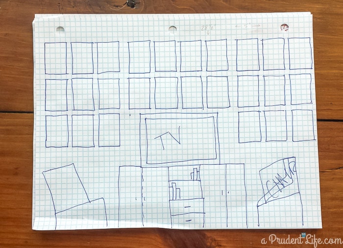
I was SO wrong. After I saw how much my 10 frame plan didn’t work, I drew a pretty picture on fancy graph paper. I’m a pretty good artist. As demonstrated by the part where I had to write “CHAIR” so people who don’t get my abstract style could still interpret my drawing.
Some of you are probably wondering why I didn’t do the chalkboard art in the pantry myself, right?
Now that you are impressed by my drawing, I should mention that it still wasn’t to scale. It was to guesstimated scale 🙂 When we ACTUALLY measured, I decided I needed even more than the 26 frames in the picture. I needed at least 32. I was going for BIG impact!
In addition to the expense of buying 22 more frames at $7 each, IKEA didn’t have the gray gloss available for shipping and the IKEA is 4 hours away. But, as you can guess since I’m posting this, we finally made it back to Dallas and I came home with a trunk load of frames. Elation. In a cruel twist of fate, I noticed today that IKEA now ships these exact frames. Rude.
Now that we got the dramatic back story out of the way, we can move on.
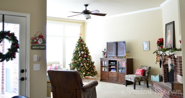
Here is an pic from last Christmas showing the vast emptiness of the wall. Seriously, what is that tiny frame doing on the right side of the TV?
Making the actual typography art was really easy and kind of fun. My husband and I each looked through all of our existing fonts and this project was a great excuse to spend some quality time with DaFont finding new fonts to love. My concept was to make our G’s as big as possible on a normal piece of copy paper, then add the font name small at the bottom. Kinda like a little gallery plaque.
The only tricky part to this project is that all fonts are created in different width to height ratios and different scales. So we couldn’t just print them all out in 200 pt and have them look consistent. We used grid lines in Photoshop to create a margin around the page. Then we could drag the font to fill the space between the grid lines. The font names were placed right on our lower grid line so they would all be the same distance from the bottom of mat. If you don’t use Photoshop, you could achieve the same effect by setting your margins in a word processing program.
We printed all of the art at home using a 32 lb, 98 brightness inkjet paper. We set the printer to photo quality to make sure the thick fonts were a nice solid black. When they were all printed, somehow my husband got roped into framing all of them. I’m not sure how I avoided that. I was probably busy eating bonbons.
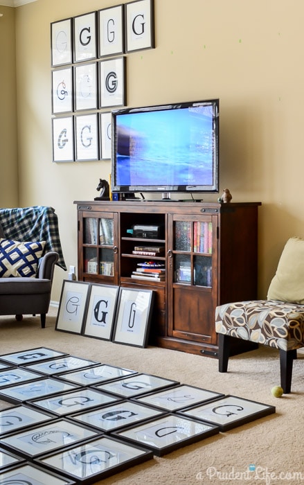
Here comes the fun part! Time to hang everything up. We laid all the frames out on the floor so we could decide where we wanted each font. We weren’t super picky, but wanted to make sure different styles (script, serif, super bold, etc) were distributed somewhat evenly.
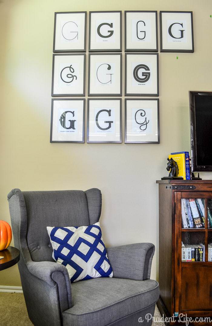
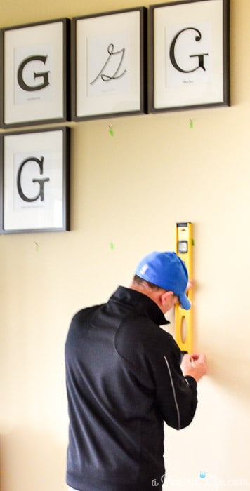
In the picture below, you can see green tape on the walls. Back when the first 10 went up, super husband measured out the full wall and made little pencil marks were each nail needed to go. Then he used tape so he could easily find the pencil marks. Each mark was checked against it’s neighbors to make sure everything stayed as level as possible.
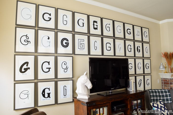
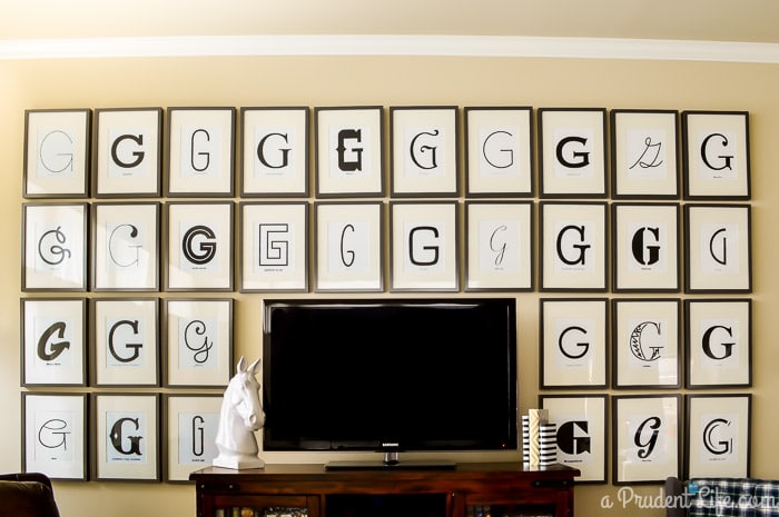
When he was done, it was even better than I imagined it would be! The finished size is approximately 6 ft tall and 12 feet wide. Whoa!
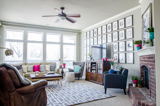
Completely worth the trip for more frames, right? (2017 Updated Pic Below!)
You know what’s crazy-making? Trying to take a picture of 32 pieces of glass when two of the walls in the room are floor to ceiling windows.
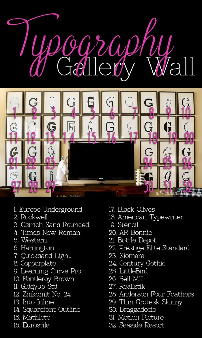
Here’s a guide to all the fonts we used. Make sure you check the license agreements as some of them are personal use only. If you love fonts, this is a definite must pin!
To see more of the updated living room, check out this post.



Liz says
The G’s for genius, right? 😉
Melissa George says
Ha! Totally! 🙂